Creating an architecture website is an important milestone in every architect’s career. Having one is a statement in itself: you are professional and dedicated to what you’re doing.
Now, you may think that creating your architecture portfolio website is too daunting, but we’re here to demystify the process and help you get started. Therefore, we’ve rounded up the 20 best architecture websites to give you a boost of inspiration and our top tips on how to get started with yours.
The 21 Best Architecture Websites
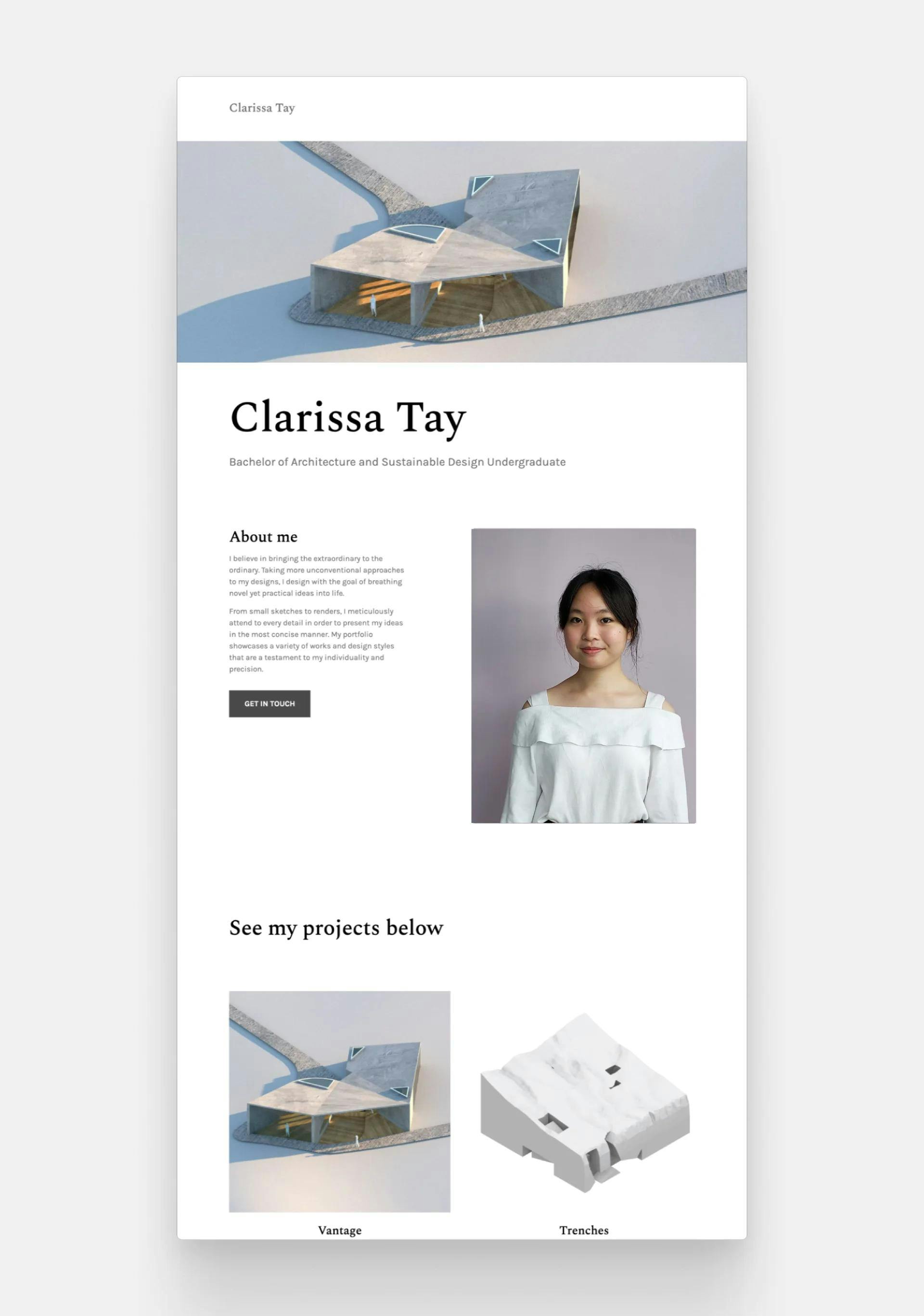
Clarissa Tay
Clarissa Tay's portfolio website
Clarissa, an architecture graduate, created extraordinary visuals and a clutter-free layout. Featuring a full-width image of one of her unique projects, her portfolio cover sets the perfect tone for a refined and professional portfolio.
Template: Agora by Archifolio
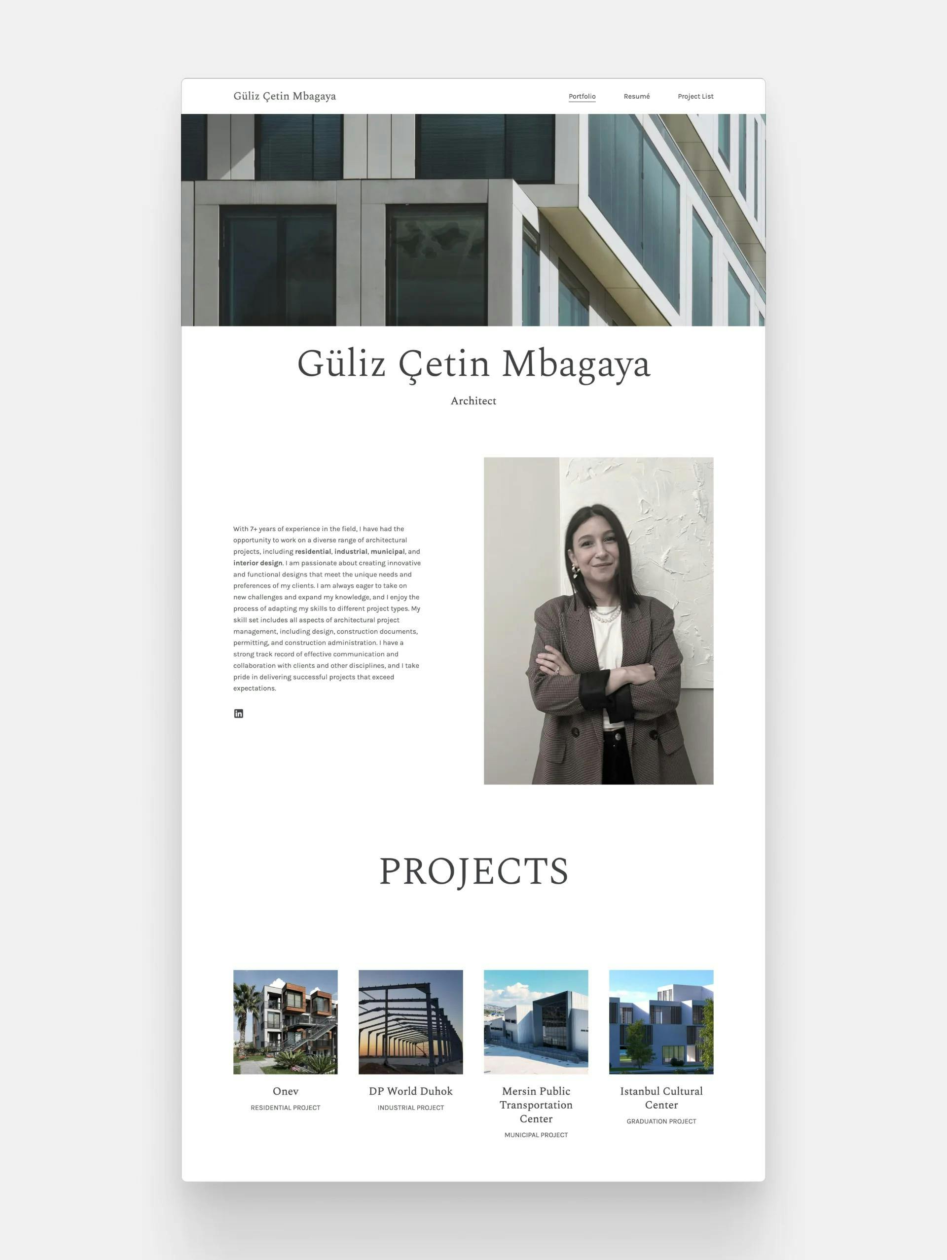
Güliz Çetin Mbagaya
Güliz Çetin Mbagaya's architecture website
Güliz's impressive curation of her work showcases her skills and accomplishments effectively. Her expertise and 7+ years of experience shine through the pages.
Template: Agora by Archifolio
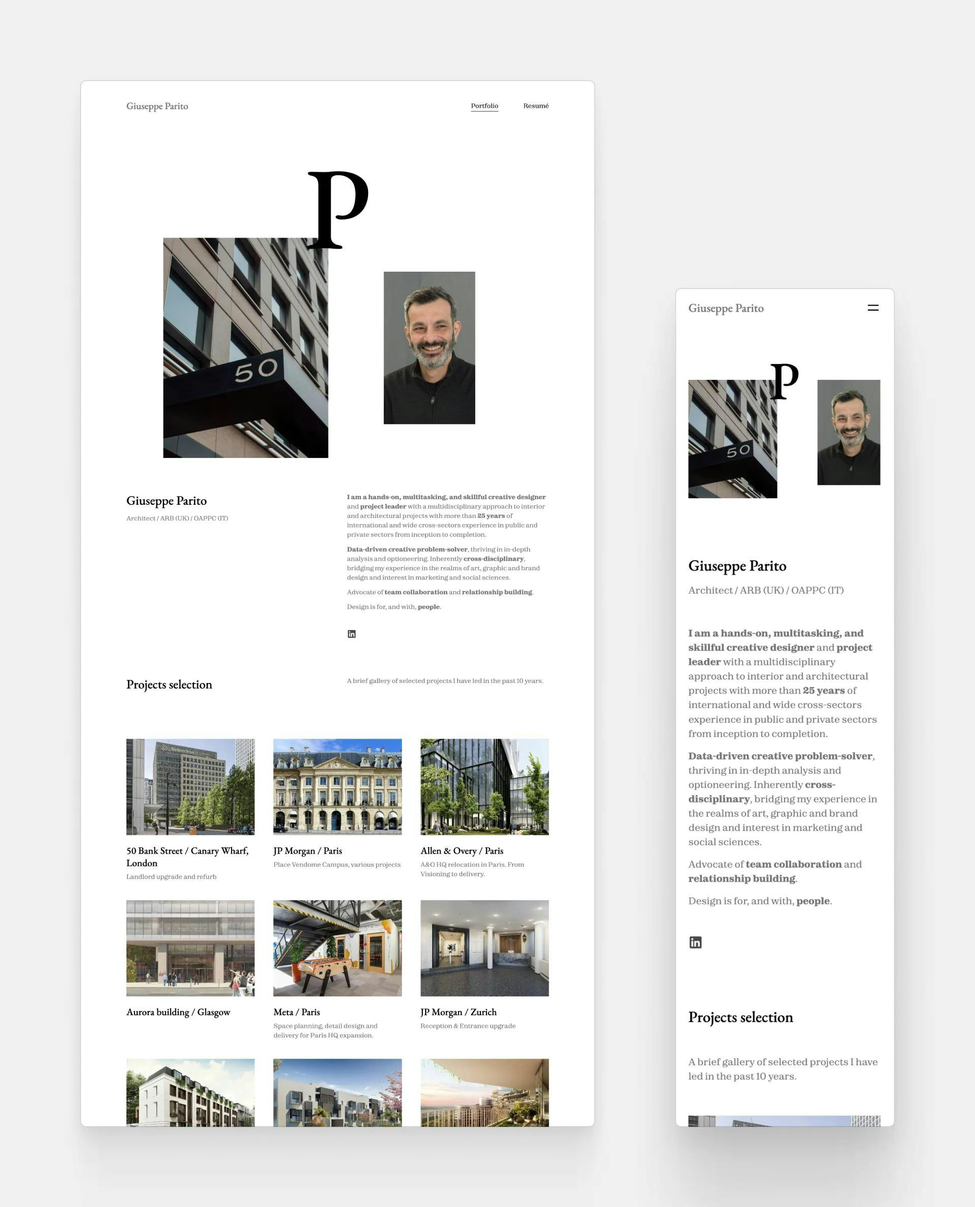
Giuseppe Parito
Giuseppe Parito's architecture website
Giuseppe's superb projects and impressive experience are perfectly summed up by his website. It's clean and straightforward, but with the unique composition of the cover, it makes it visually compelling.
Template: Downtown by Archifolio
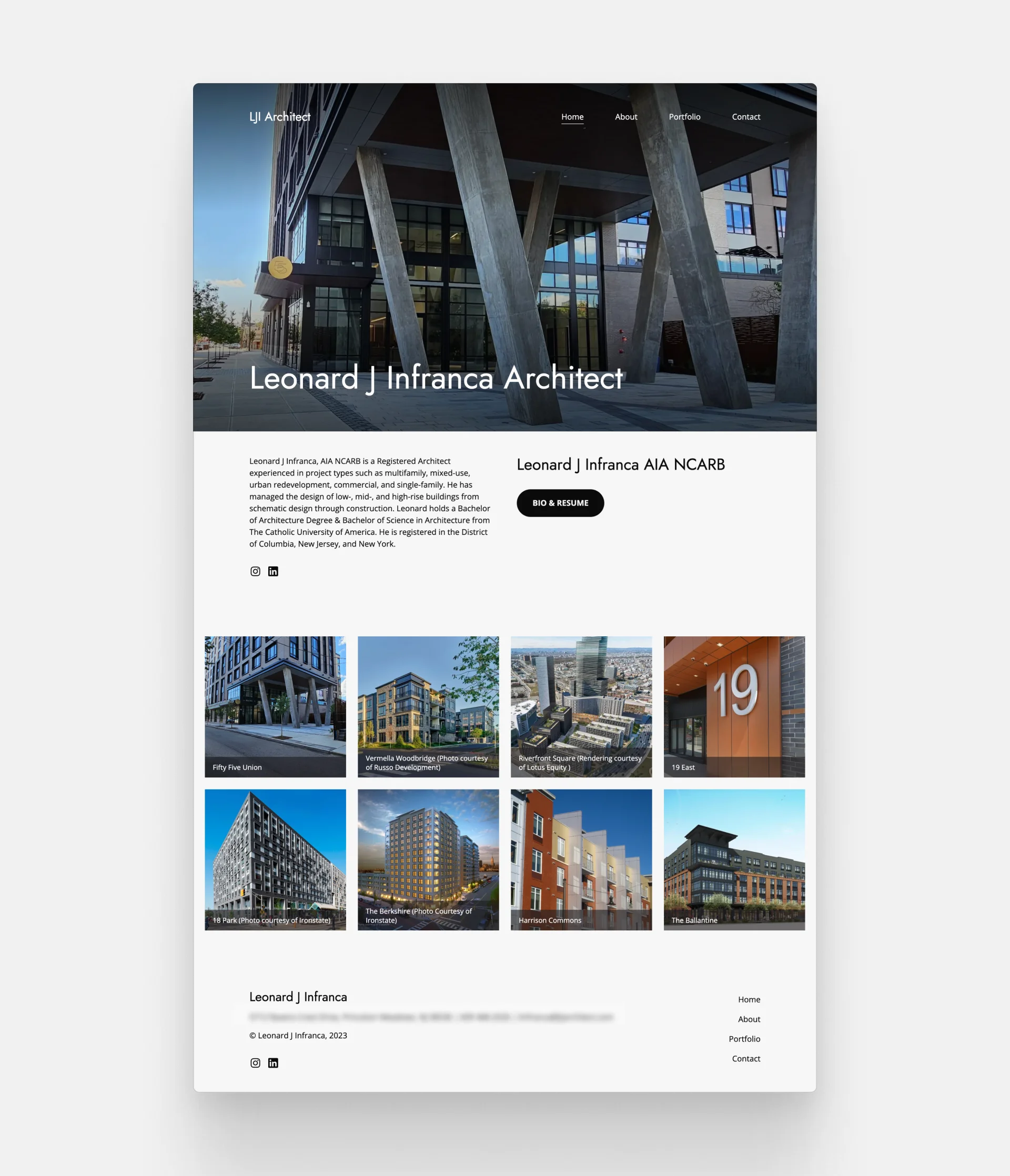
Leonard J. Infranca
LJI Architecture's Website
Leonard's architecture website is a stunning example of how less is more. He managed to encapsulate his expertise and three decades of experience in a comprehensive portfolio with merely 8 projects.
Template: Loft by Archifolio
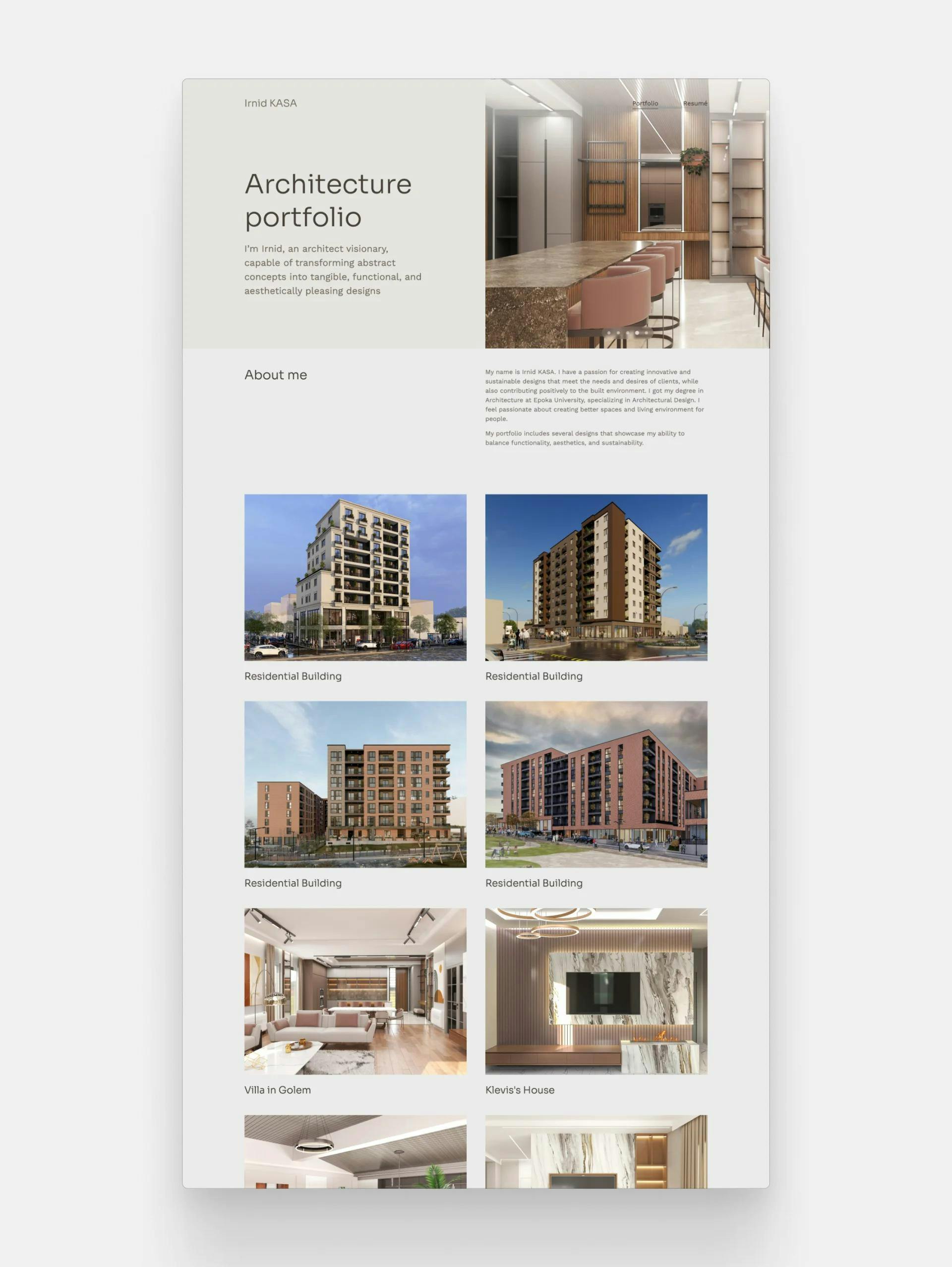
Irnid Kasa
Irnid Kasa's architecture website
The brilliance of Irnid's website lies in the perfect choice of project page thumbnails. These images—that when clicked lead to a whole other page—create a sense of harmony and playfulness, while also showcasing Irnid's exceptional rendering skills.
Template: Loft by Archifolio
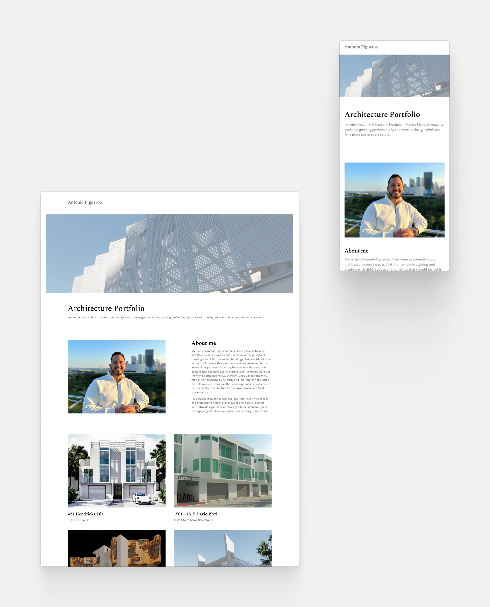
Antonio Figueroa
Antonio Figueroa's website
Antonio's portfolio is welcoming yet professional at the same time. By including a mix of renders and real-life photography, he gives tangible evidence of his expertise.
Template: Agora by Archifolio
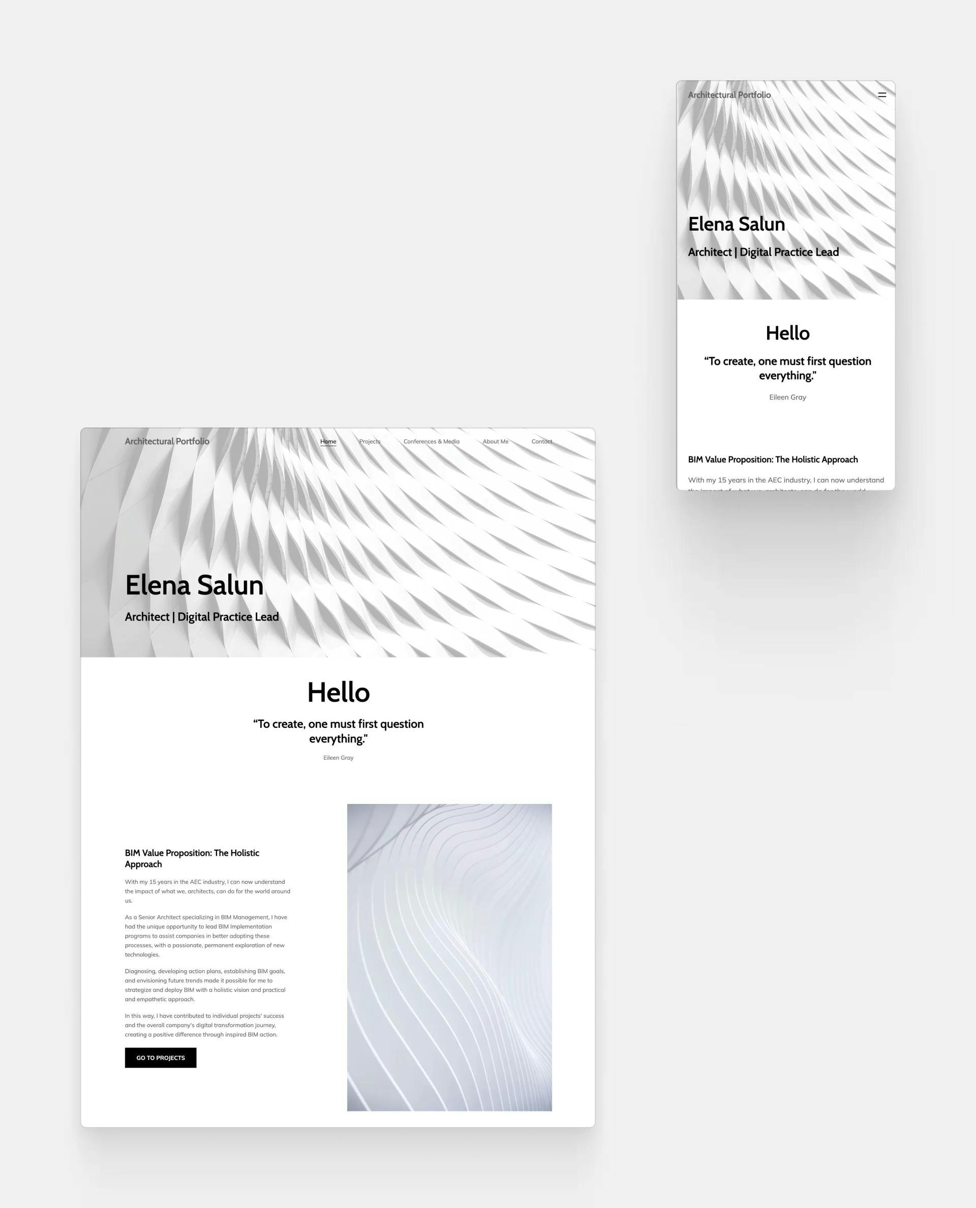
Elena Salun
Elena Salun's portfolio website
Elena's portfolio does more than just showcase her projects. She gives a glimpse into her way of thinking by including an inspirational quote as well as her credo.
Template: Museum by Archifolio
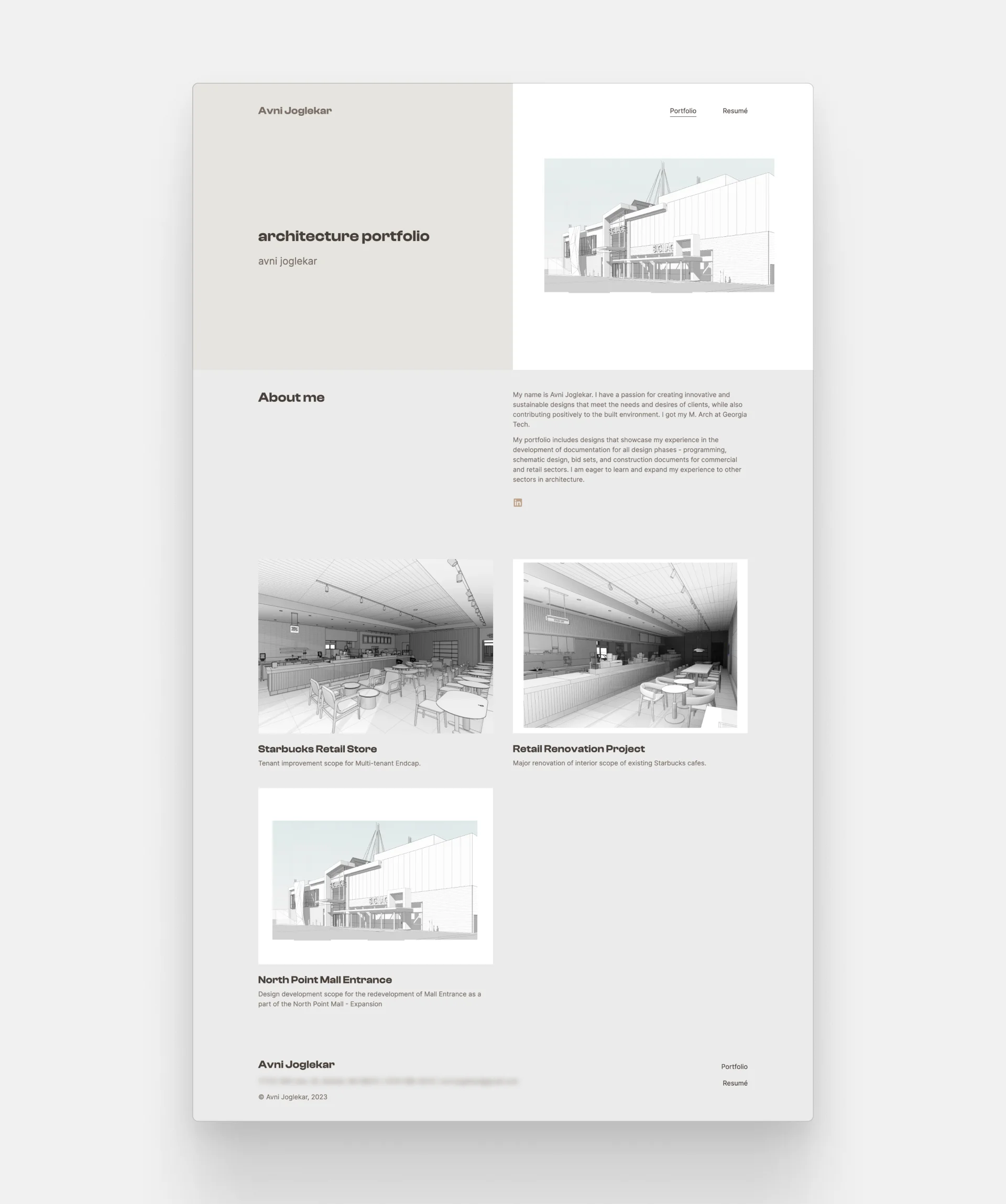
Avni Joglekar
Avni Joglekar's website
Avni created a clean and clutter-free layout but made it soulful by the outlined drawing style images as thumbnails. They liven up the site and make us want to know more about their project.
Template: Loft by Archifolio
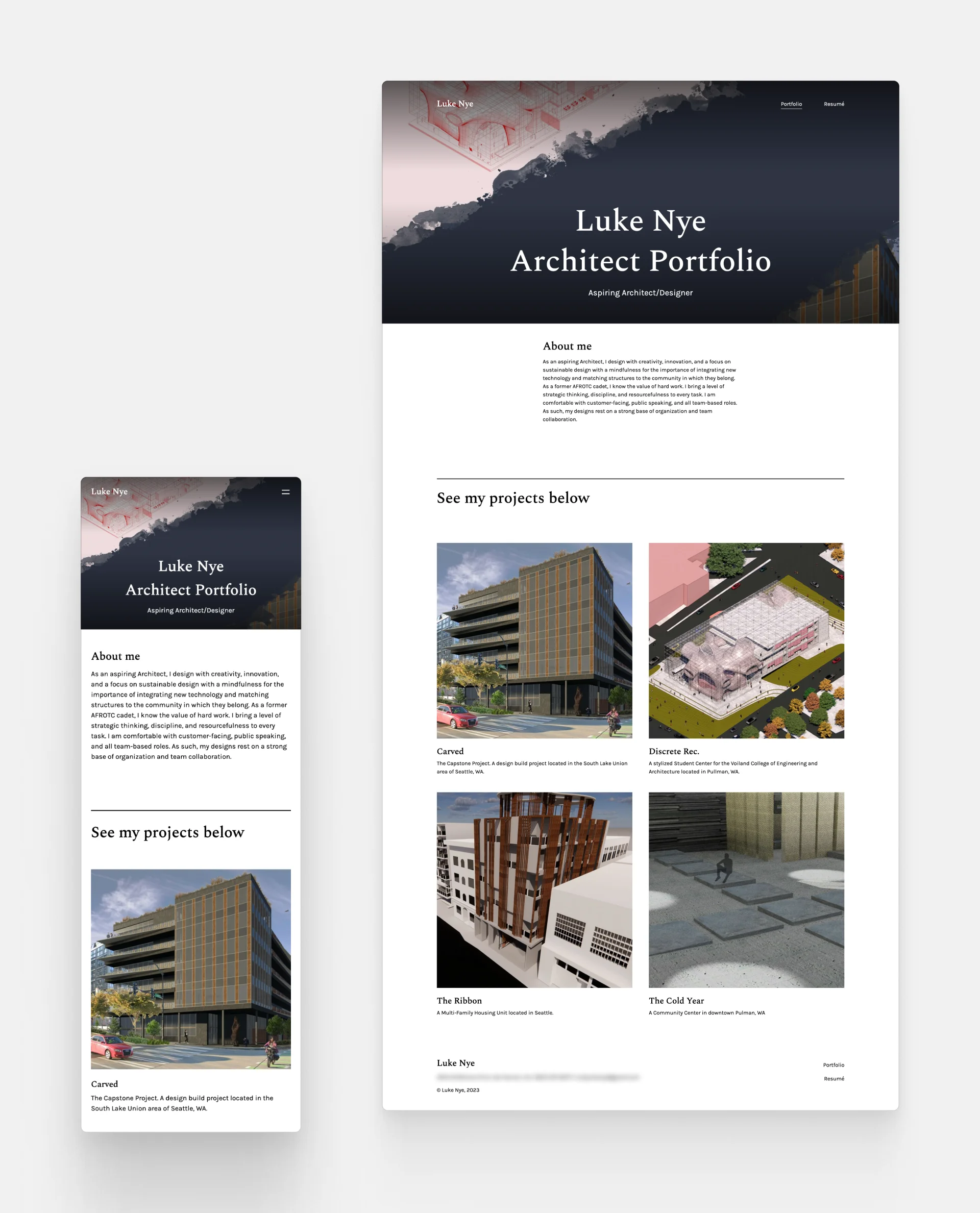
Luke Nye
Luke Nye's website
Luke's discipline, resourcefulness, and astonishing design eye make this portfolio more than just a collection of work. It's a strong professional statement, one that gets him that job he really wants.
Template: Museum by Archifolio
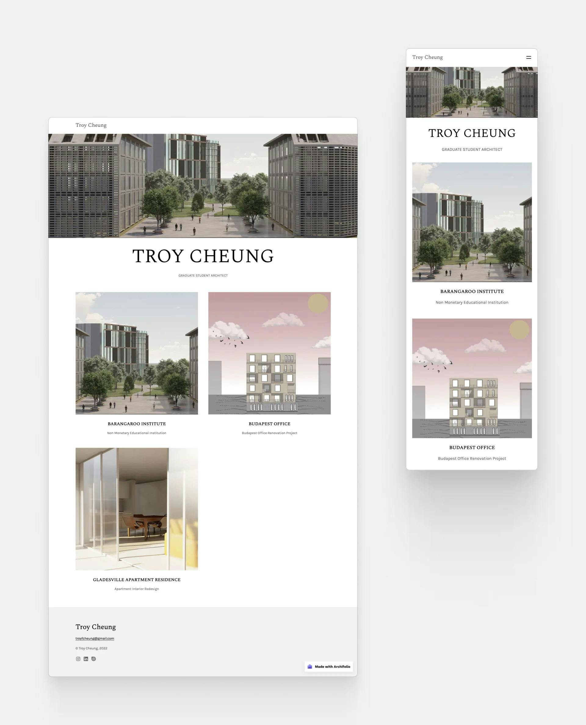
Troy Cheung
Troy Cheung's architecture portfolio website
Troy's portfolio website is simple, yes, but it does exactly what it was made for. It leads us, viewers, to explore his stunning projects, accomplishments, and skills.
Template: Agora by Archifolio
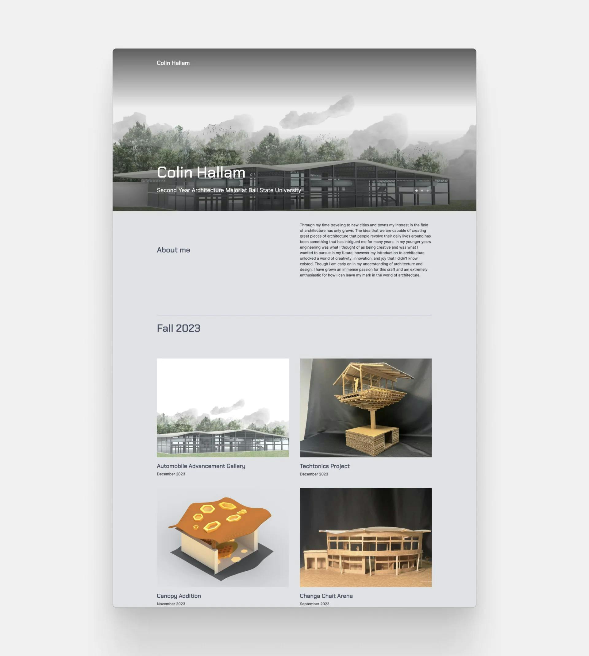
Colin Hallam
Colin Hallam's architecture website
Collin's undergraduate architecture portfolio is a comprehensive collection of his school projects categorized semester. Thus, it's highly convenient to browse through his projects and see his progress.
Template: Metropolitan by Archifolio
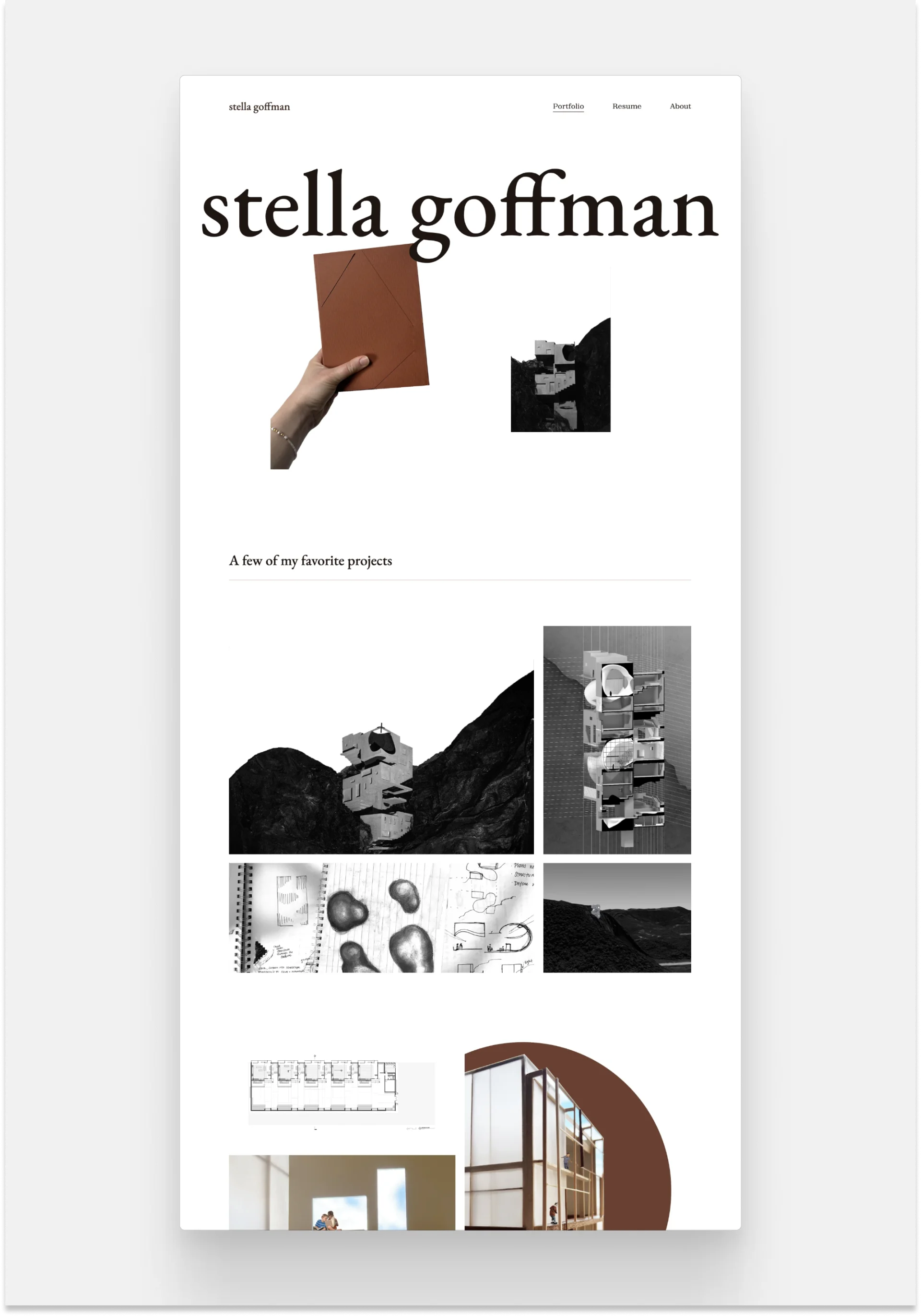
Stella Goffman
Stella Goffman's website
Stella's unique site communicates her out-of-the-box way of thinking about her work and architecture. She let her pictures do most of the talking but organized them in small, but thoughtful compositions through Archifolio's collage sections.
Template: Downtown by Archifolio
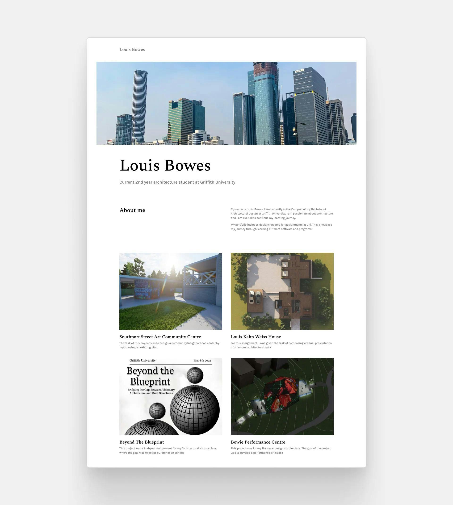
Luis Bowes
Luis Bowes' architecture portfolio
Luis's architecture portfolio is a snapshot of his expertise and experience so far in his career. As an architecture student, it's important to showcase your range and versatility, and that is skillfully done on this website.
Template: Agora by Archifolio
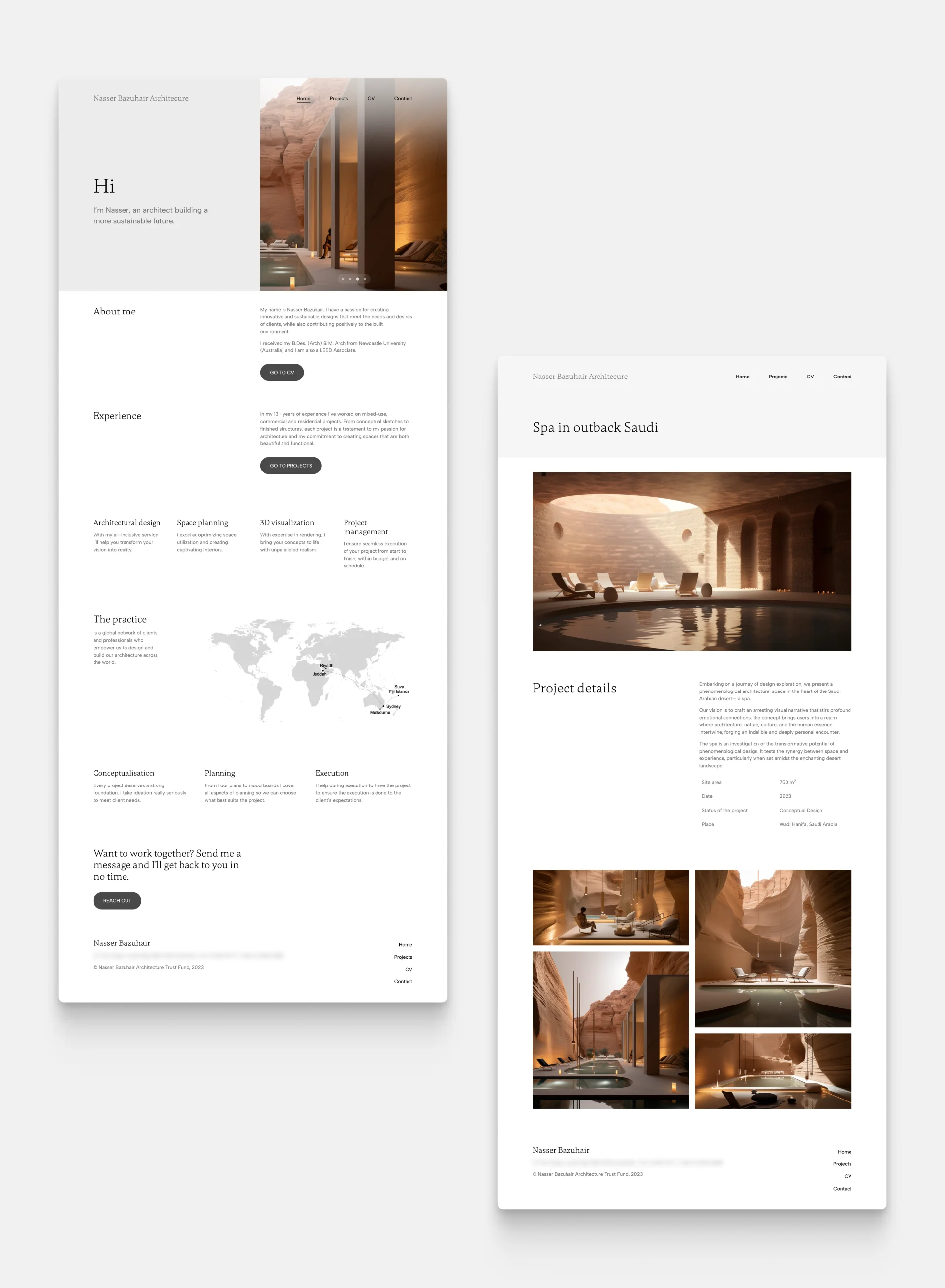
Nasser Bazuhair
Nasser Bazuhair's website
Nasser's expertise is plain to see right off the bat. His website starts with strong visuals that practically lure us in to see more. And when we dive into the projects, jaw-droppingly beautiful renders are waiting for us to explore them.
Template: Loft by Archifolio
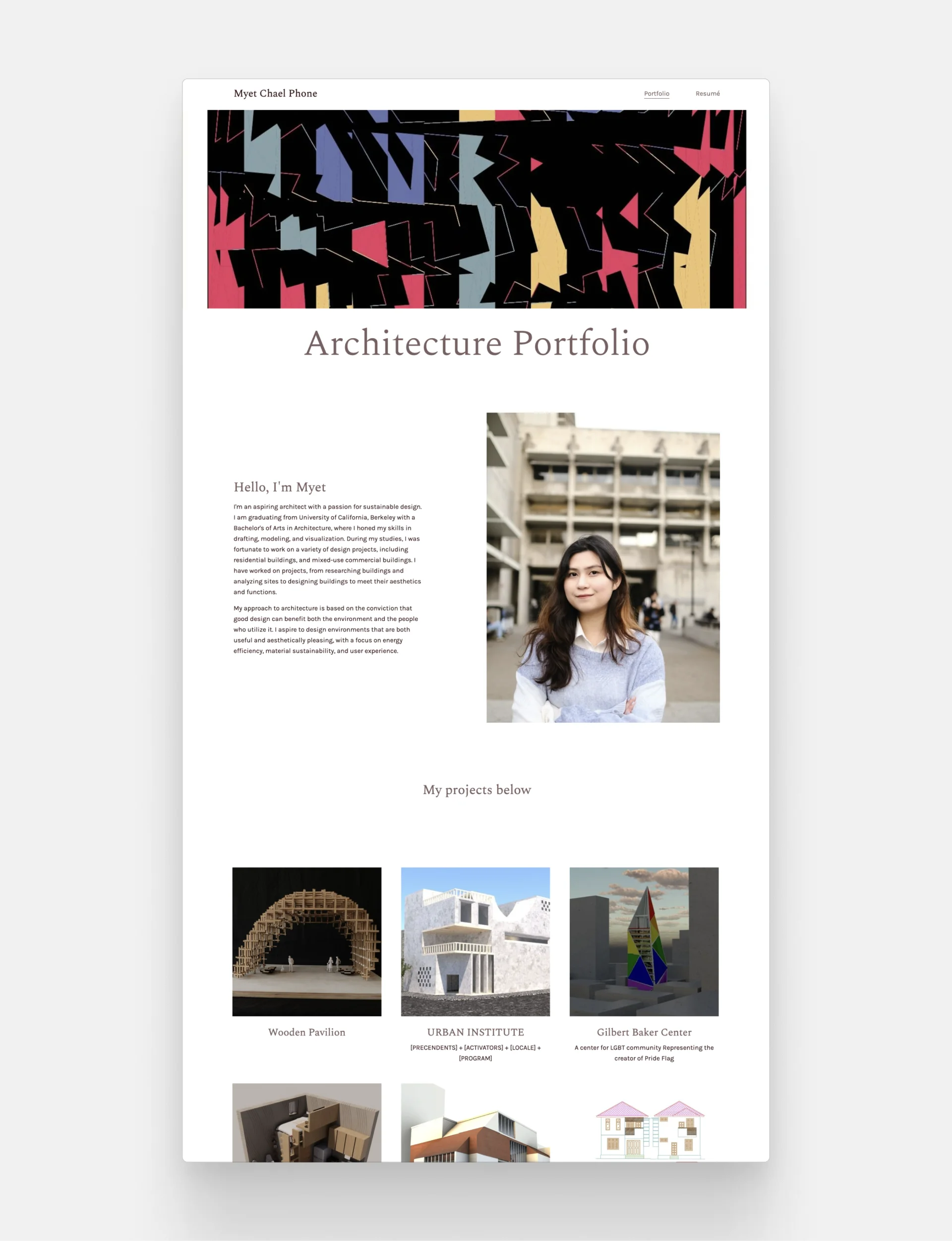
Myet Chael Phone
Myet Chael Phone's architecture website
Myet's portfolio is something else. She used the perfect layout to a) create an artistic atmosphere, b) give a friendly and professional introduction, and c) showcase her expertise in an evident way.
Template: Agora by Archifolio
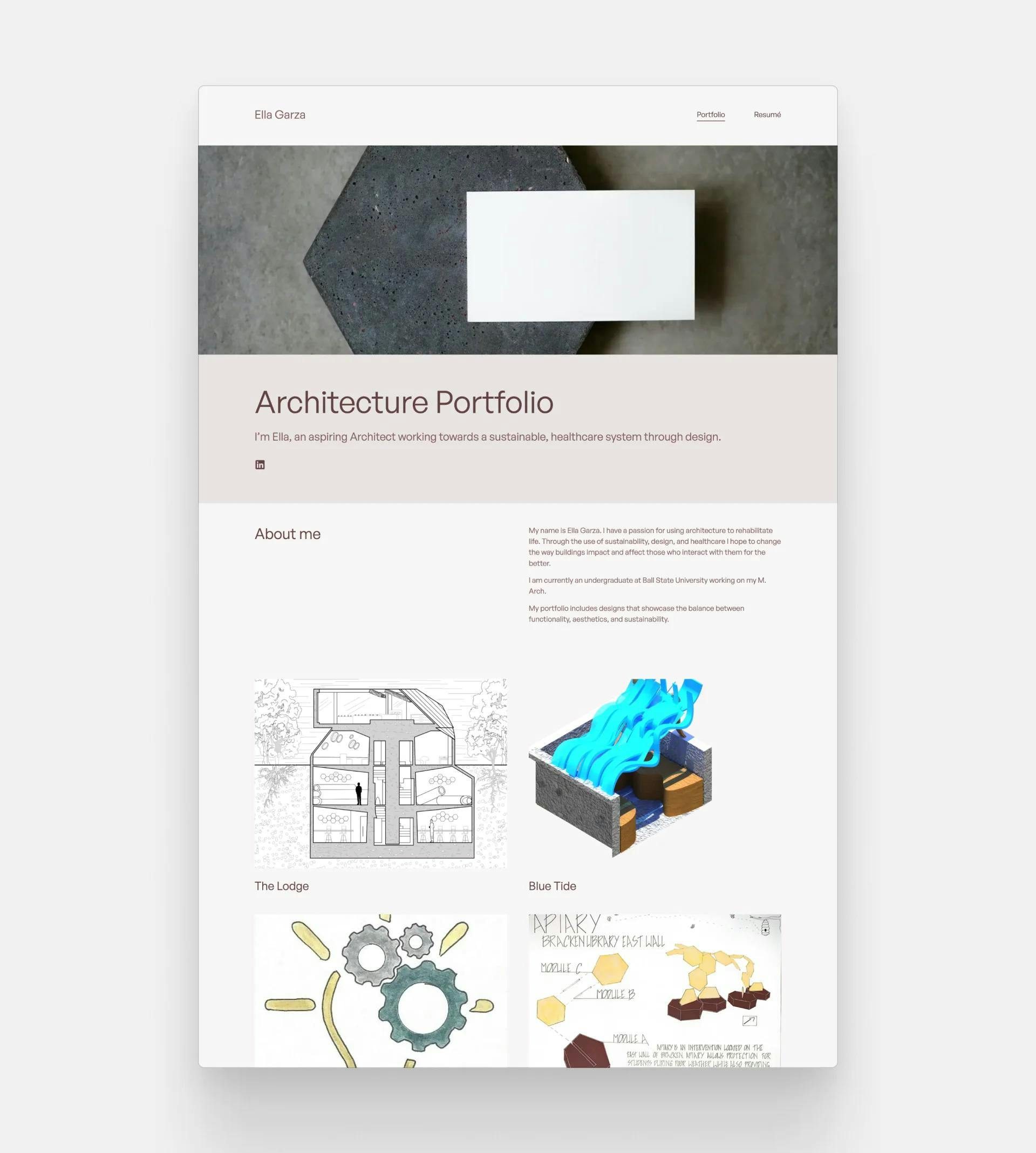
Ella Garza
Ella Garza's portfolio
Ella's website is a detailed inventory of her innovative projects and ideas. Her specialization is visible right at the beginning laying out her apirations and giving visitors important context.
Template: Neue by Archifolio
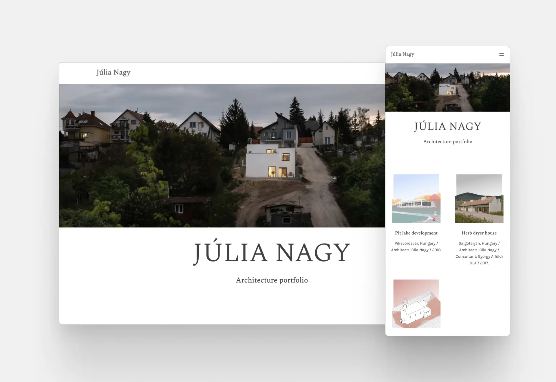
Júlia Nagy
Júlia Nagy's architecture website
Júlia's portfolio is a stunning exhibition of her skills and talent. Just look at the way she plays with the project thumbnails to redefine the grid. It's outstanding!
Template: Agora by Archifolio
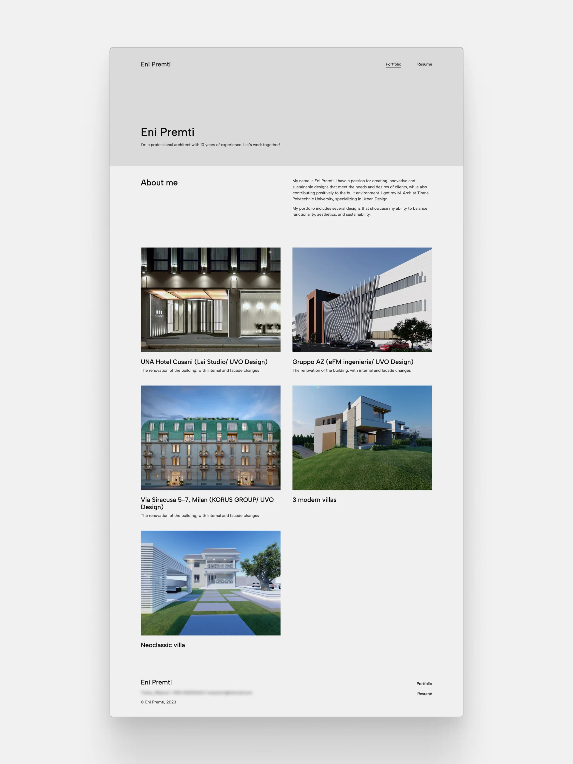
Eni Premti
Portfolio by Eni Premti
Eni's portfolio website showcases their range and versatility of skills and experience. It is enhanced by the fact that for each project, he included different techniques to showcase them on his site.
Template: Modular by Archifolio
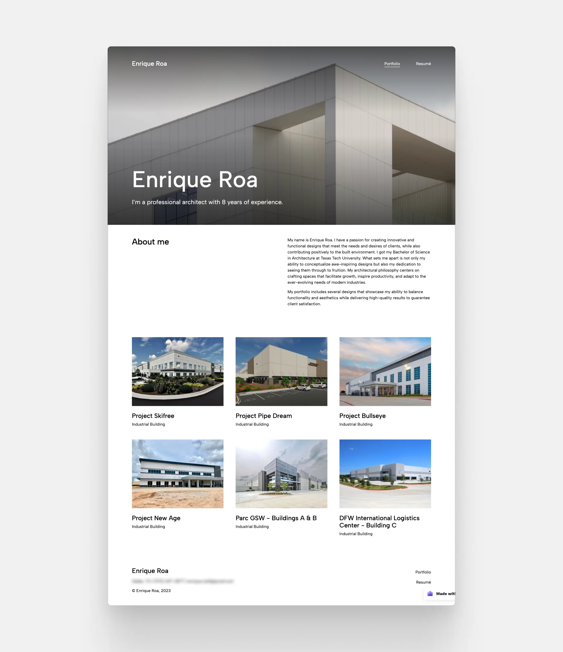
Enrique Roa
Enrique Roa's portfolio website
Enrique Roa is a talented industrial architect, who showcases his stunning projects in a straightforward, grid-based manner on his website. While keeping it completely professional, he managed to create liveliness through the superb renderings of his previous work.
Template: Museum by Archifolio
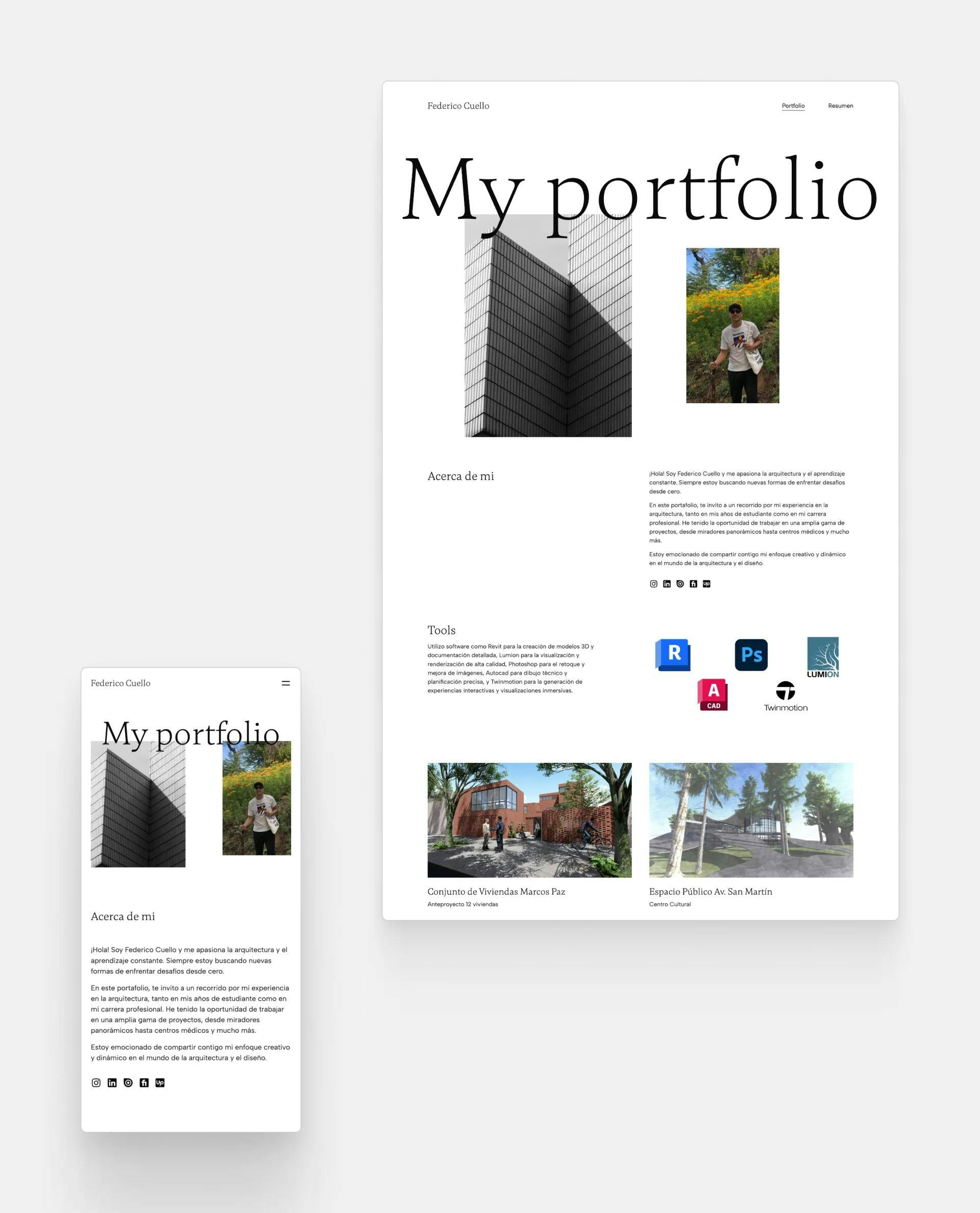
Frederico Cuello
Frederico Cuello's portfolio website
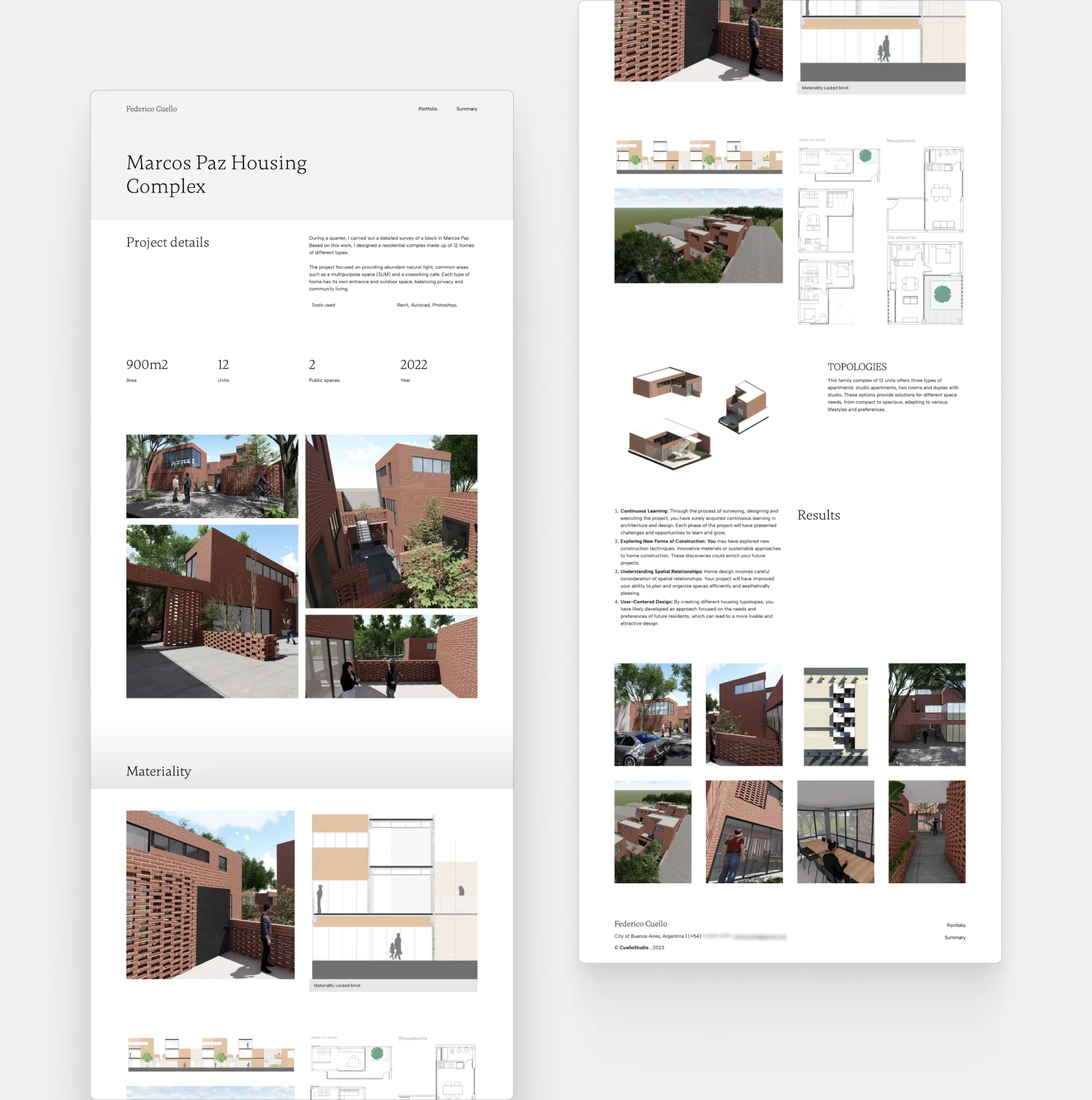
The multi-purpose website of Cuello Studio emphasizes the professional skills and experience of Frederico elegantly but effectively. The jack of all trades, as he is, managed to combine his love for architecture, 3D visualization, and marketing in one handy website.
Template: Haus by Archifolio
Jennifer Wilson
Jennifer Wilson's architecture portfolio website
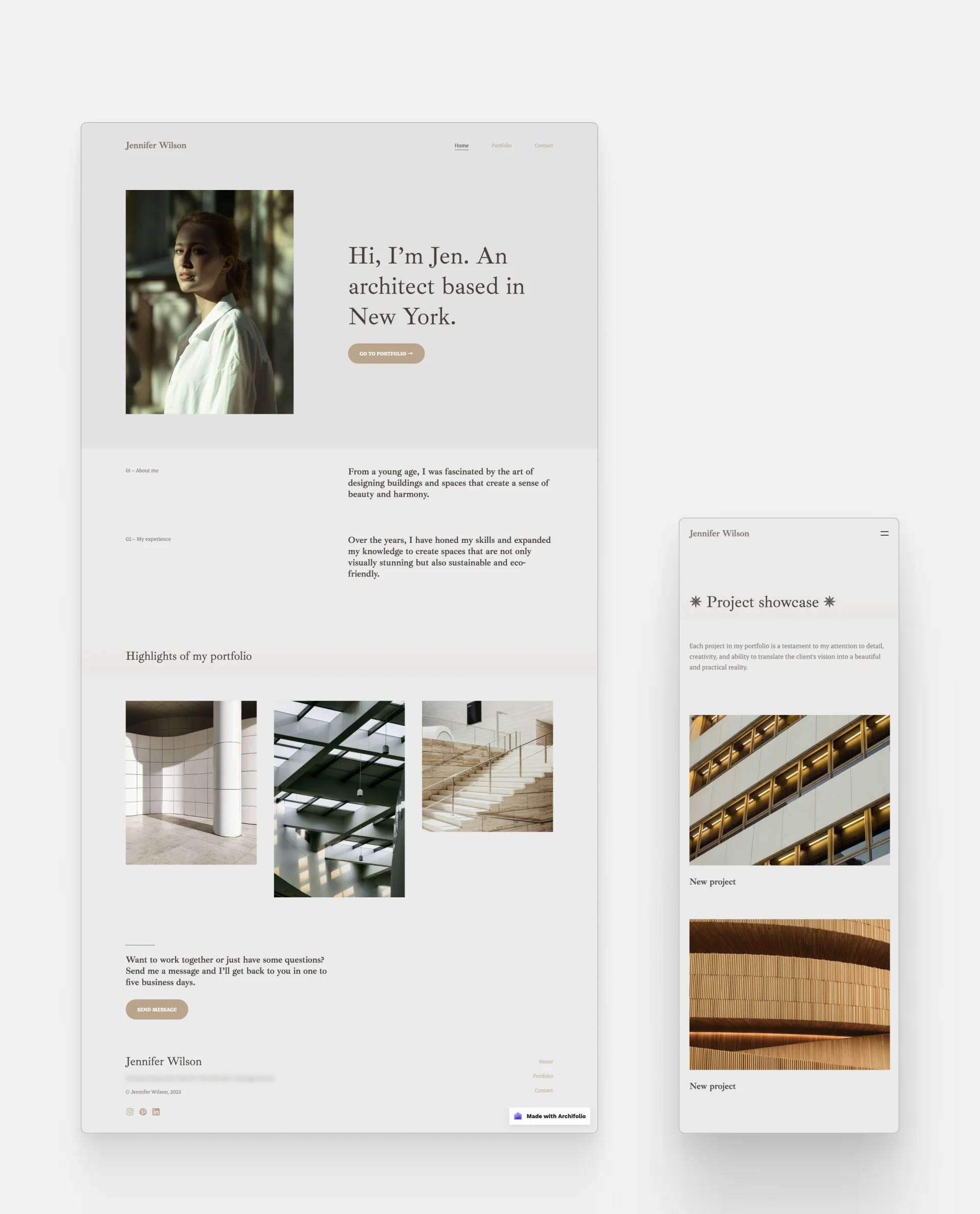
The base of Jennifer's portfolio is a blank canvas, but her projects make it live and breathe with their harmonizing project thumbnails and skillful organization.
Template: Classica by Archifolio
Get Started Creating your Architecture Website – Step-by-step Guide
We’ve outlined the most important phases of the website creation process below to help you get started.
1. Start with the why
Before getting into the nitty-gritty details, first you need to identify why you are creating your website:
- Looking to get hired and you need an architecture portfolio that stands out from the crowd?
- Do you want to land freelance work and find new clients?
- Would you like to build your personal brand?
Keep in mind your audience when you start thinking about the website design.
2. Choose a website builder that works for you
There are countless website builders out there. Thus, it’s easy to get lost in which one would work best for you.
We recommend building your site with Archifolio. Here’s why:
- what-you-see-is-what-you-get editor,
- PDF export,
- specific features for the architectural industry,
- intuitive user interface free of coding jargon,
- guidance on creating a stunning portfolio + writing prompts,
- custom domain option,
- fast loading and editing.
Give Archifolio a go and create your amazing website quickly and easily.
3. Create the essential pages
Depending on your why, you may want to have an About page, a Contact page, and/or a page for your extracurricular projects.
4. Create your project pages
And last, but definitely not least, come your project pages. These are the most crucial elements of your site.
Let’s see an example of a great project page:
Frederico Cuello's project page created with Archifolio
What Frederico did right:
- Clear portfolio layout,
- A collage of the finished renders to set the scene,
- Contextual information at the beginning,
- Including heaps of images (not just of the end result, but technical drawings as well),
- Placing their contact information at the bottom of the page.
What could be improved:
- Placing important information in every image caption to give context,
- Including 1-2 sentences about the process
- Did they finish the work under budget?
- What was the biggest challenge?
- Was the client happy with the end result?
What Makes a Good Architecture Website? – Our Top 3 Tips
1. Organization
People come to the website for a reason. Make sure that they find what they are looking for. It’s best not to start with an artistic cover page, but rather your projects or project categories laid out in front of your audience.
2. Fast Loading
It’s crucial to have a fast website. It’s simple: if a site loads slowly, people leave instantly.
There are a couple of things that you can do (e.g. compress your images), but loading time is mainly influenced by the code behind it. If you want to make sure that your architecture or interior design website is blazing fast, build it with Archifolio. You just bring your projects and we’ll take care of the coding.
3. Personality
Your website presents you as a professional and therefore, it should reflect your design style as well. So, for example, if you’re creating minimalist building designs, your portfolio should be clear and simple too.
6 Things to Avoid
1. Breaking all the website design rules
You may have seen architecture websites that are all about artistic components, constant animations, and disappearing elements. You may be wowed for a moment or two by the innovation, but if you spend more time on the site, you’ll get lost at some point.
People quickly get frustrated with an over-complicated website. They want to understand how to get where they want to go and the best way to help them is to follow the most common website architecture rules. It’s OK to break them a bit to be unique (e.g. finding a bold color or experimenting with the image size), but don’t go overboard.
2. Hiding the most important information
You know that it’s not a great website if you’re looking for the contact information and you can’t find it. Think about what your audience is interested in and make it easily accessible.
3. Vague or incomprehensible navigation
Use the lingo that your audience speaks. If they are interested in your extracurricular, then don’t just put it on a page that’s titled “other”.
4. Making it look busy
If you make your website look busy with way too much information, people won’t understand half of what you’re trying to say. Rather, aim to keep it short and to the point.
5. Poor quality images
Pixelated images can make the whole website look sloppy. Pay attention to the quality of the image when compressing it.
Building your website with Archifolio will not only mean that you have unlimited storage for your projects. We automatically convert your images into a website-friendly file type, which guarantees that your images will look sharp, without slowing your site.
6. Unreadable fonts
We get that some architects try to be artsy with their choice of fonts, however, in many cases, they end up with a fancy-looking font that misses one important aspect: readability. Find a legible font, and make sure to choose the right font size.
So, there you have it. We hope that you got enough inspiration from the examples to start working on your architecture website. If you’re itching to start right away, give Archifolio a go. Sign up, choose a portfolio template to start, and create something unique!
