24 Architecture Portfolio Examples and Your Ultimate Step-By-Step Guide
Designing a building is much different from creating your architecture portfolio. And while you have the first one down, the second one might leave you scratching your head. If it is the case, or you’d just like to browse through some examples and get some inspiration, this article is for you.
Let’s dive right in, shall we?
24 of The Best Portfolio Examples
So, what does a good example look like? We’ve listed our favorites to give you inspiration.
1. Nadia Somrey
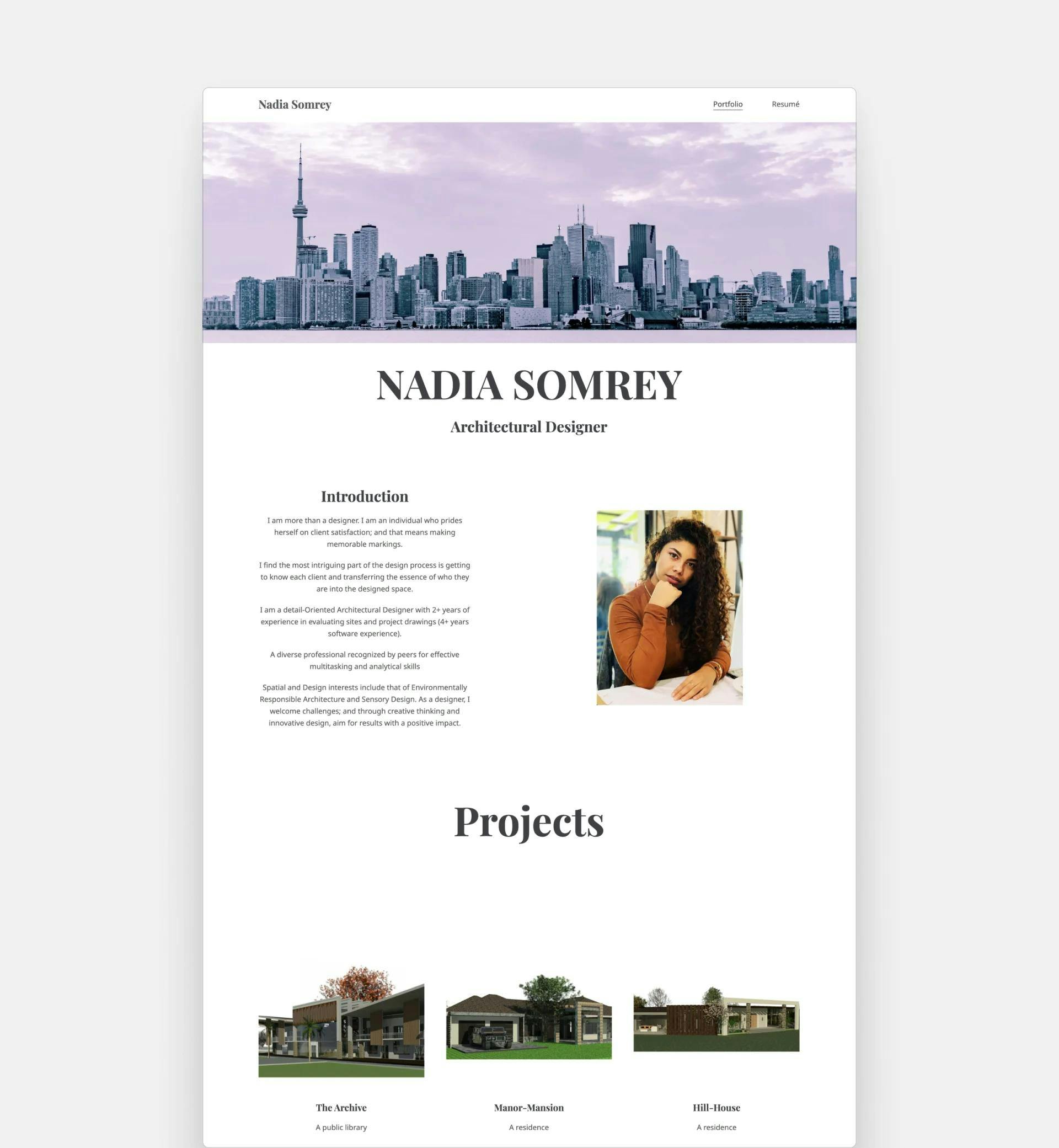
Nadia Somrey's portfolio - This website was created with Archifolio
The composition in Nadia's portfolio is impressive. It's clear she put a lot of thought into how everything is presented. Her introduction gives just the right amount of context for her work without being too wordy.
Also, her projects tell a compelling story about Nadia's design skills. We can tell that she's passionate about her work and has put a lot of effort into crafting a portfolio that showcases her talent.
2. Güliz Çetin Mbagaya
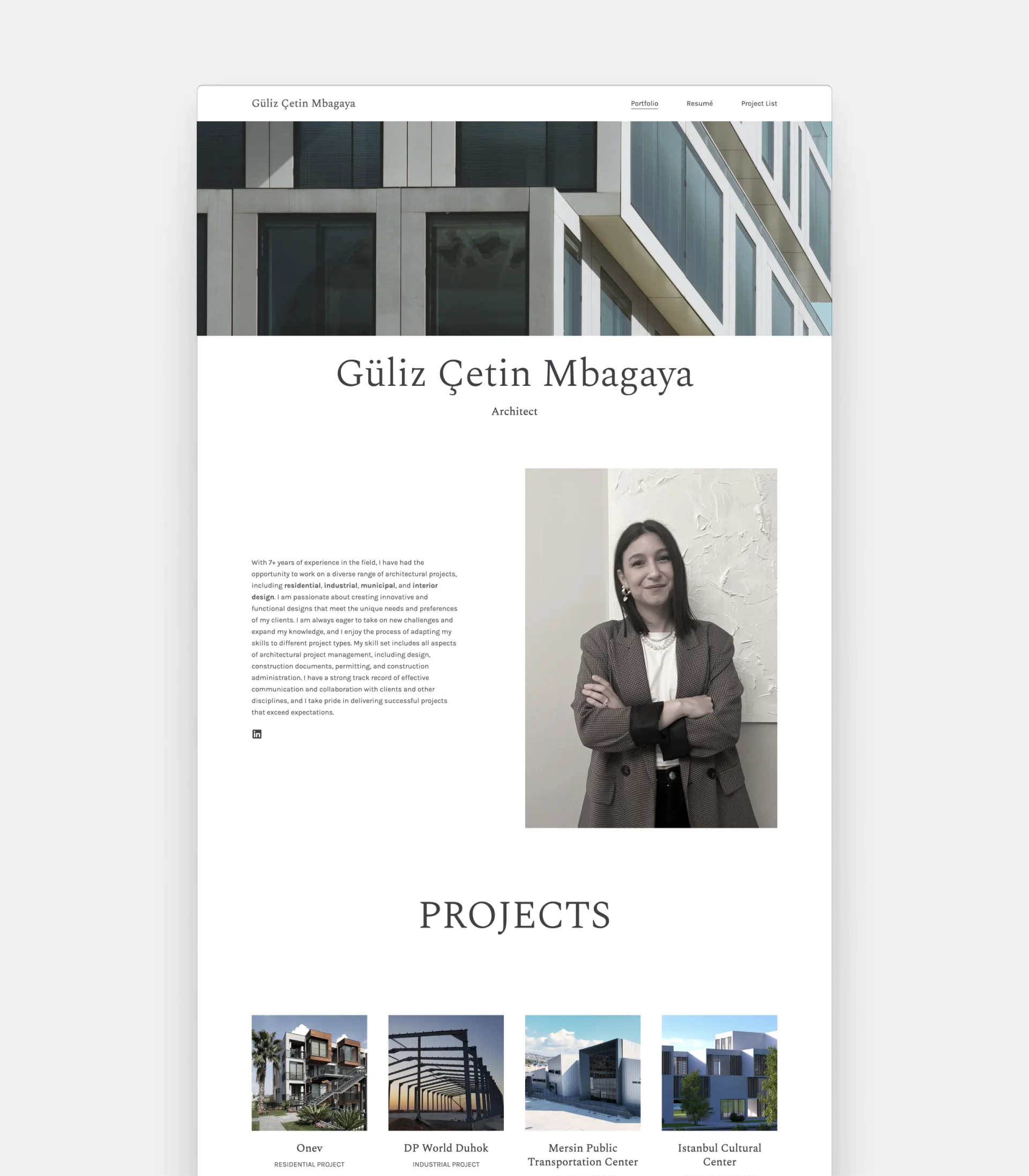
Güliz Çetin Mbagaya's portfolio - This website was created with Archifolio
Güliz managed to create a truly eye-catching portfolio website. The render as the hero image immediately draws you in and showcases her rendering skills.
But it's not just the visuals, the structure of her project pages is also top-notch. It's easy to navigate and find the information you need about each project. And the range of her industry experience is incredible, with expertise in a wide range of architectural fields.
It's clear that Güliz Çetin Mbagaya is a highly experienced architect, and her portfolio demonstrates her talent and dedication to her craft.
3. Elena Salun
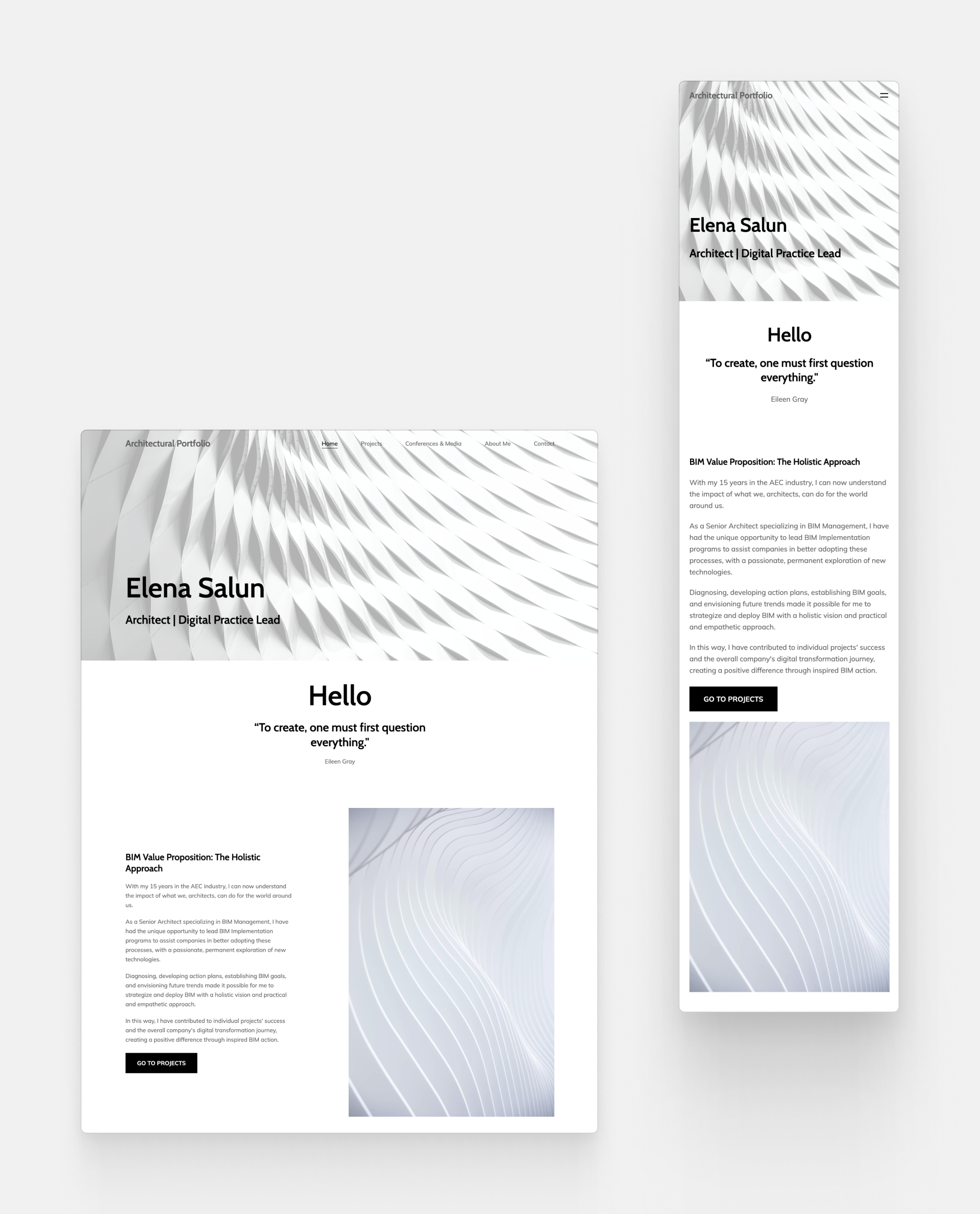
Elena Salun's portfolio - This website was created with Archifolio
Elena has created a portfolio with such a seamless flow, that viewing her portfolio is an absolute treat.
She used these black and white renders of architectural details to create movement on her pages and to give them a cohesive look. She starts with a powerful quote, and on her project pages, she walks her audience through a visual story.
4. Landscape Architecture Portfolio by Aisy Jrdan-Smyth
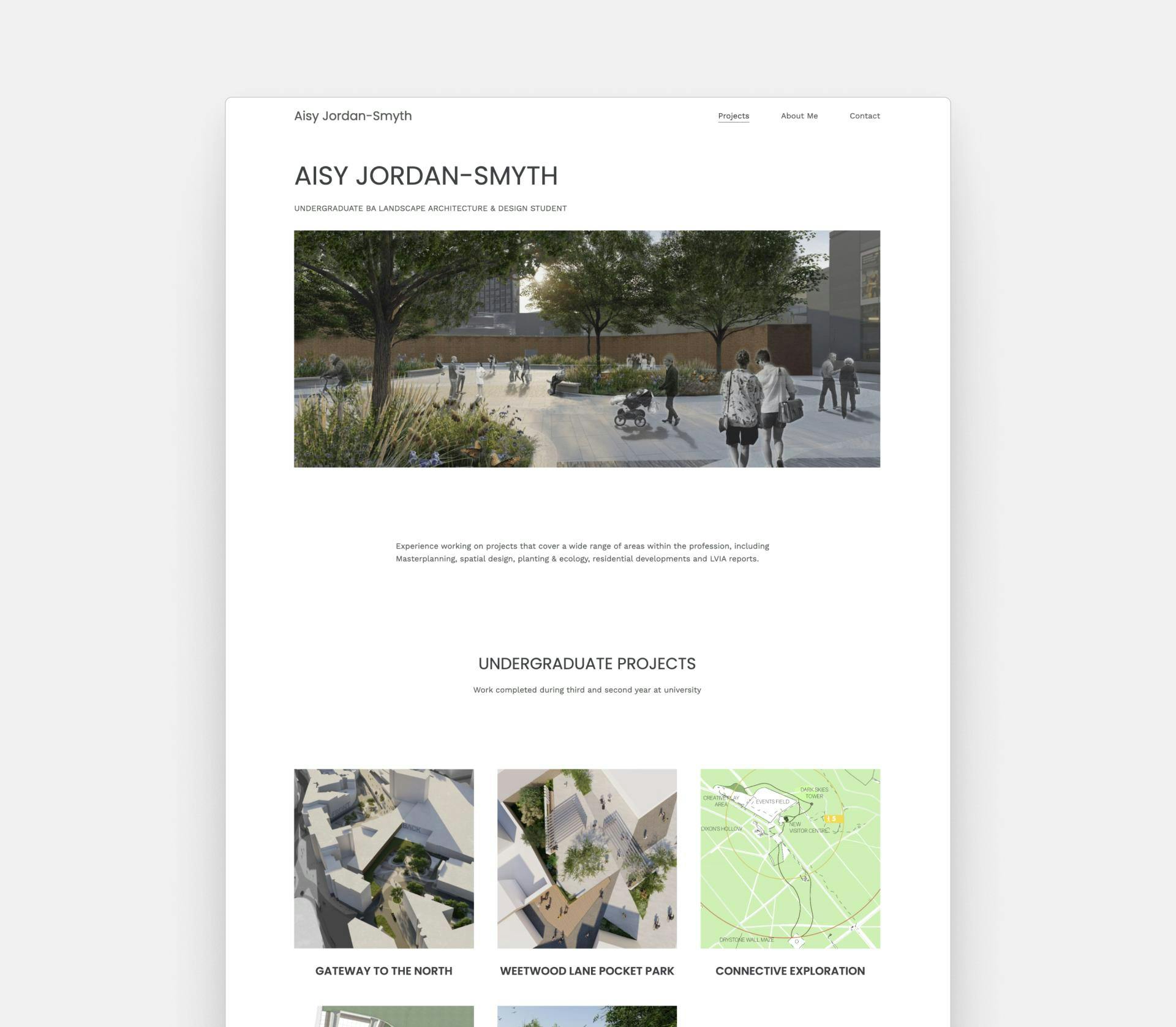
Aisy Jordan-Smyth's portfolio - This website was created with Archifolio
Aisy’s home page has the perfect structure. She started with her name, and her title and then added a stunning hero image from one of her projects. Then, she continued with a quick note about her relevant experience and went right into her projects. She created nice-looking cover images (a.k.a. thumbnails) for her separate project pages.
5. Architecture Website by Norm Architects
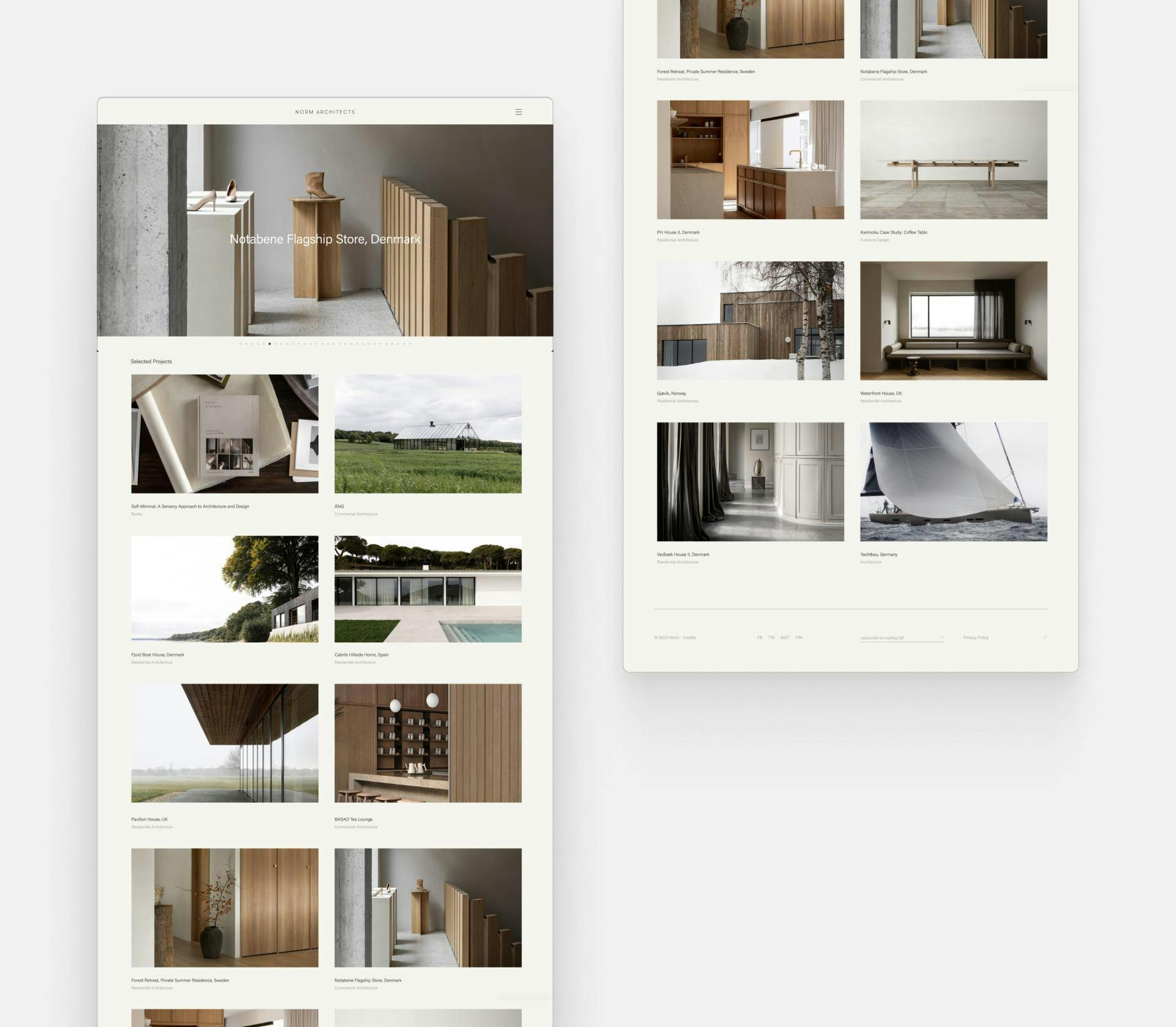
Portfolio Website of Norm Architects
The architectural website of Norm Architects invites us on a visual journey. Right away you'll see some breathtaking imagery and their featured projects underneath. Once you visit a project page, you'll see their finished projects showcased in a dynamic way.
6. Junior Architecture Portfolio by Samuel Kurti
Samuel Kurti's portfolio - This website was created with Archifolio
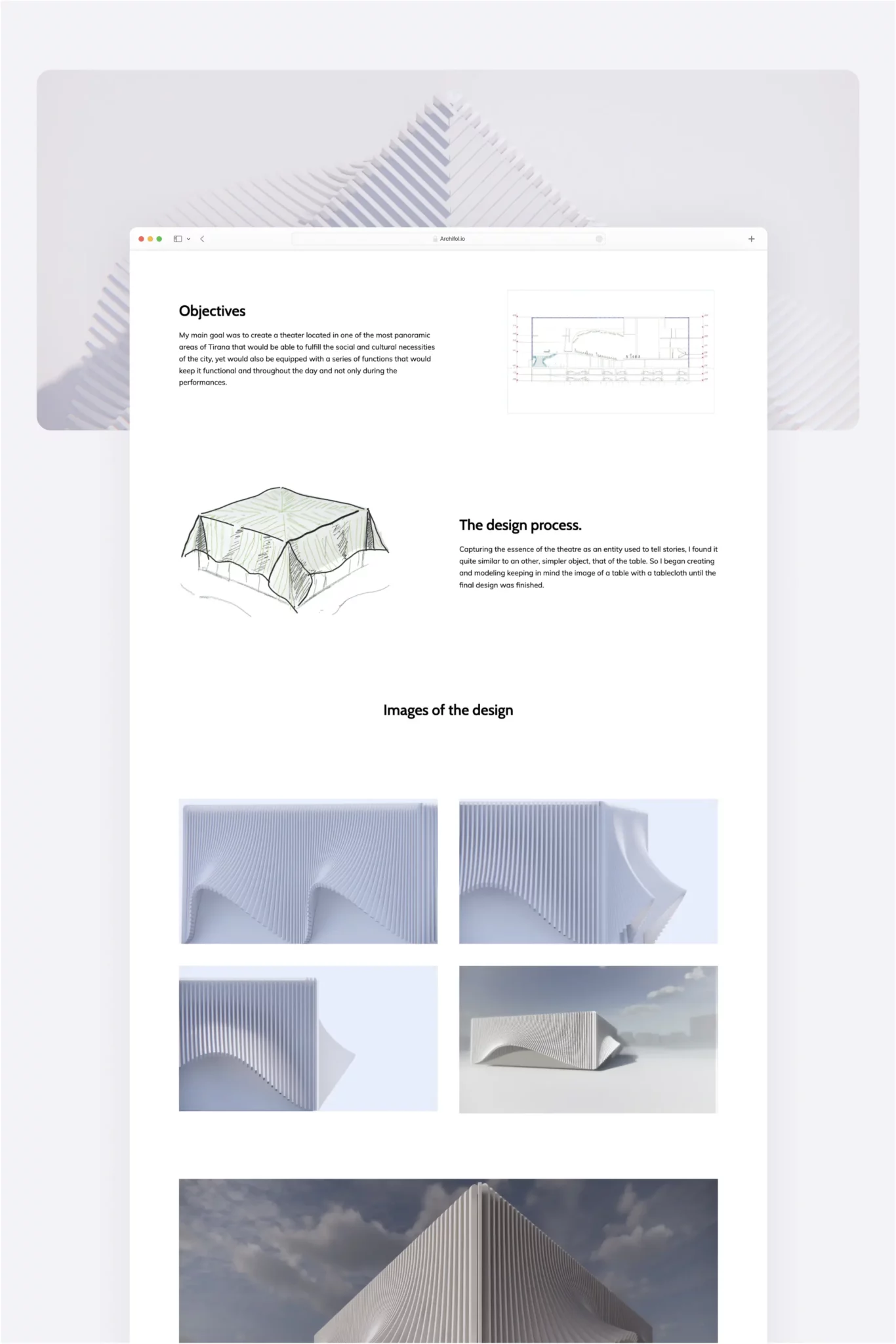
We love how Samuel displayed his theatre project! The breathtaking renders and his visible design process are an amazing inspiration. He shared some important information about his project and then went right into the visuals. This is the perfect balance.
7. Website by Studio Libeskind
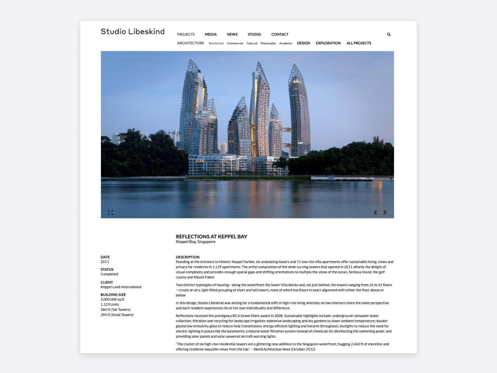
A project page of Studio Libeskind
The project pages of Studio Libeskind are so well-structured. On the left, you’ll see the most important information about the projects and on the right, there’s a longer description. They also have a great way of organizing all their projects in the top menu.
8. Website of Mark English Architects
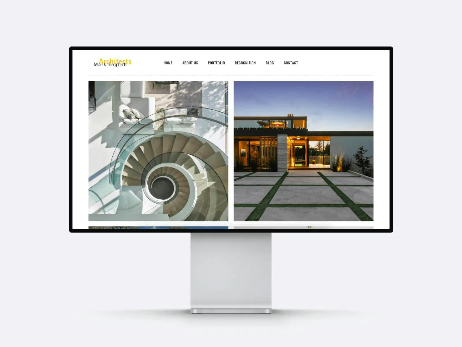
Home page of Mark English Architects
The portfolio layout of Mark English Architects is clean and simple, yet their projects add a dynamic feel to it. They have a clear navigation, and beautiful representation of their projects, which we love!
9. David Whitney‘s Portfolio
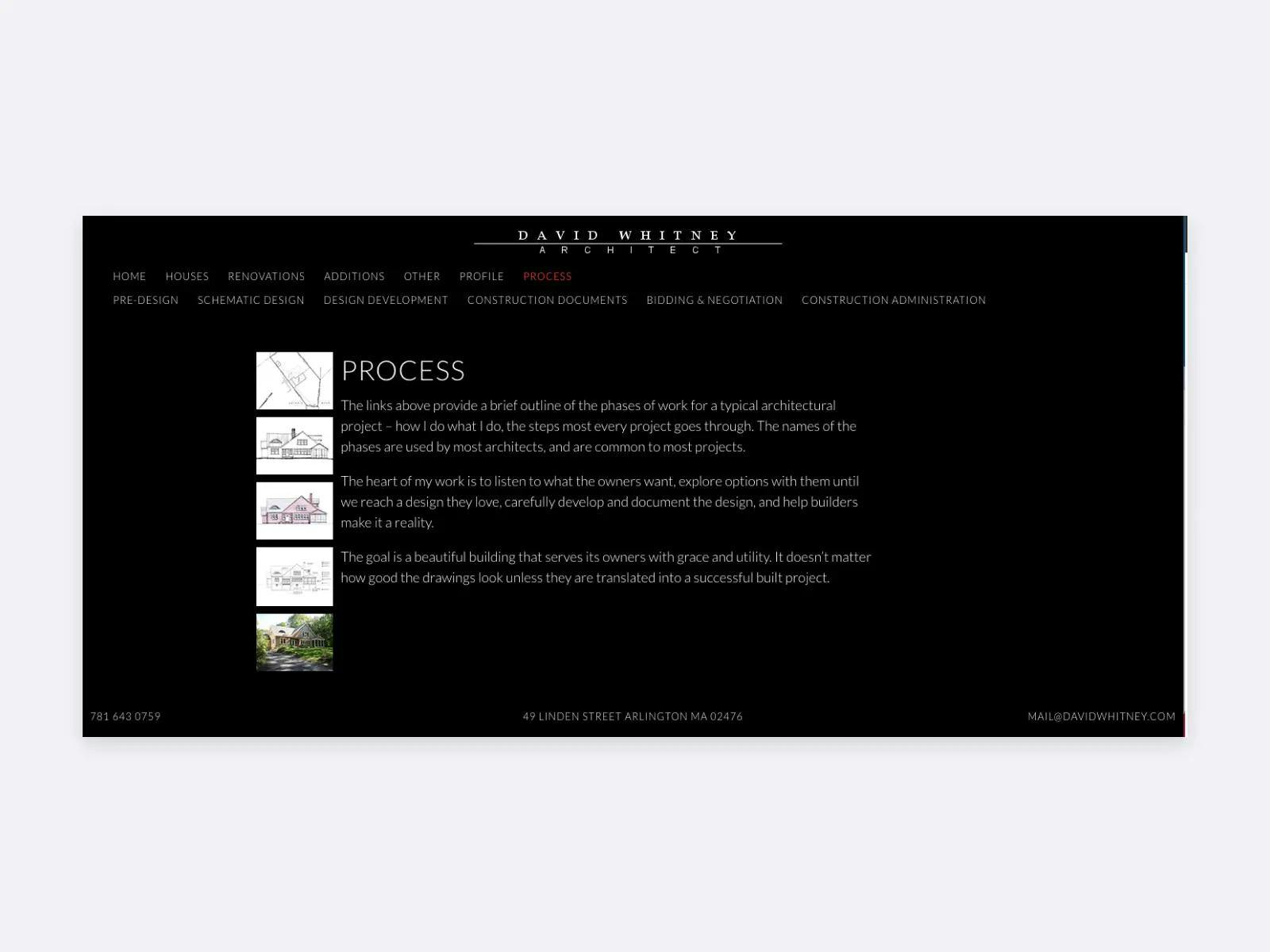
David Whitney talks about his process on his website
We’re amazed by how David Whitney’s website walks us through his design process from start to finish. His portfolio has a dark theme with a red accent color, which makes important information stand out.
10. Website of Bernard Tschumi Architects
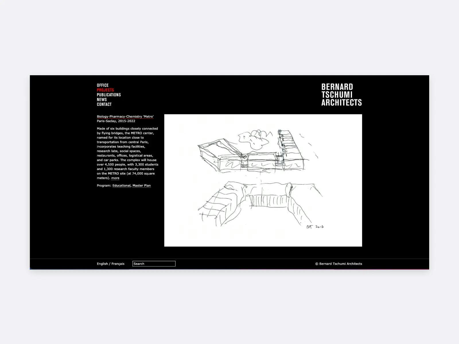
The project page of Bernard Tschumi Architects
Talking about dark background and red accent color, Bernard Tschumi Architects’ stunning website displays early sketches of their projects as well as the final results. This allows us to see how they turn a concept into reality, which is a powerful thing to show in a portfolio.
11. Daniel Hopwood‘s Architecture Portfolio
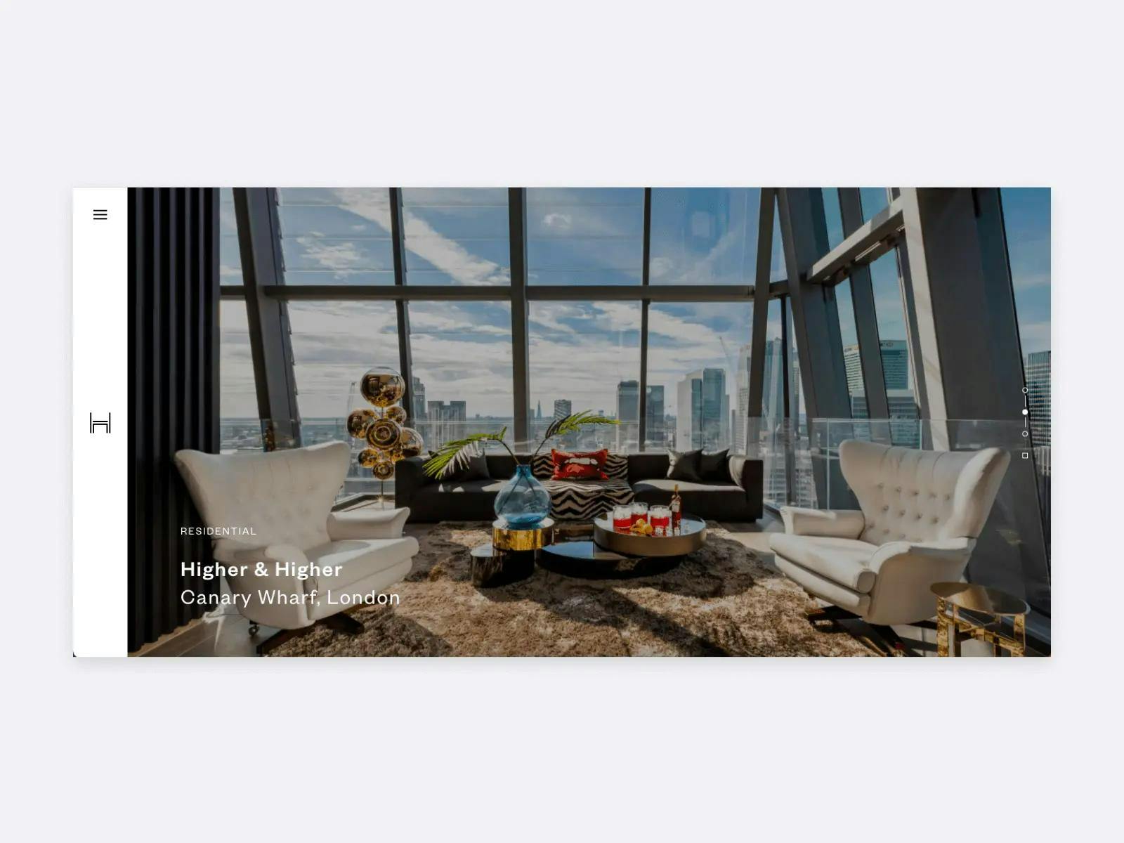
Home page of Daniel Hopwood
One of the reasons why Daniel Hopwood’s website made it to our collection of architecture portfolio examples is its emphasis on visuals. We love that their homepage is one big slider, which is a powerful way to make a good first impression.
12. Website of Saunders Architecture
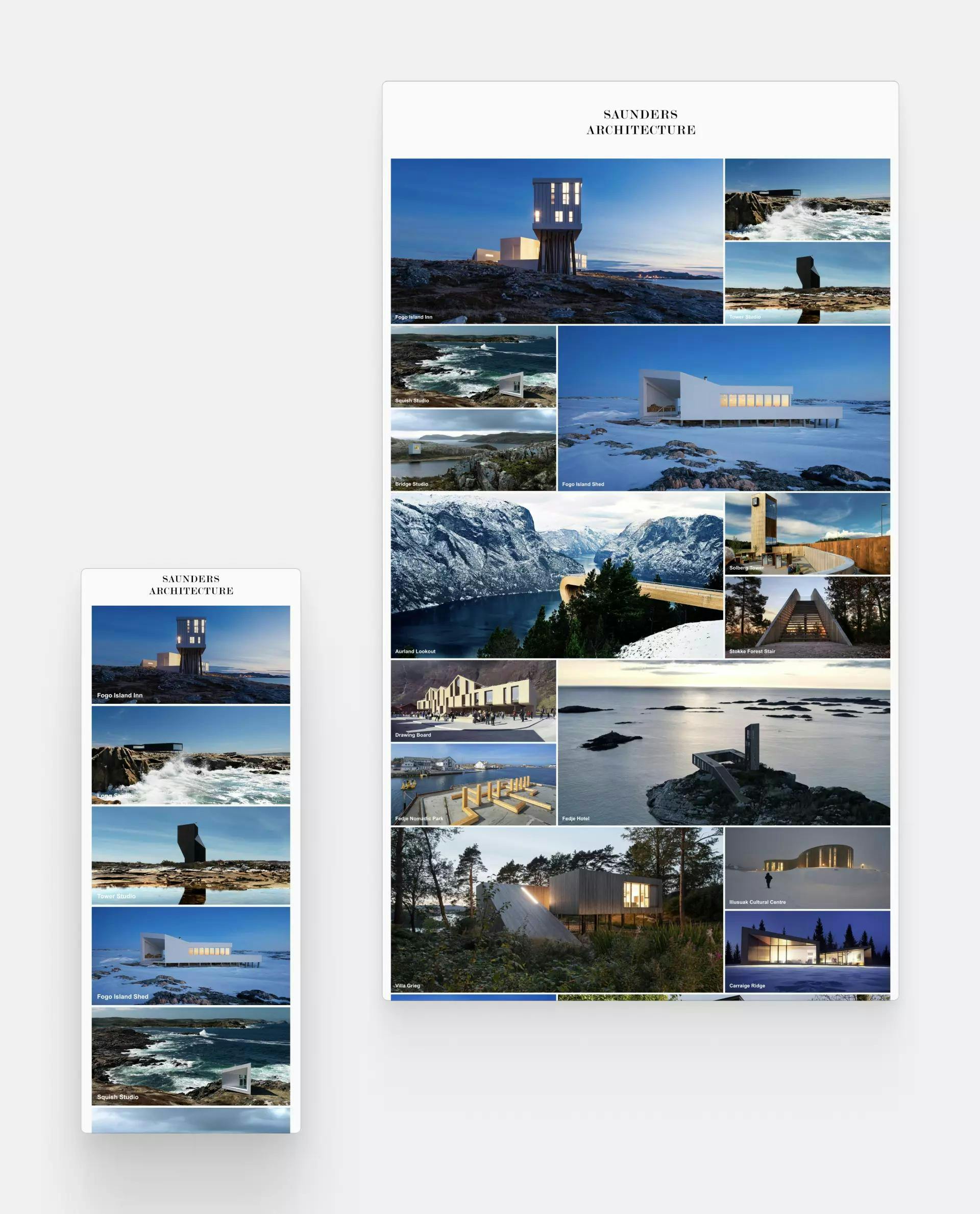
Portfolio website created by Saunders Architecture
This uncomplicated yet elegant design of the website by Saunders Architecture is perfectly aligned with their architectural style. With huge and breathtaking imagery, their website achieves all of their goals.
13. Portfolio by Troy Cheung
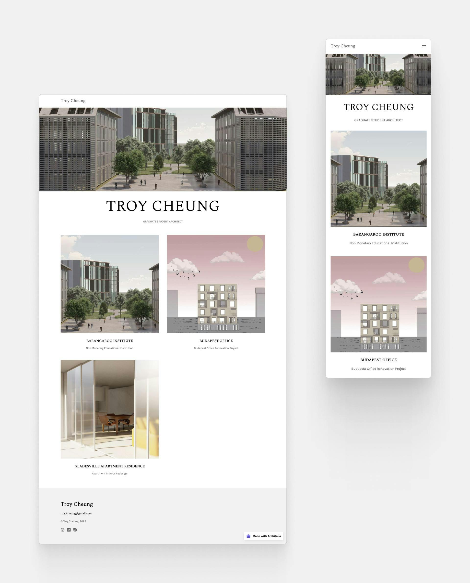
Troy Cheung's portfolio website
Troy Cheung's portfolio shows what a good layout and nice images can do to a website. Troy managed to showcase his skills in a digestible and understandable format. He built his portfolio with Archifolio's Agora template.
14. Bastian Marzoli‘s Design Portfolio
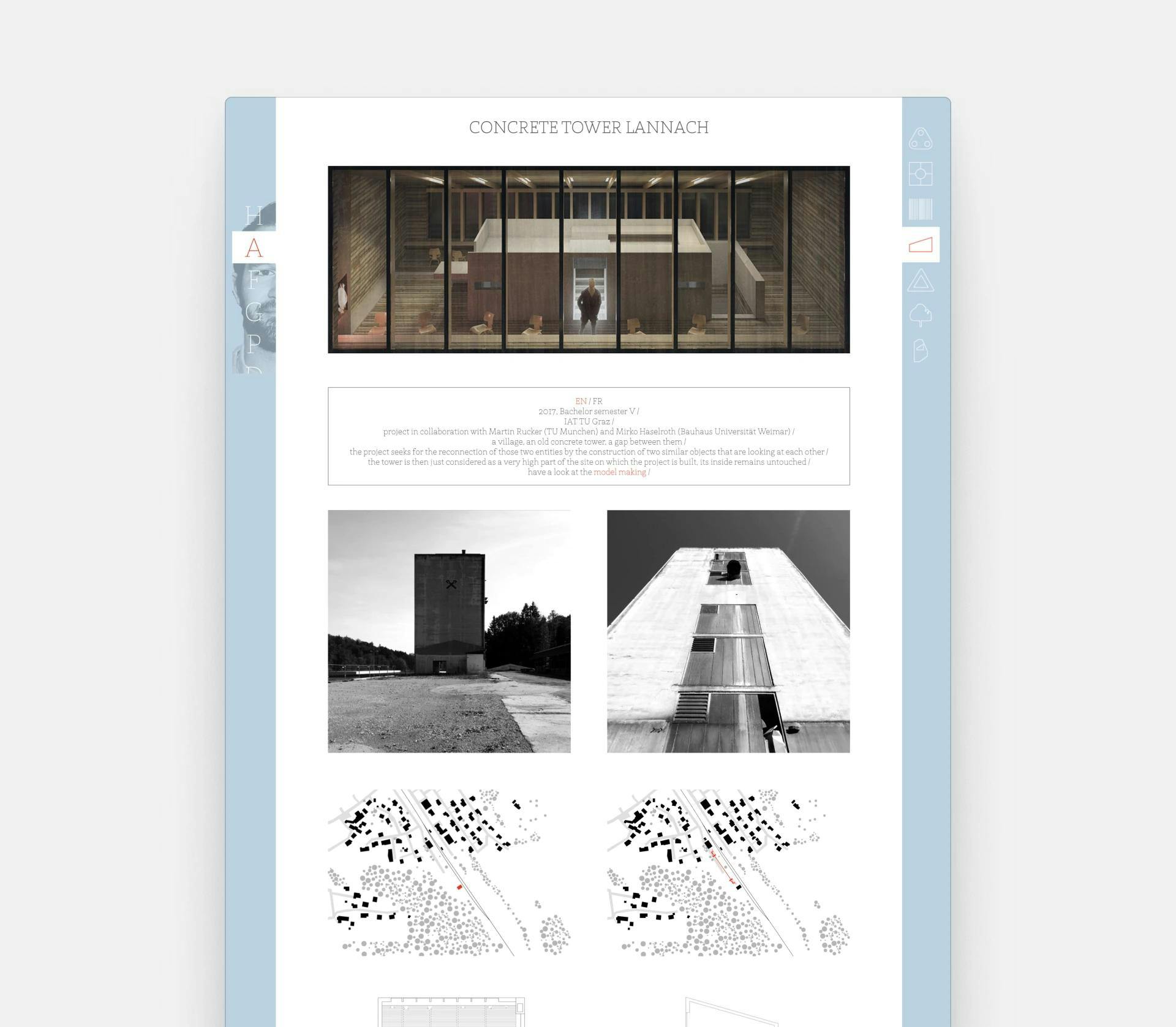
Everyone’s first impression of Bastian Marzoli is that he’s a versatile designer. On his homepage, he highlights not only his architectural works but also his photography, drawing, graphic, and furniture design skills.
15. Architecture Website by O2 Architecture
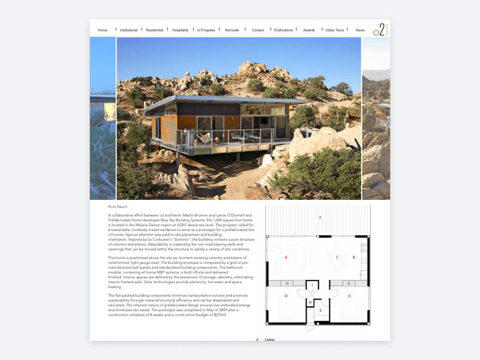
One of the project pages of O2 Architecture
We love the emphasis O2 Architecture puts on the visuals of their projects. Their layout is easily understandable and their navigation is super convenient.
16. Website of Valerio Dewalt Train Associates, Inc.
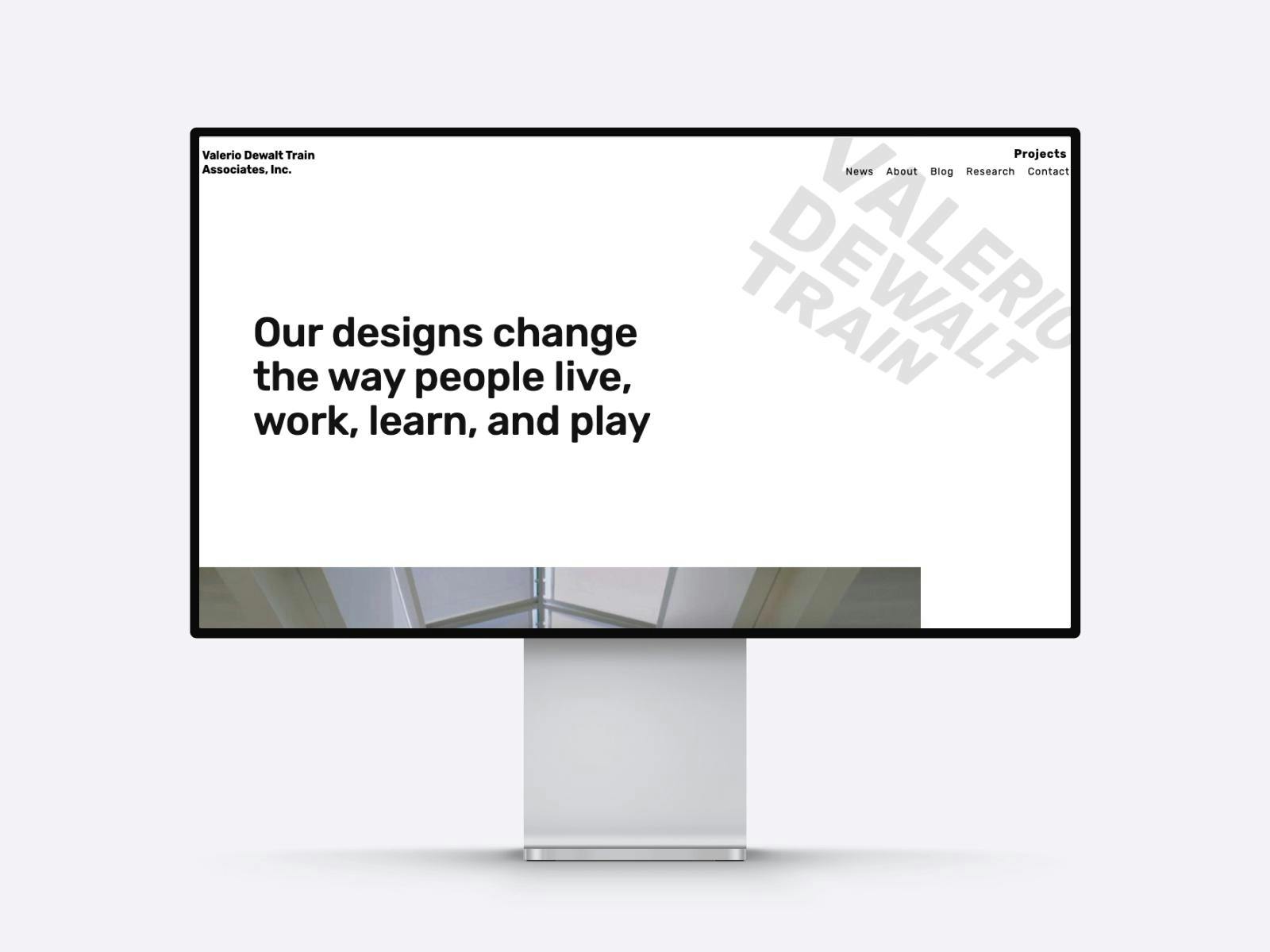
The portfolio website of Valerio Dewalt Train Associates
The portfolio website of Valerio Dewalt Train Associates starts with a mission statement, which serves two aims: on the one hand, it tells the visitors that they are on the right page (if they are looking for architects). On the other, it’s a powerful way to show how dedicated they are to their work.
17. Simon Aldridge‘s Portfolio
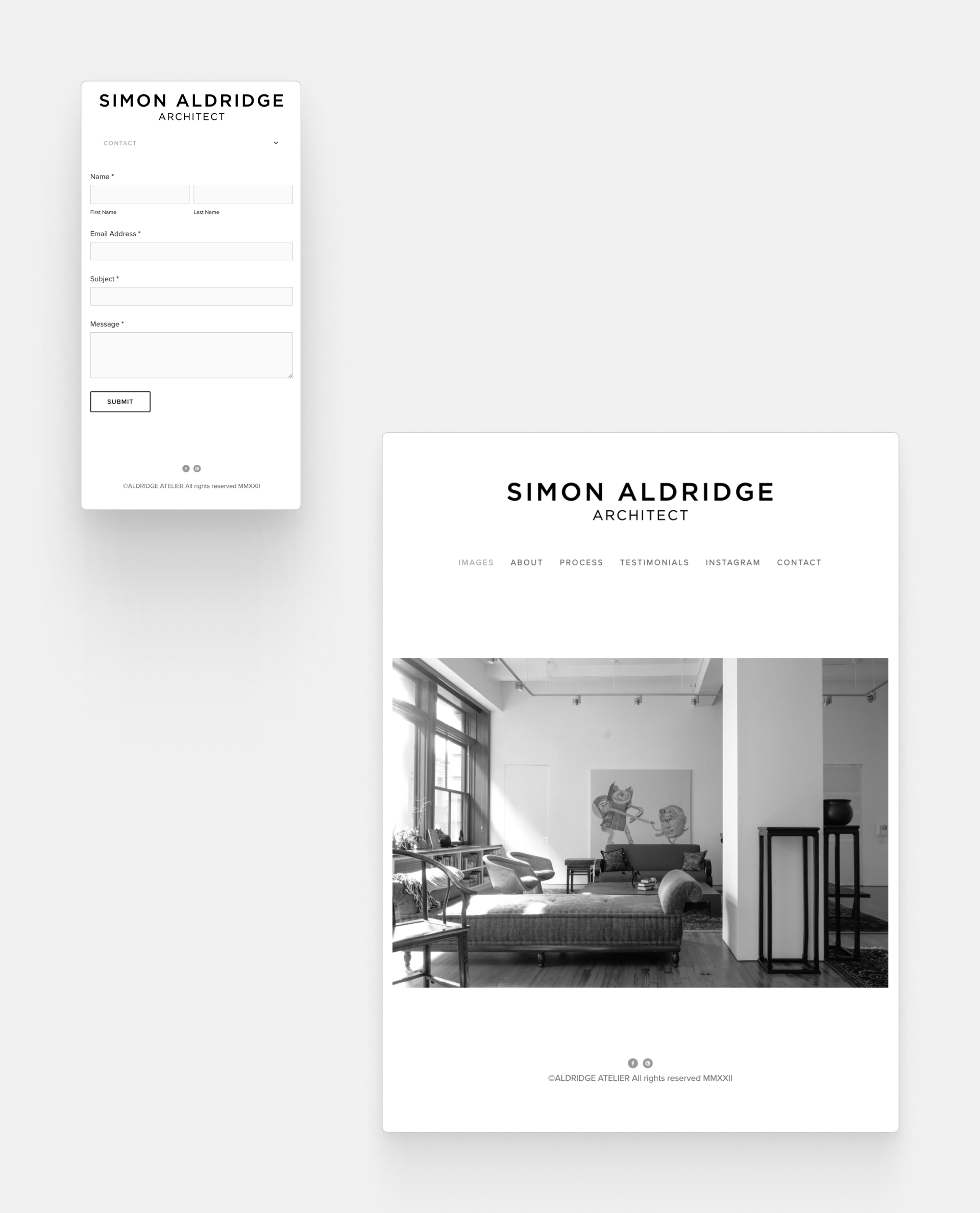
The home and the contact page from Simon Aldridge‘s Portfolio
We adore how straightforward this portfolio is! It has absolutely everything you’d need with a separate page for client testimonials. This helps to build trust with their potential clients.
18. Donna Riley‘s Portfolio Website
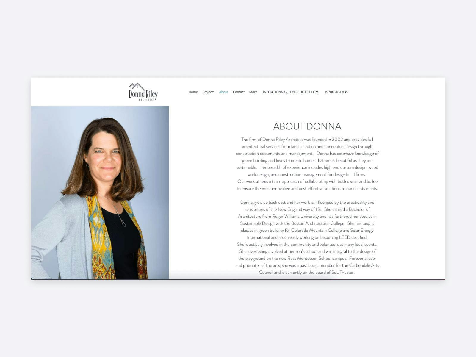
Donna Riley's website
We’re fond of the way Donna Riley introduced herself and her company in her portfolio. Her professional picture with a description brings the visitors closer to the firm, which helps in their decision-making process. Another bonus point for making it easy to get in touch by showcasing their email address and phone number right at the top of the site.
19. Website of Mark Brand Architecture
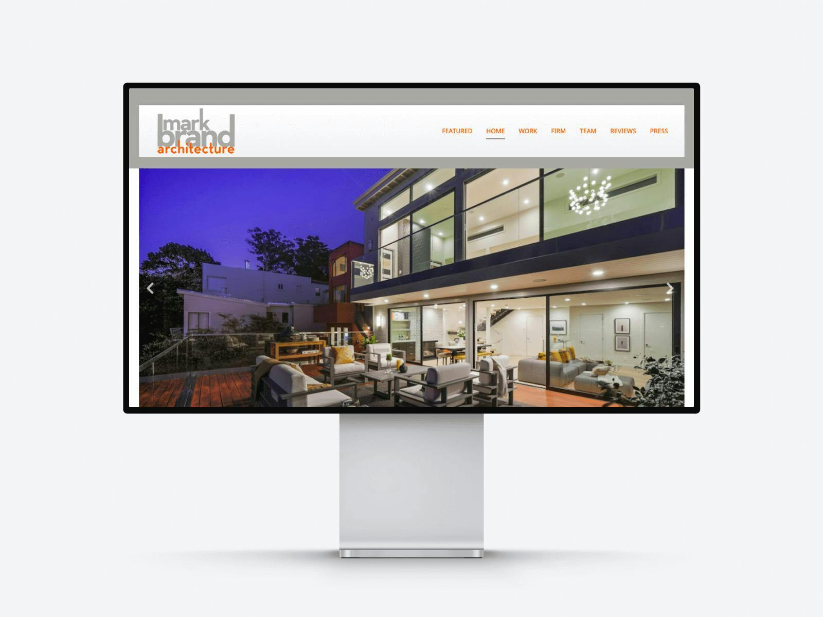
Portfolio website by Mark Brand Architecture
The homepage of Mark Brand Architecture starts with their logo and navigation and right under these, they have a vast slider with their projects. This gives context to the visitor and encourages them to look even further. We also like their color choice, and how the orange in the logo appears again and again on their site.
20. Ruxin Xie‘s Architecture Portfolio
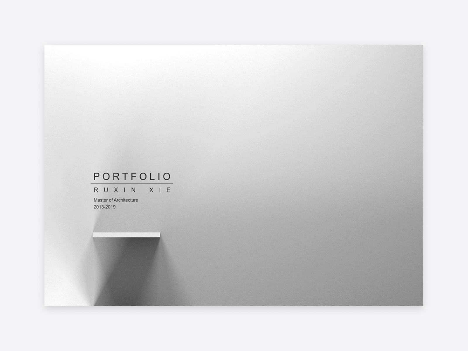
Ruxin Xie's portfolio cover
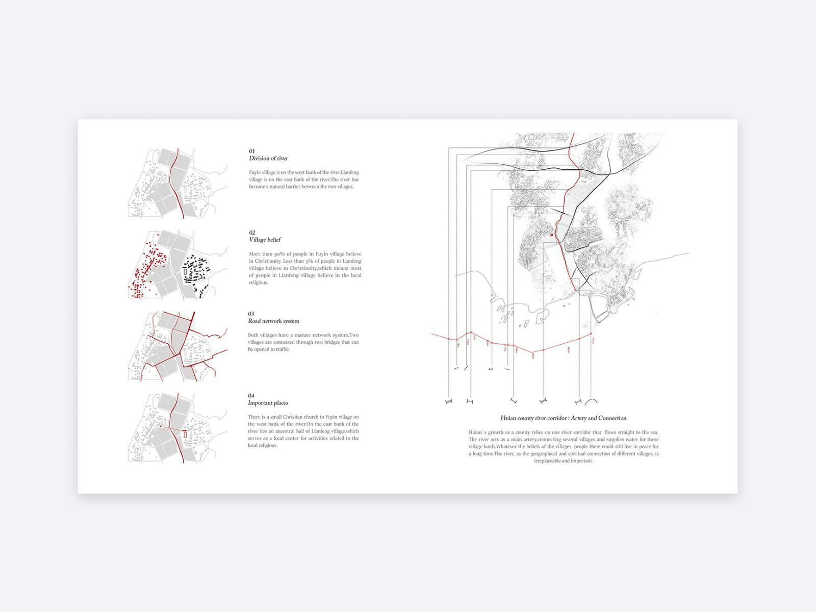
Ruxin Xie's project page
Ruxin Xie’s PDF portfolio is a bit different from the examples above. It starts with an artistic cover page and then has a very different layout than portfolio websites. Ruxin starts with a project title page and then goes into the project images.
21. Gregory Barber‘s Portfolio
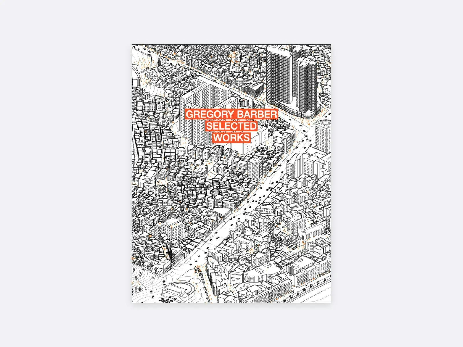
Gregory Barber portfolio cover
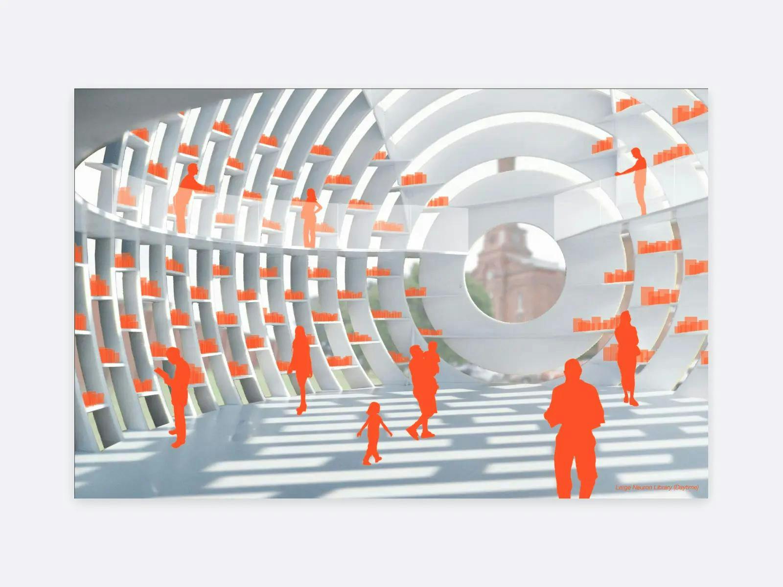
Gregory Barber's architectural project
This PDF portfolio has such a cohesive look to it! It shows that Gregory Barber paid attention to even the smallest details, which is something you want to show in your portfolio. His visual representation of his projects is fascinating!
22. Li Dai‘s Portfolio
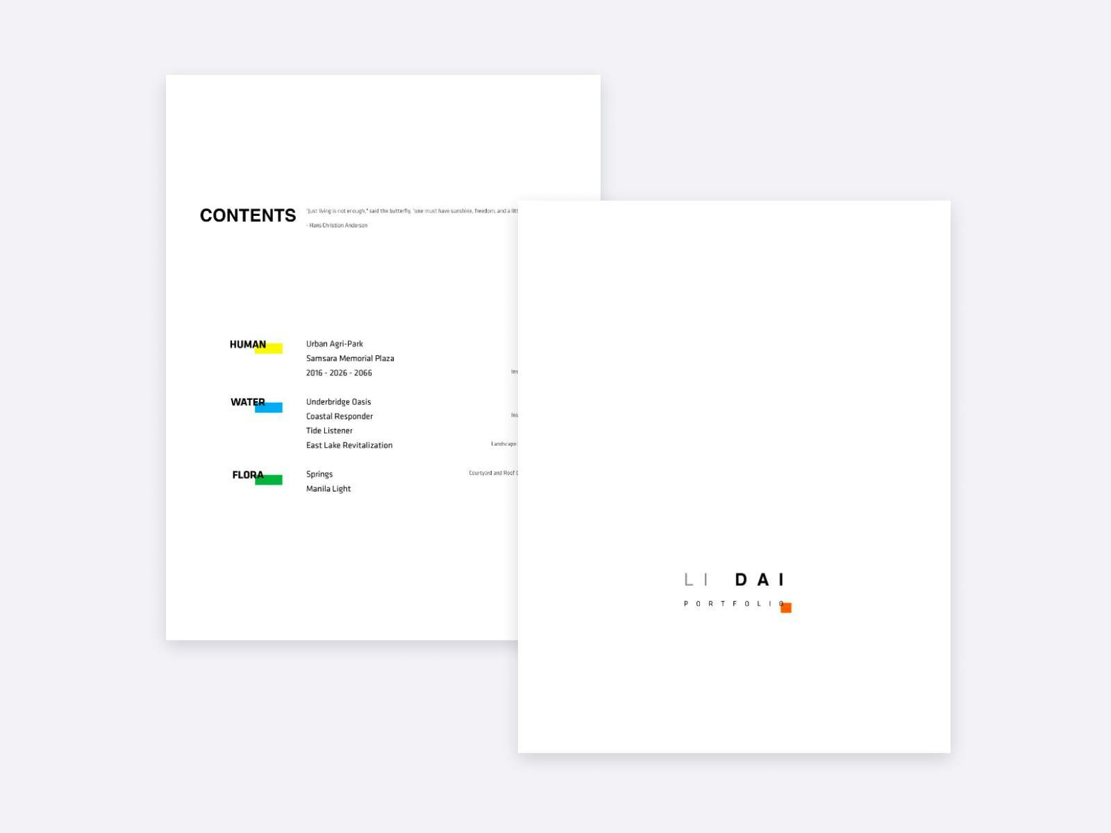
Li Dai's portfolio cover
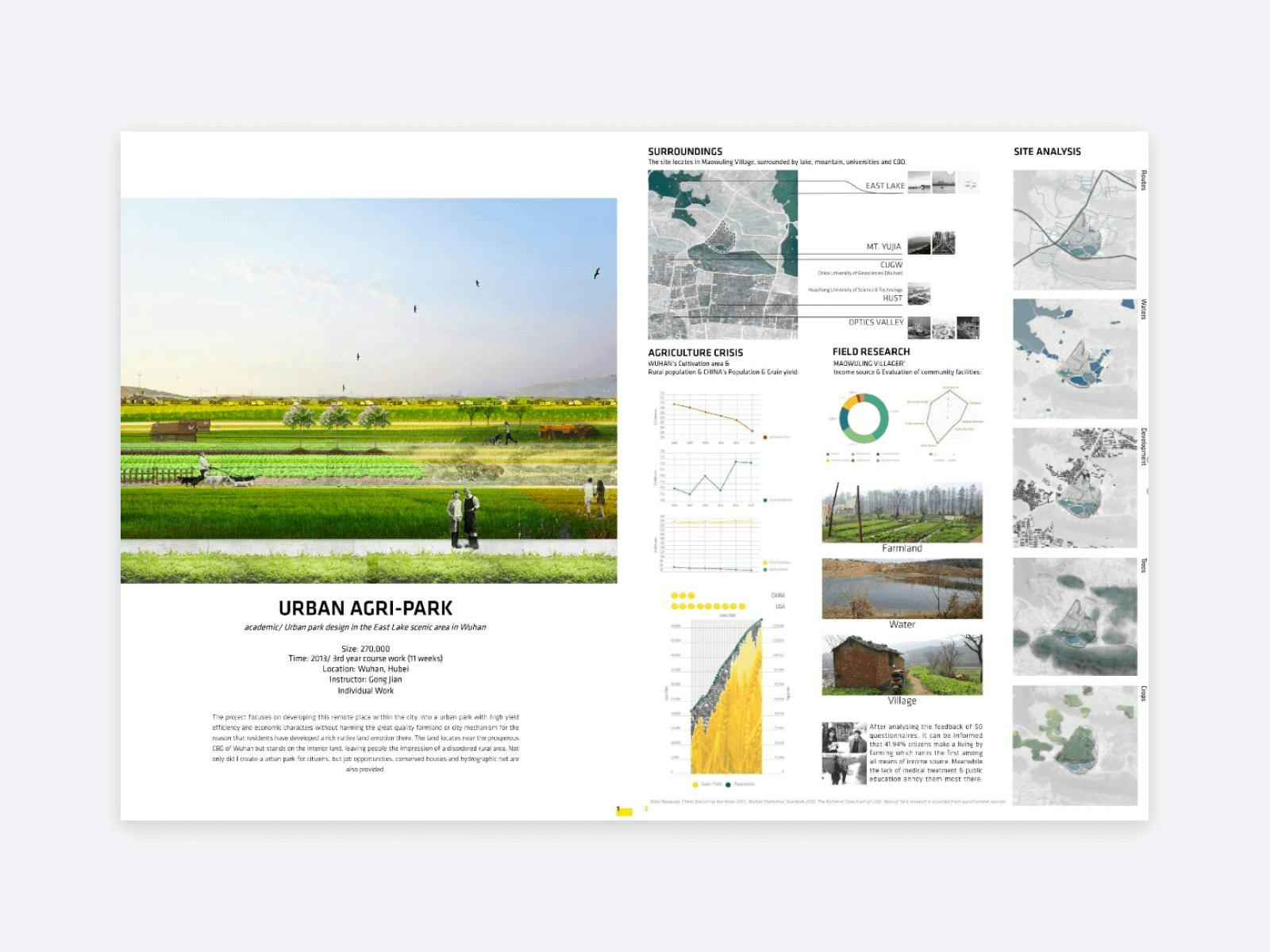
Li Dai's architectural project
The bright colors and simple layout contribute to a put-together feel in Li Dai’s portfolio. We love the table of contents at the beginning of the portfolio, as it helps the navigation in the PDF. We also love that the data presented in the portfolio is as visual as it gets.
23. Interior Design Portfolio by Rebecca Gaffiero
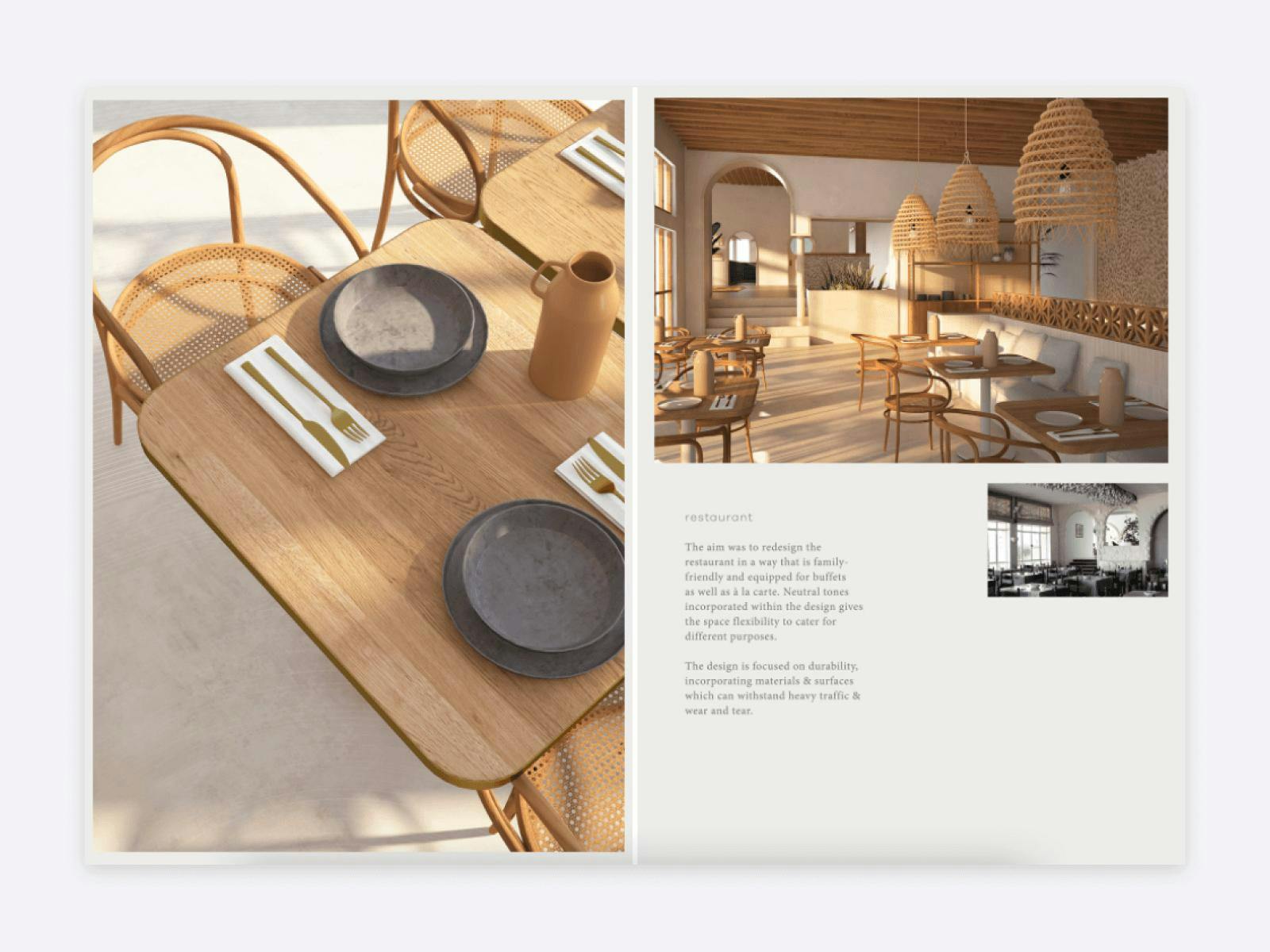
Rebecca Gaffiero's interior design portfolio
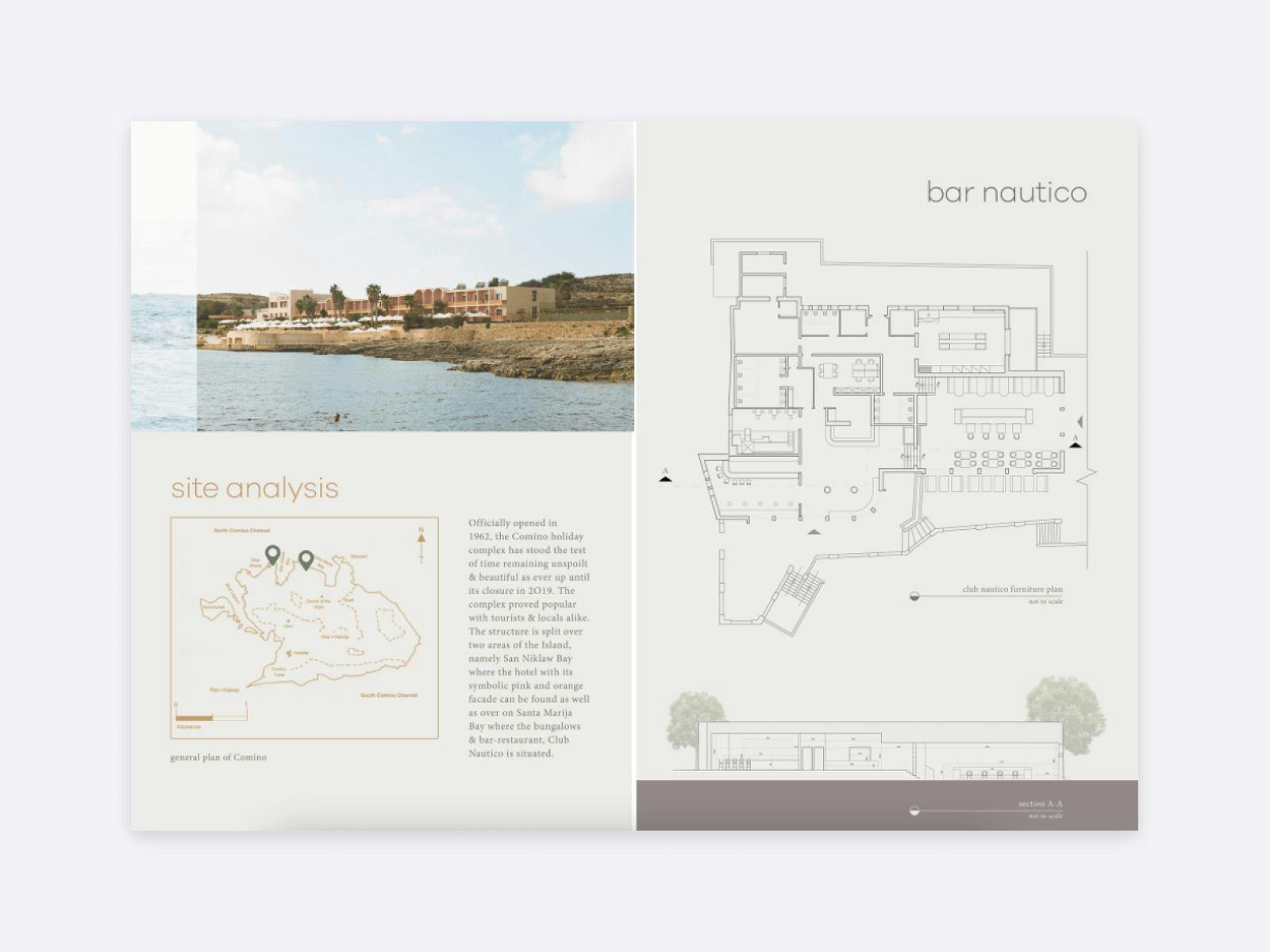
Rebecca Gaffiero's interior design portfolio project
Rebecca Gaffiero’s portfolio is such an outstanding one. She managed to create harmony in her PDF portfolio with the well-thought-out color palette and the chosen font pair. She even has a cohesive way to present floor plans and line drawings.
24. Architecture Portfolio by Lazar Belić
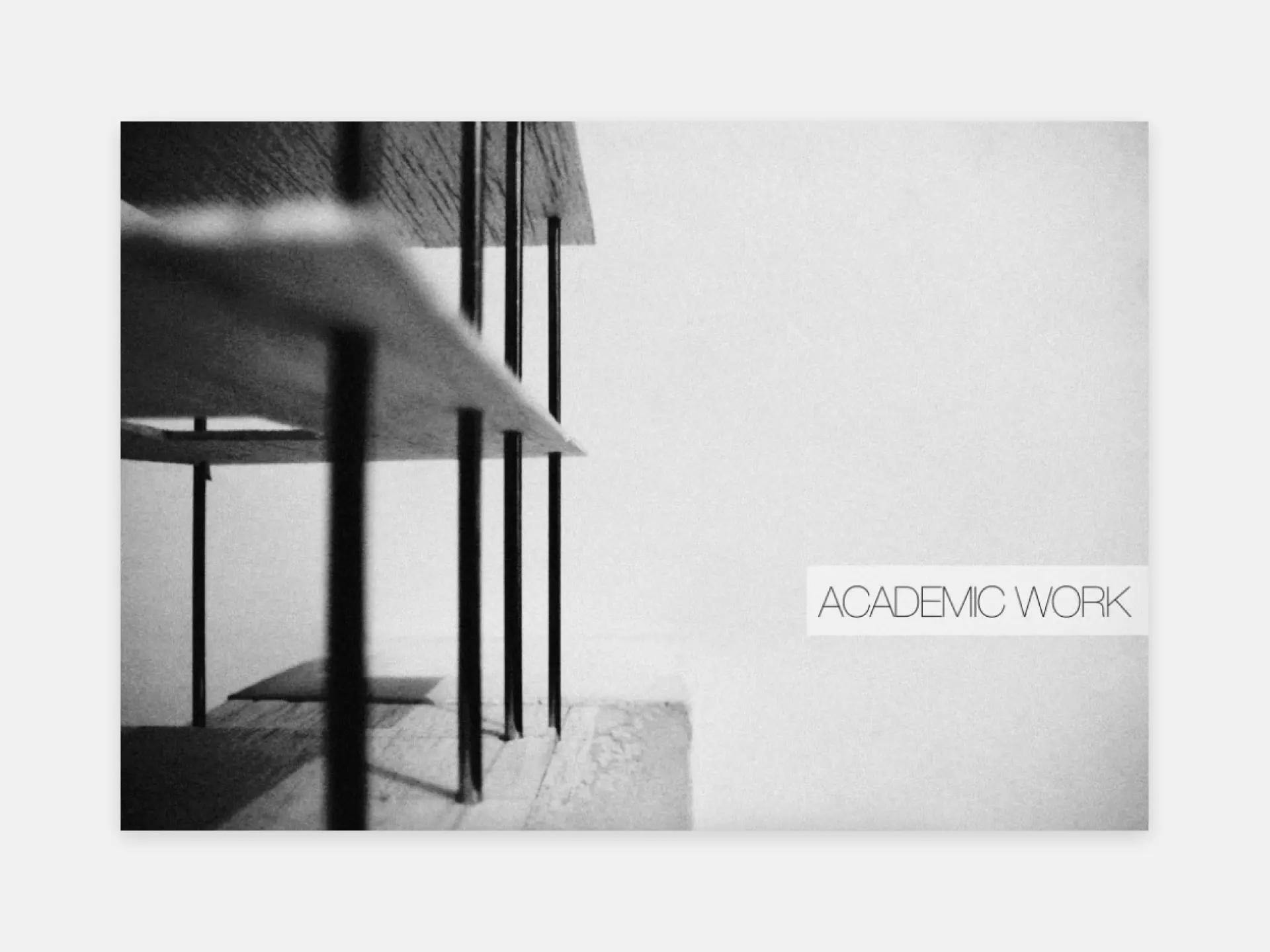
Portfolio title page by Lazar Belić
Lazar Belić is a Milan-based architect with so many stunning projects! He uses a black color scheme with a splash of blue or green here and there. Great choice!
A Step-By-Step Guide to Creating Your Portfolio
By now we’ve covered what an architecture portfolio looks like, but now let’s look at how to put together one from start to finish.
1. Answer these 4 questions
#1 What do you need your portfolio for?
Would you like to study architecture? Then analyze the websites of the colleges you are applying to. In most cases, they have some information about what the requirements are. Look at them carefully and follow the instructions.
Are you applying for a job in architecture? In this case, research the firms you are applying to. For example, look at their projects and see what market they are serving. Is it a firm working in industrial, commercial, residential, or landscape architecture? Do they list interior architecture as a service? Are they focused on sustainable design?
Unless the job description states clearly what area you will be working on, you need to showcase all relevant projects of yours that align with the company’s profile.
Would you like to impress potential clients? Then decide what types of customers you will want to work with. You can even create a description of your ideal client and get to know as much as you can about their preferences. This way, you’ll know from the get-go how you can impress them.
#2 Which format is the best for you?
This is twofold: You should consider which one you prefer and if there are any restrictions or requirements from the architecture firm or university.
#3 What to include in an architecture portfolio?
The short answer: your most outstanding architecture projects and a few other designs.
Here’s a great way to go about it:
- Gather all your projects into one folder on your computer. And we mean everything. Don’t just think of architecture projects, but furniture design, photography, graphic design, and anything that you have created.
- Organize your projects in a separate folder based on the type or date of the project or any way it makes sense to you.
- It’s time for the selection. Set yourself a high standard and then in a third folder include only your best work. If you have countless projects, be ruthless about the selection and only include the best of the best.
#4 How to organize projects?
When building your portfolio, it is advisable to start with your strongest piece and end with your second best. This way, you have a great first impression and you end on a high.
2. Structure your portfolio to highlight your best work
Print or offline portfolios
For your offline portfolio you will need the following structure:
- Cover page,
- CV,
- Contents,
- Project title, and
- Project page.
Online portfolio website
For your website you should have the following pages:
- 1. Homepage,
- 2. Projects,
- 3. About,
- 4. Contact, and
- 5. Others (optional): Resume, Extracurricular projects, Awards.
In this next section, we will cover architecture websites in greater detail, however, most of the advice is applicable to print and offline portfolios as well.
1. Homepage – make it interesting and impressive
First impressions are crucial and your home page (or cover page) is your hook. With a great design and impressive visual content, you can convince your audience to see more of what you have to offer.
Navigation is also a key element that you need to keep in mind from the beginning of designing your portfolio. It needs to be easy to get around your site.
What should you include on your homepage?
- Your name (this should be constantly visible),
- A short introduction and a resume section,
- Social media accounts, and
- Project thumbnails (links to your project pages).
2. Projects – let your work impress your audience
This is the reason your portfolio will be viewed, so you should give it the attention it deserves. Your projects should not only be aesthetically pleasing, but they should also showcase your skills, knowledge, and how professional you are.
It’s beneficial if you present your design process. This will show them much more than a great-looking building. It will let your audience know how you think, how detail-oriented you are, and how well you would fit into their team.
The must-have elements of a project page are the following:
Name of the project
It can be the name that you used for your project, or you can come up with a new, creative name, it’s up to you. The name allows your audience to easily refer back to one certain project in your interview.
High-quality images
This is vital. Even if your work is the best in the world, if you present it in a sloppy way, it will reflect poorly on you as an architect. So, either hire a professional photographer for your finished buildings (whom you give credit to in your portfolio) or take some time to learn photography skills and invest in a good camera.
Of course, if you are an undergraduate architect and you haven’t participated in a project that has reached the construction phase yet, you don’t need to hire a professional. But when documenting your models using a tripod and having good lighting is highly recommended.
If you are wondering what sort of imagery you could include, here is a list:
- First sketches,
- Site plan,
- Chosen design plans,
- Floor plans,
- Elevations and 3D renders,
- Construction drawings,
- Aerial view perspective,
- Sectional perspective, and
- Photography of finished projects or models.
You don’t need to include every one of these in each project, just when they are applicable.
Normally in graphic design, the optimal text-to-image ratio is balanced, but with architecture portfolios, your pictures are doing most of the work. Thus, you should give them much more room to breathe.
Information for context
Some vital pieces of information are expected to be shown right away. These include:
- type of project (type of service that you performed),
- type of real estate,
- size of real estate,
- location,
- client (private person or firm),
- stage of the project,
- date/year, and
- collaboration and credits (e.g. to the photographer, colleague).
Since hiring managers in most cases don’t read longer texts, it’s better if you include all this information in bullet points separated from the description.
When you build your site with Archifolio, you’ll find that we’ve included some guiding questions in the editor. This will help you figure out what you can write about, so it’s easier than ever to build your stunning portfolio.
Short description
Most works you will include in your portfolio are complex and long-term projects and therefore it might not be straightforward for everyone how to describe a project.
Our recommendation is to keep it short and to the point. Start with a few words about the client brief or the academic assignment, and then explain how you approached the task. Keep in mind that above all you want to walk your audience through your own design process. Documenting your projects in every stage might come in handy for this step.
You may also write about the style of the project, the materials used, or other information that is relevant to the specific project.
3. About page – make them want to work with you
Your About page is where you introduce yourself to your potential employer or client, in addition, this is the place where you can convince them that you are the right choice.
If you are a professional, start with your expertise and your services. If you are an architecture college graduate, tell them about your specialization and the field of architecture you’d like to dip your toes into.
Include your experience and where you are based, but also tell them about your interests and hobbies.
Whenever you have the chance include some client testimonials from happy clients.
4. Contact page – keep it simple
Your contact page should be short and clear. Include the following information:
- Email address,
- Phone number,
- Where you are based or the address of your studio, and
- Social media accounts.
3. Design your portfolio easily
Once you have the structure, you might be wondering how to design the layout of your architecture portfolio. You’ve seen a couple of great examples above, which can prove to be useful as inspiration. This is where we advise you to start.
Then, we recommend starting with a template as this will save you a great deal of time.
Lucky for you, Archifolio, your portfolio website builder comes with built-in templates you can choose from. Choose the design that fits you the most and then customize it to fit your style!
When you are choosing a template, make sure that it reflects your design aesthetic and that it has enough whitespace, and room for large images. These will allow your work to shine and impress your audience.
4. Share your portfolio at the right place
Sharing your portfolio the right way is just as important as creating it. There is some difference between offline and online portfolios. Let’s see them:
Offline portfolios
If you are wondering where to upload it, here’s a handy list of all relevant sites:
Portfolio websites
There are various ways to showcase a website, but the most important is your LinkedIn profile and other social media platforms that you use professionally. When applying for jobs or internships, you will include the link to your portfolio in the email.
5. Present your portfolio with confidence
As the last step, you will need to practice presenting your portfolio for a job interview. There are two main ways employers conduct interviews:
- actively – asking questions, pointing out parts in your resume and portfolio they are interested in, and
- passively – sitting back and letting you hold a presentation, only asking questions at the end.
Be prepared for both approaches.
A great structure in which you can present any project is the following:
- Context – outline the client brief or academic assignment, give information about the real estate, and describe the project.
- Your role – write about exactly what parts of the project were you responsible for and give credit to your teammates.
- Challenges – highlight some of the challenges you faced and how you overcame them.
Since the pandemic, it has become frequent that we resort to keeping in touch online. Thus, make sure that you practice presenting through all the most common video conferencing software (Zoom, Google Meet, Microsoft Teams) so you will look professional no matter what.
How long should your portfolio be?
The preference of how many projects should be presented may vary from one architecture firm to the other. But ideally, the number of projects should be 5-10, including detailed architectural projects, and a few projects from other disciplines.
Key takeaways – what makes a good portfolio?
All-in-all you need to consider a vast amount of aspects when creating your portfolio, including:
- What is your purpose?
- Which area of architecture are you working in?
- What portfolio format do you prefer?
- What structure works best for you?
- What’s your design aesthetic?
- How can you tailor your portfolio to best fit the position you are applying for?
However, the most important is still this: your audience should be able to read between the lines and see your creativity, skills, and personality. So to answer the question of what makes a good architecture portfolio, it is you and your originality.
We hope that these tips will help you create an impressive website and you get the motivation to start this hard but rewarding task. We are here to make it easier for you. Give our tool a go and build an impressive portfolio with Archifolio!
Here are some other useful resources you might like:
