Creating an architecture website design is wildly different from sketching a building. While a keen eye for design is needed for both, they require a completely different set of skills. So, to help you build your own site, we interviewed people who’ve done it all.
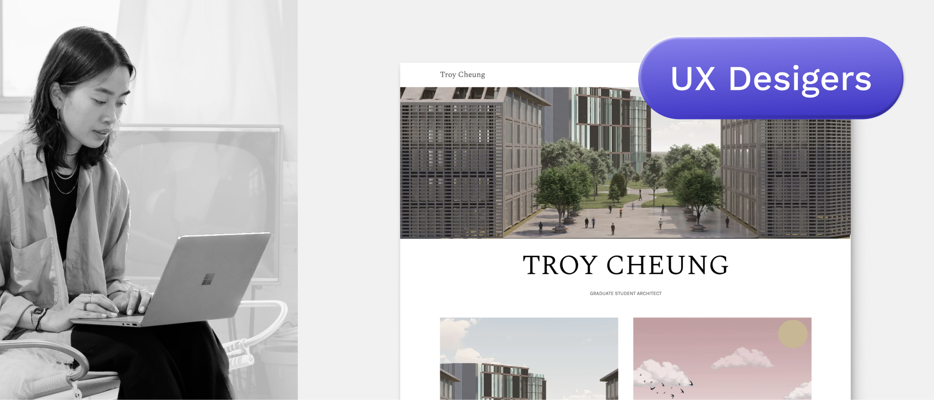
We talked to Farhad Soheili and Paola Zardo (a former architect and a civil engineer), who have transitioned into User Experience (UX) Design. They are experts in how to build understandable, yet jaw-dropping website designs that users love.
Let’s hear what they say about the portfolio examples below:
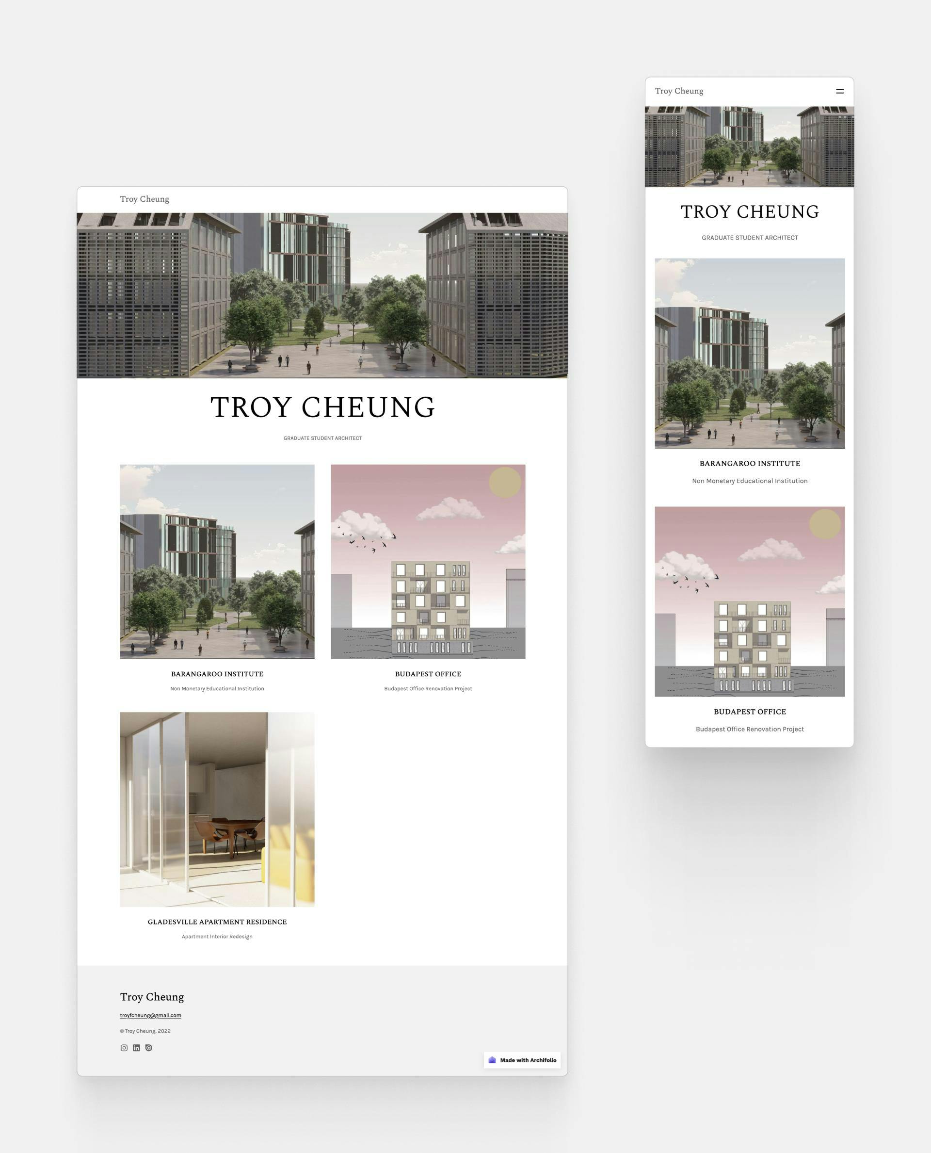
1. Troy Cheung
Troy Cheung created this site with Archifolio’s Agora template
Strengths:
- Simple, clear design with enough white space
- Good page speed
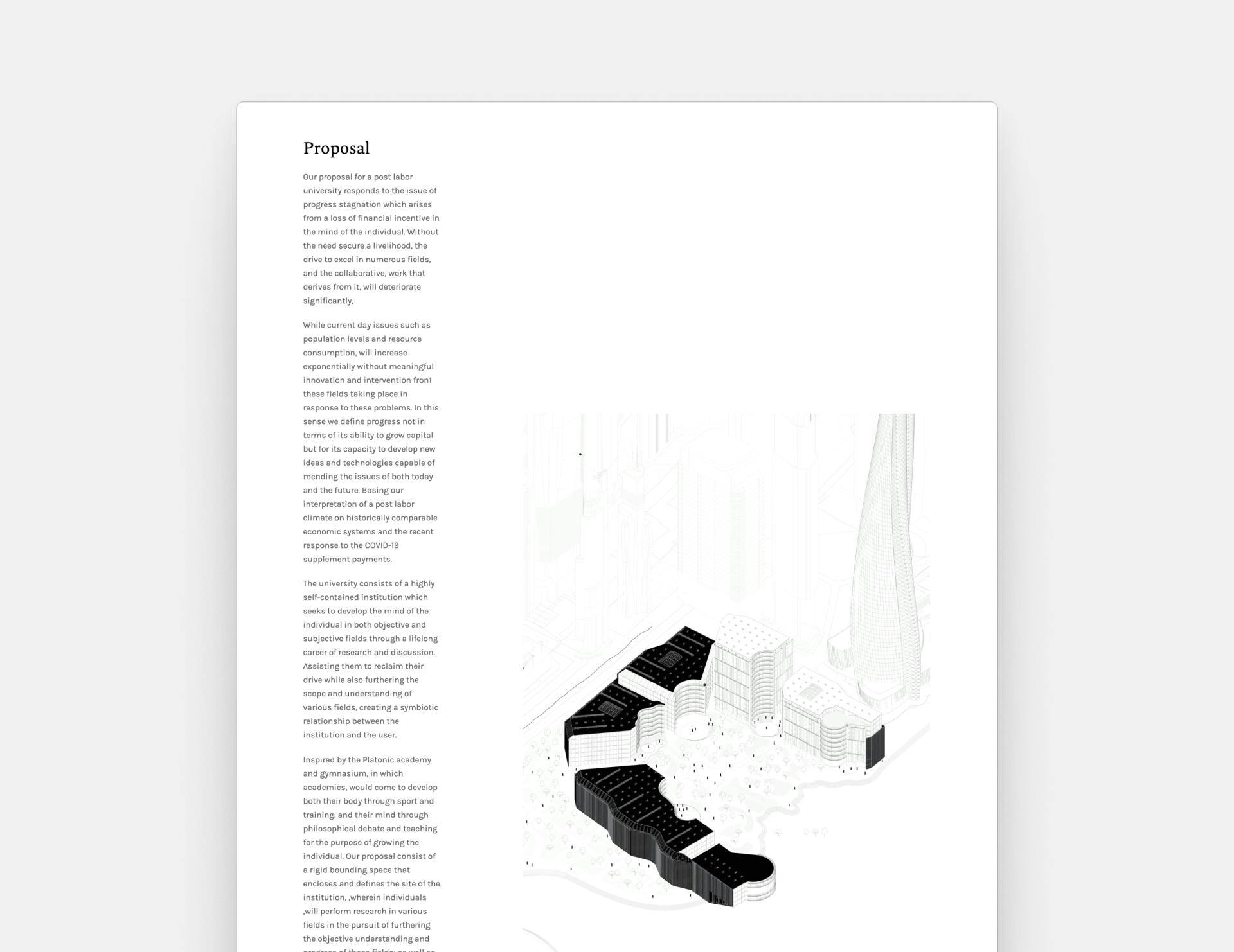
- Important contextual information on every project page
- The low-key hover state animation makes the site lively
- Social media icons in the footer
One of Troy Cheung’s projects called Barangaroo Institute
Weaknesses:
- Image aspect ratios are inconsistent
- Too much written content
- Text boxes aren’t well-aligned with the images
I like how it’s clear and simple, and right from the start I know what I’m looking at. The employer will appreciate it too. Nothing super fancy, but just what you want to showcase on a student site.
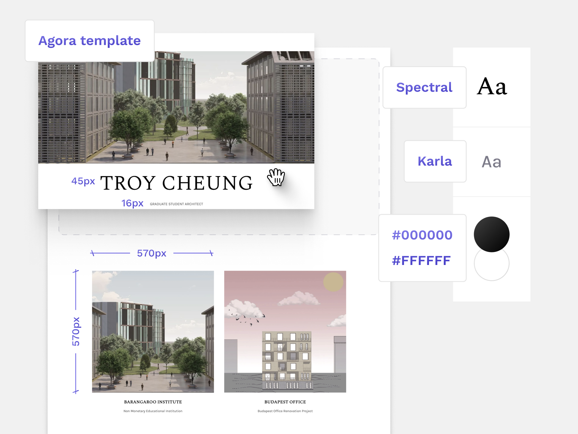
Recreate this design:
Troy used Archifolio’s Agora template to create this portfolio.
Like this website? Build yours with the same Archifolio template and customize it to fit your style.
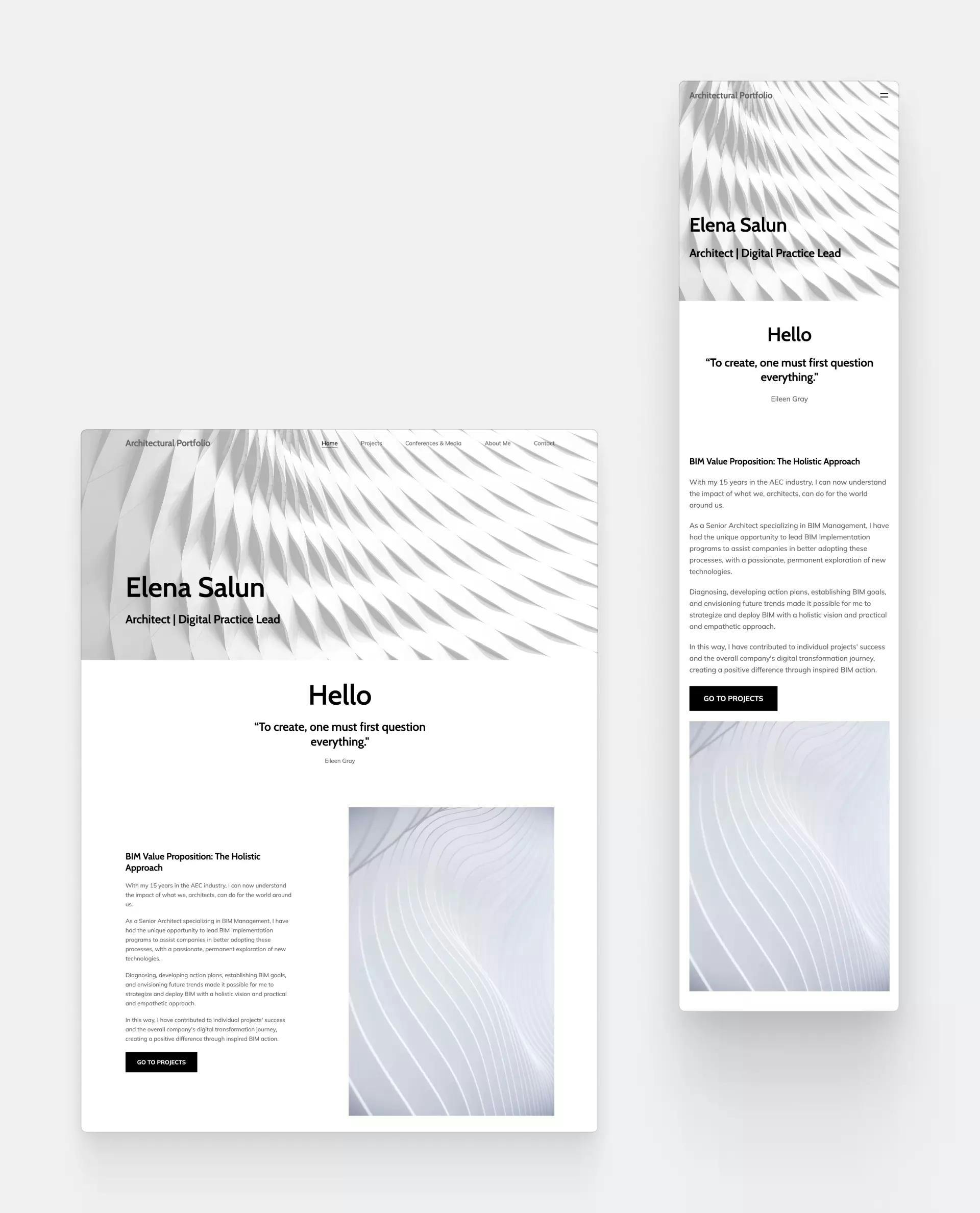
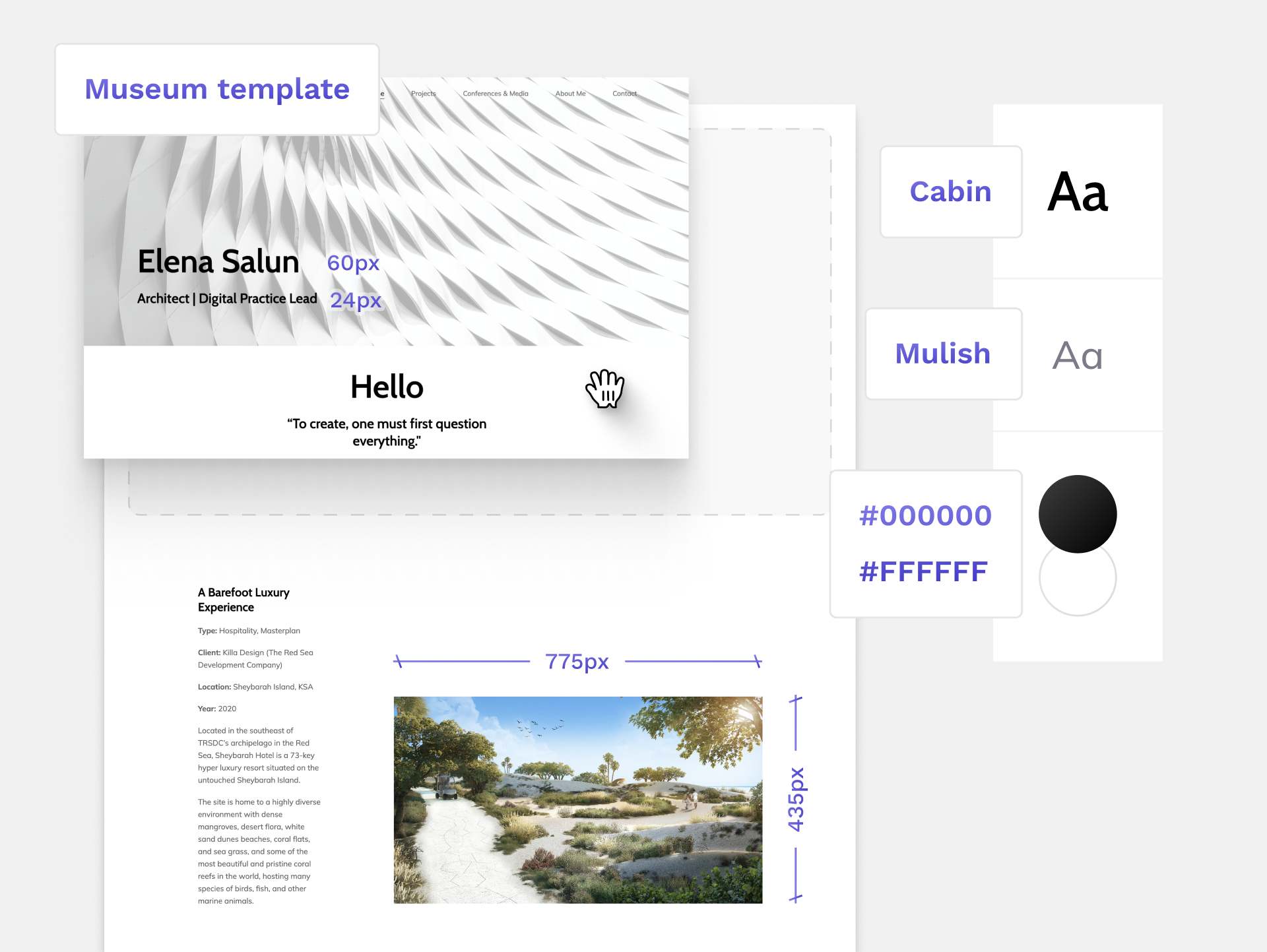
2. Elena Salun
Elena Salun created this site with Archifolio’s Museum template
Paola’s first impression: “I immediately understand which type of job Elena does. She’s focused on complex construction shapes designed with parametric modeling and she works with Rhino, Revit, and Dynamo. It’s great, she already made a great first impression with her home page.”
Strengths:
- Image-heavy layout
- Linking out to the client’s website makes her site authoritative
- Mixing renders with technical drawings shows a great project narrative
- Nice flow, you always know what to see next (i.e. use of buttons)
It’s not text-heavy, which is great. However, I do miss some vital information about the project, for example, the square footage. It helps employers to see how much impact you had on the project.
Weaknesses:
- The technical images could be of better quality
- Scale and measurements aren’t readable
Recreate this design:
Elena used Archifolio’s Museum template to create this portfolio.
Like this website? Build yours with the same Archifolio template and customize it to fit your style.
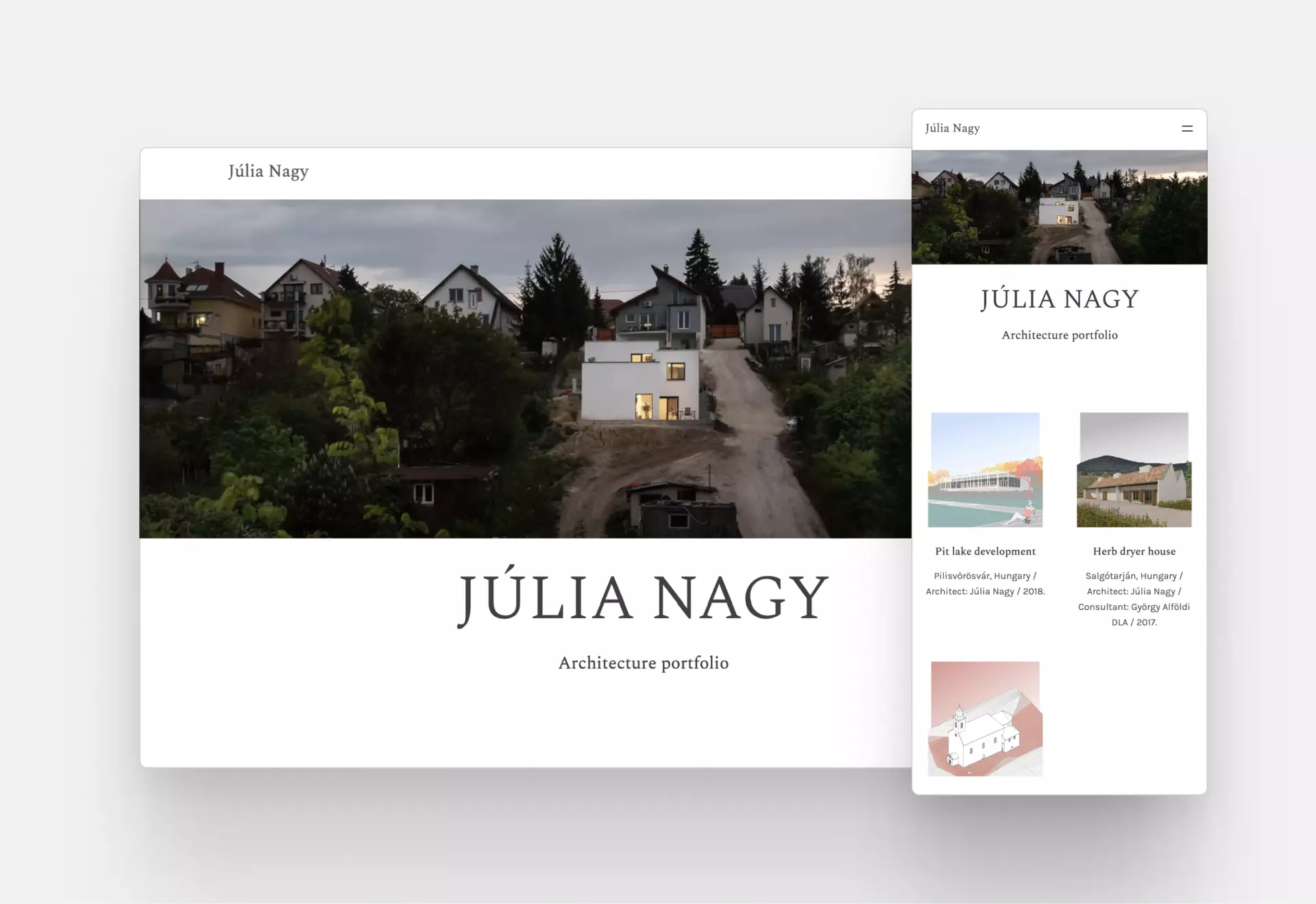
3. Júlia Nagy
Júlia Nagy’s architecture website design
Strengths:
- Simple, timeless design
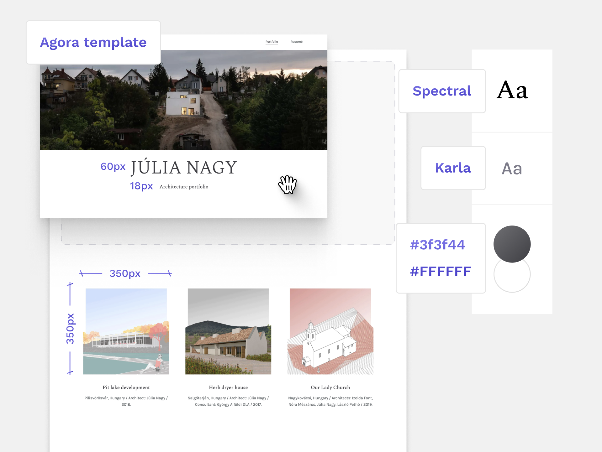
- Engaging project thumbnails
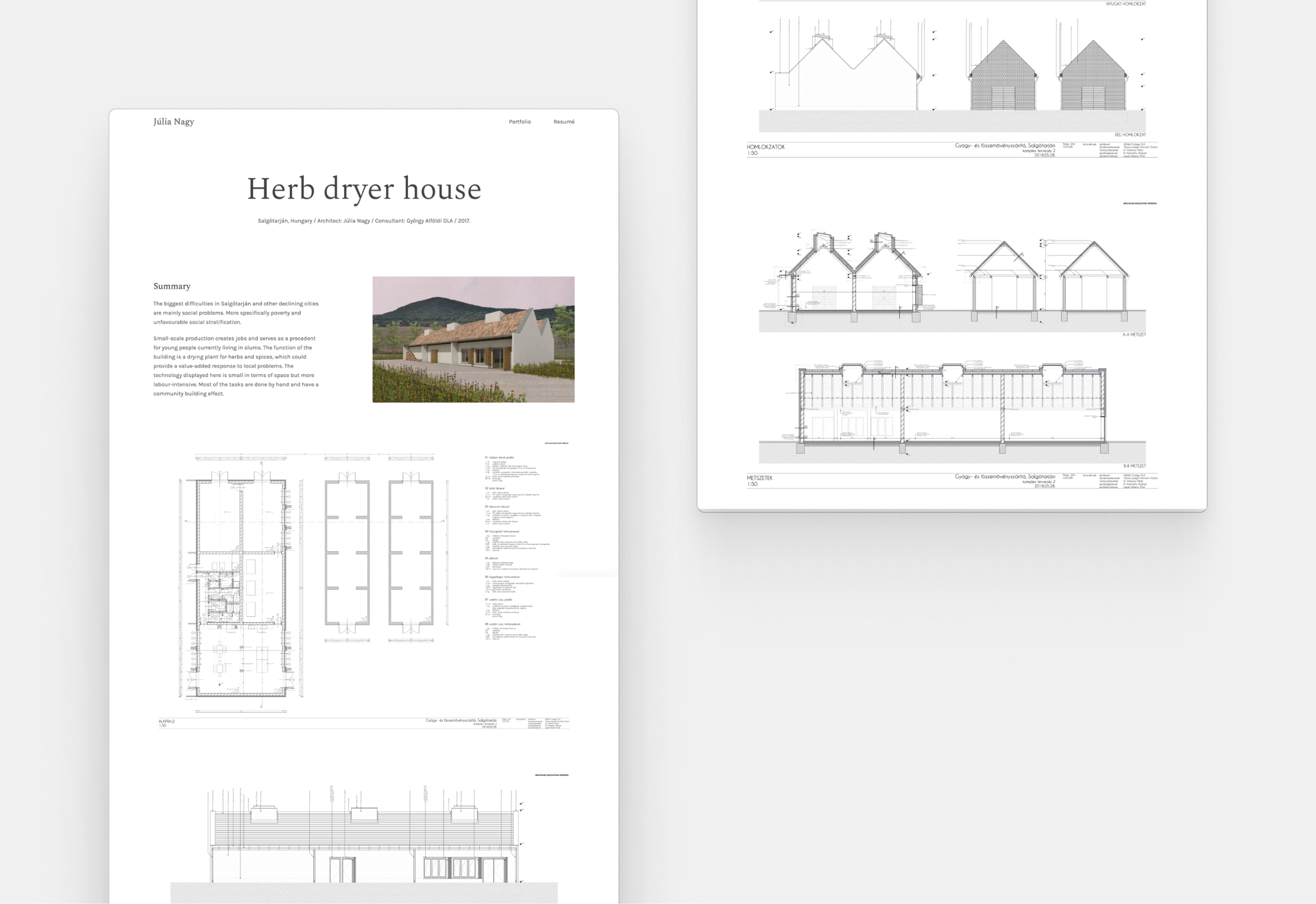
- Site analysis is presented well
- Snappy project summaries that give enough context
Weaknesses:
- Lack of context on the landing page image
- An introductory paragraph would be nice
Júlia’s Her Dryer House project with technical drawings
I’m not sure where this architect is based right off the bat. As most jobs are still in person, your location can be really important for your employer. Also, a short introductory paragraph would be welcome to make it more personal.
Recreate this design
Julia used Archifolio's Agora template to create this portfolio.
Like this website? Build yours with the same Archifolio template and customize it to fit your style.
4. Dami Lee
Dami Lee's website landing page
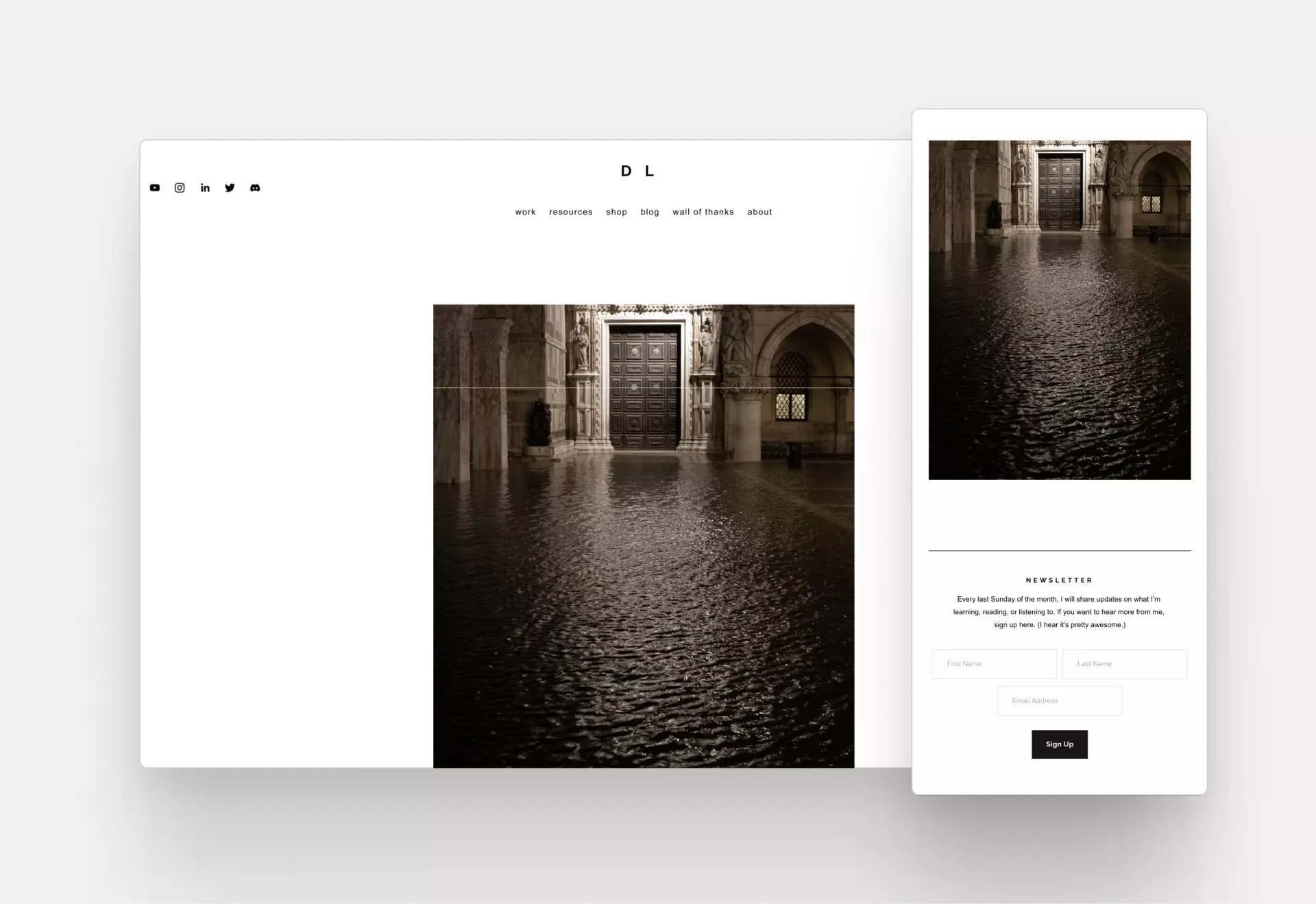
Farhad’s first impression: “As you arrive, you are greeted with a photograph without any captions. It’s a nice image, I just don’t get the message immediately without digging deeper."
Remember, you have 5-6 seconds to convince the audience that it’s worth checking out this website, so convey your message clearly.
Strengths:
- Good navigation,
- Decent page speed
- Great about page
- Separated conceptual works from real, built projects
- Professional domain name (www.damilee.com)
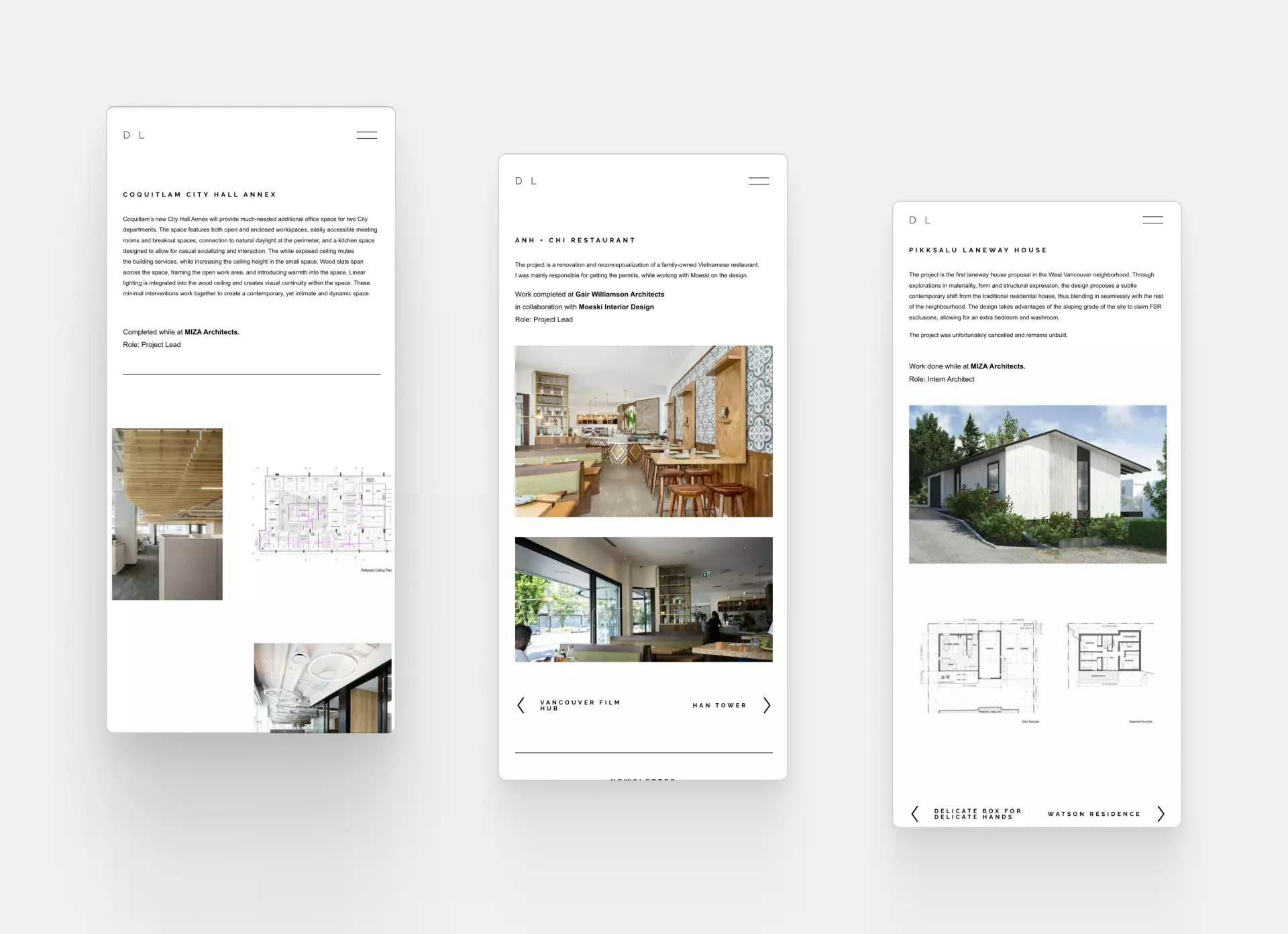
Dami Lee’s architectural projects
Not everything you design will be built, but this architecture website solves this issue elegantly. Dami Lee separated her real-life experience from her conceptual projects. The result is a well-organized, relevant portfolio.
Weaknesses:
- Her name is not visible
- The landing page doesn’t invite us to see more
- The exact tasks for her projects are missing
- She hasn’t included an architecture resume
Recreate this design
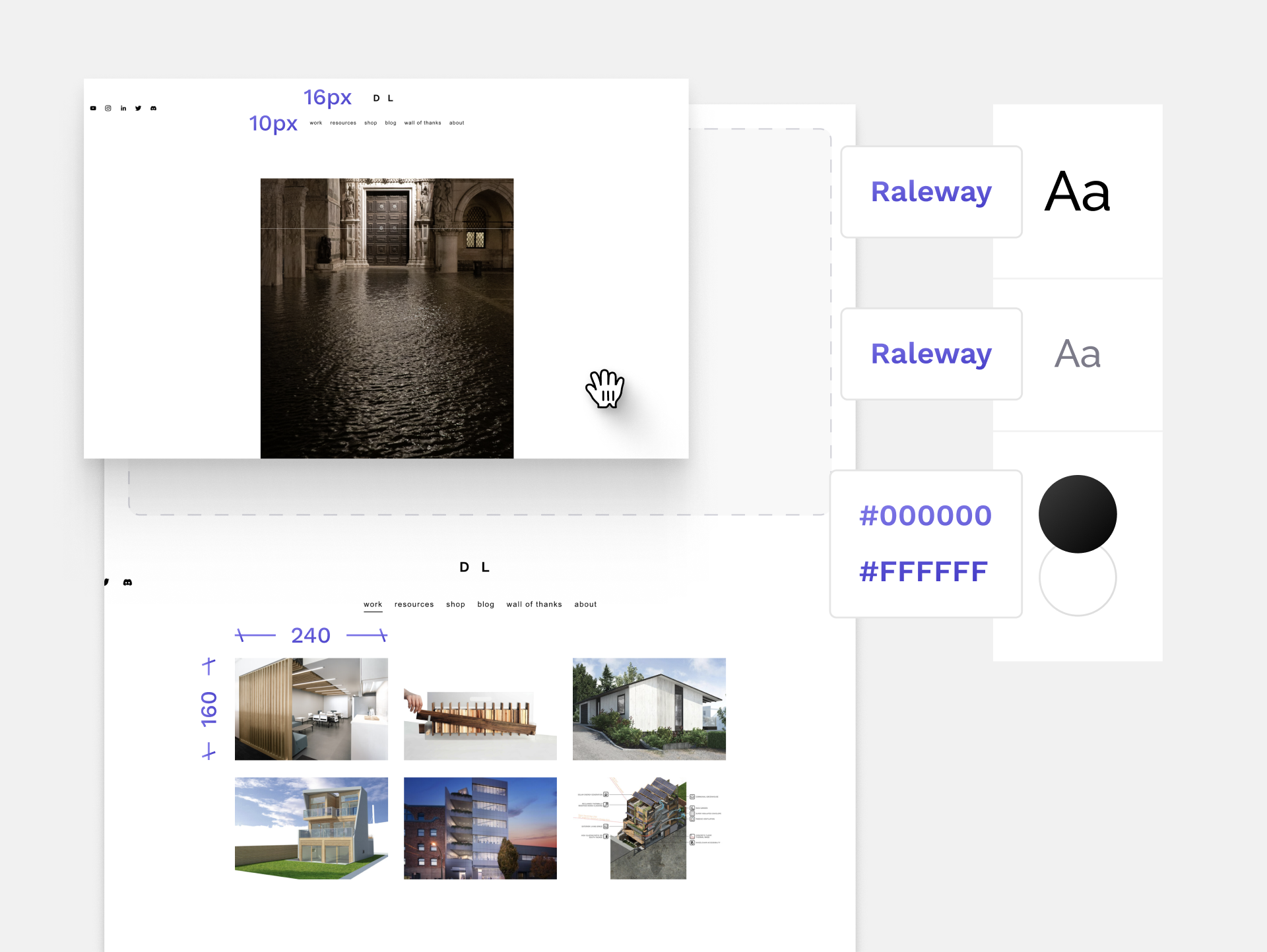
Demi Lee used a black&white color palette and a modern sans serif font family.
What makes a good architecture website design?
“If you visit a big firm, you expect to see something unusual, something that breaks the rules. And if they have a unique user interface or some fancy interaction design, you say: ‘Wow, that’s cool!’ However, it’s almost the opposite for juniors. For them, the main goal is to provide good user experience to make sure the employer finds every relevant information.” – Farhad
Employers don’t have the time to figure out a completely new website logic. They feel much better about a website with a clear navigational system that allows them to find relevant information easily. Less is more in this case.
2. Page speed
“Projects in architecture are usually really big: big models, big renders, big image sizes. I remember how hard and slow it was to work with these files. And if it’s all online, it affects the loading time. People get bored if they have to wait around to see your work.” – Paola
The sheer volume of architectural projects is considerable, let alone when it’s all online. Thus, optimizing your page for fast loading is crucial.
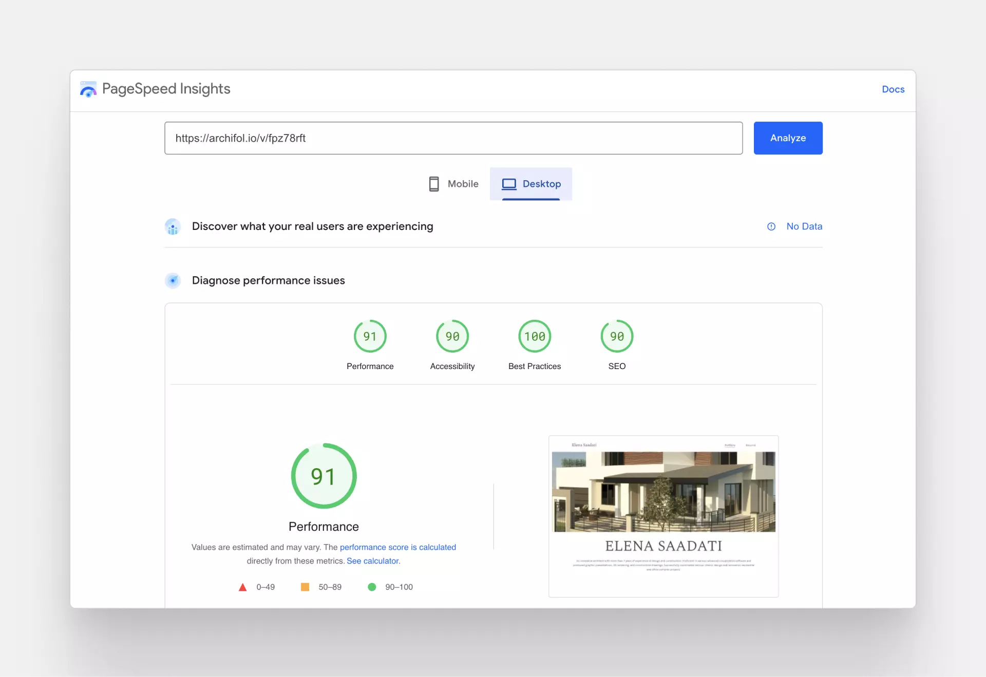
If you want to check out your site’s speed performance, visit PageSpeed Insights and type in your site’s URL.
Look at the results of with Elena Saadati’s Archifolio site: She didn’t have to do anything specific, but her site performs almost perfectly on a page speed test.
The page speed of Elena Saadati’s website, created with Archifolio
3. Clear visual narrative
“Most architecture websites are the same. They put the different steps one after the other in the ‘perfect order’ like it was meant to be. However, no two design processes are ever exactly the same. Every project I worked on was different somehow. And the project page should represent that. Because that is what will make it real and give it a personal touch.” – Farhad
Your employer will know that you have hands-on experience if you present your design process as it was.
“Architecture briefs are the starting points of the story of any architecture project. Usually, the brief includes all the limitations and requirements and therefore is extremely long. So instead of including the whole client brief, mention the limitations or challenges that you tackled the most or learned the most from. It has a huge effect.” – Paola
Tell the story in a relevant way that shows your expertise and your real experience.
4. Context
“Architects generally do a wide range of different projects. You may, for example, want to specialize in exteriors and facades, but your experience is interior design-heavy. It’s not the end of the world, you just need to be clear and give context right away on your website.” – Paola
Start with a quick and snappy intro paragraph where you write about your experience and your specialization.
Final thoughts
How can you tell that your website’s design does your work justice? If you get that job interview.
So, the tricky thing is that you can only tell once you’ve started sharing your site. Which means time is of the essence. Archifolio helps you build your architecture portfolio website without pulling an all-nighter. In fact, you could wake up tomorrow refreshed knowing that you already have what it takes to get a job you really want. The only thing you need to do is to start today.
Meet our experts
Both Paola and Farhad work at UX studio, a top UX UI agency.
