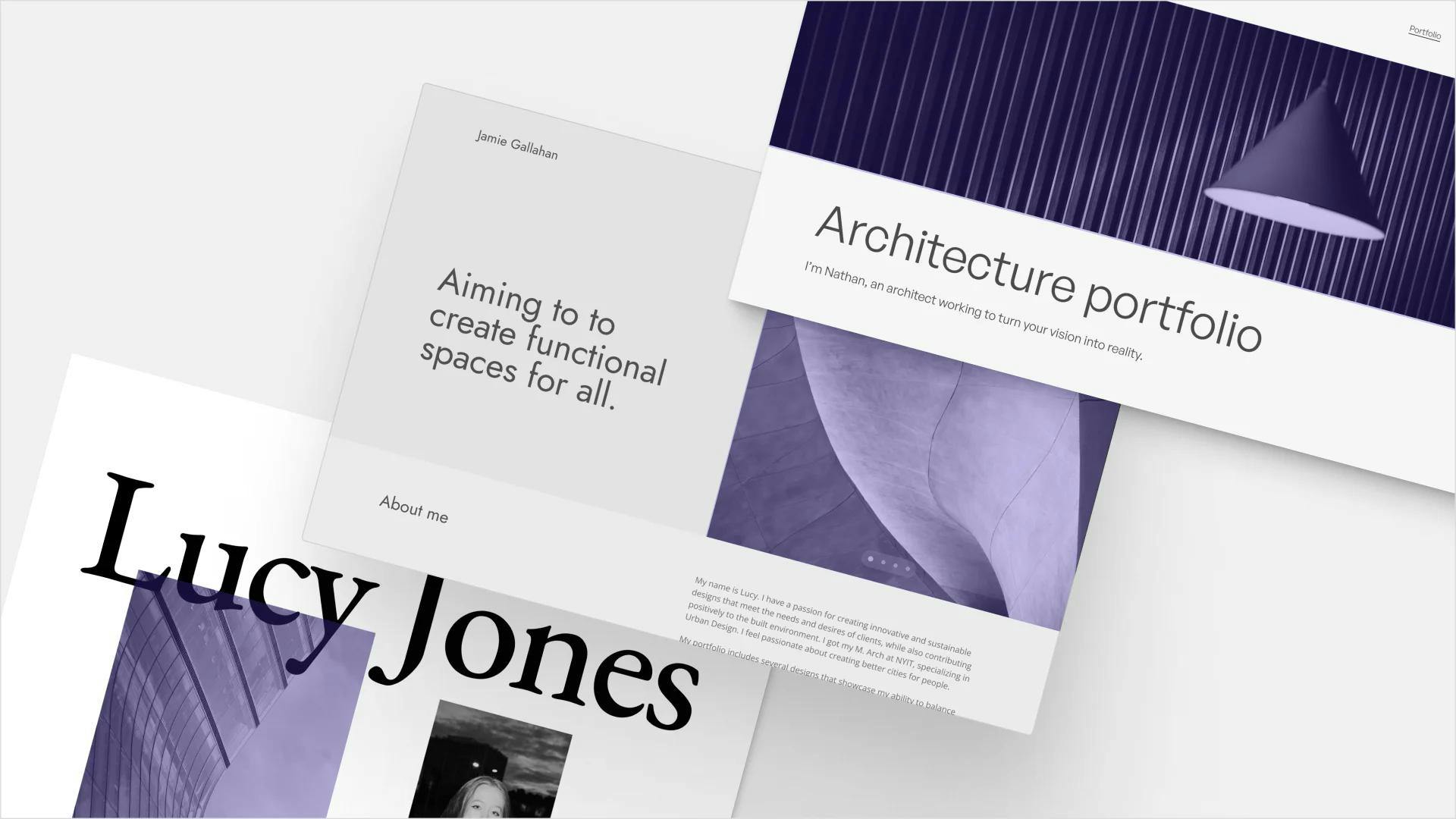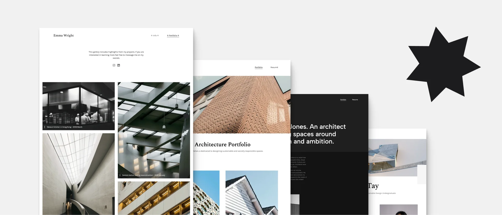
Architecture Portfolio Layout Examples for Inspiration
In the world of design, first impressions matter more than you'd think. Similarly to physical spaces, the thoughtful layout of your architecture portfolio has a profound impact on how it will be evaluated.
In this comprehensive guide, you'll find inspiration, layout examples, and helpful tips. Plus we'll dive into the crucial elements that transform a collection of random projects into a compelling portfolio.
The Structure of a Well-Designed Architecture Portfolio
To create the perfect layout for your portfolio, you’ll need to establish a clear information architecture. There are a few building blocks for an easily digestible portfolio. First and foremost, you need:
- a homepage or cover page,
- an introductory about page,
- separate pages for each of your projects,
- and a contact page.
Additionally, you can include a page for extracurricular projects (especially in student portfolios).
Architecture Portfolio Layout Examples
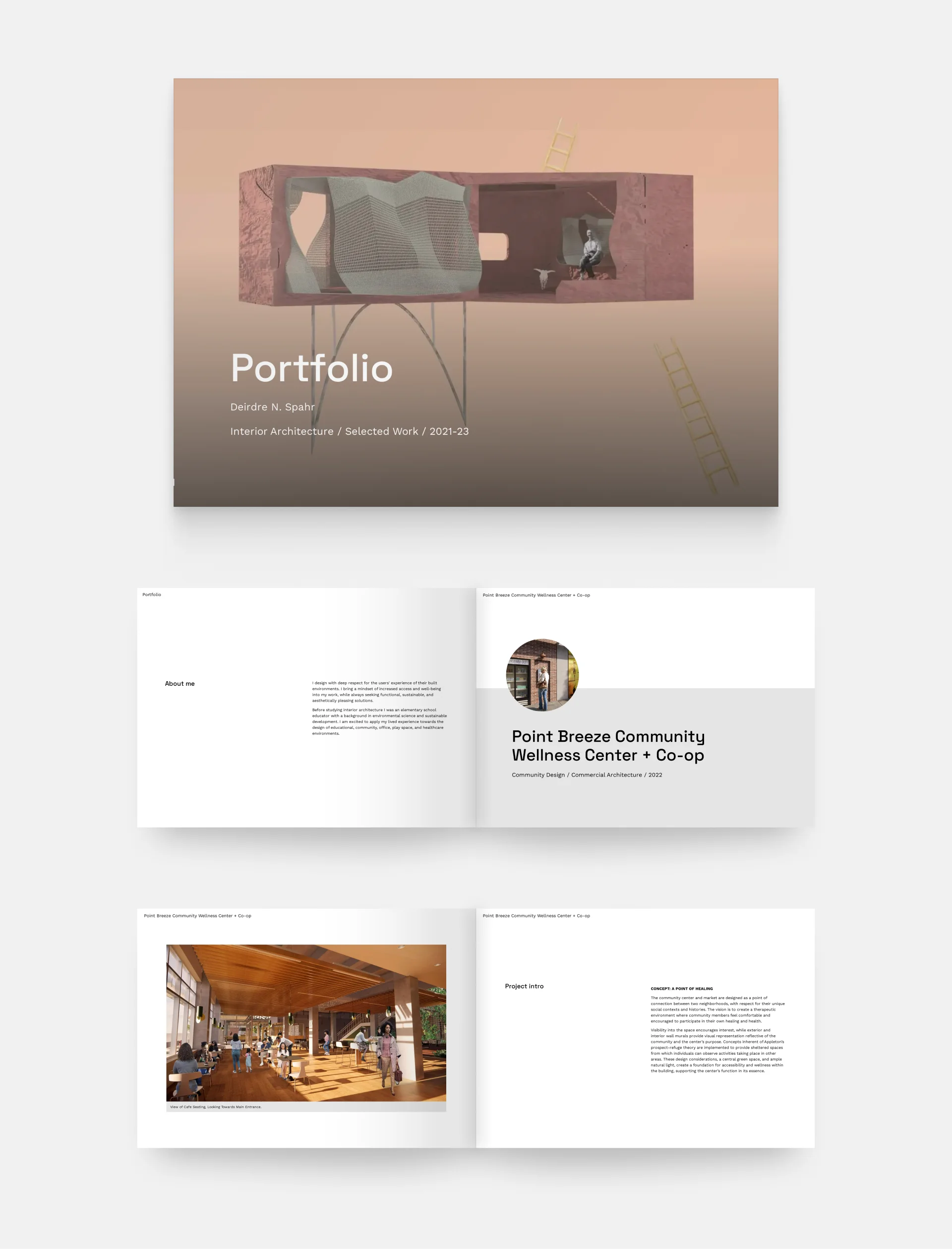
Cover page by Deirdre Spahr
Deirdre Spahr's interior architecture portfolio cover
We love Deirdre's portfolio cover page because it's simple, informative, and captivating. All the necessary information is present without filling the site, and the visualization in the background pulls us in to see more.
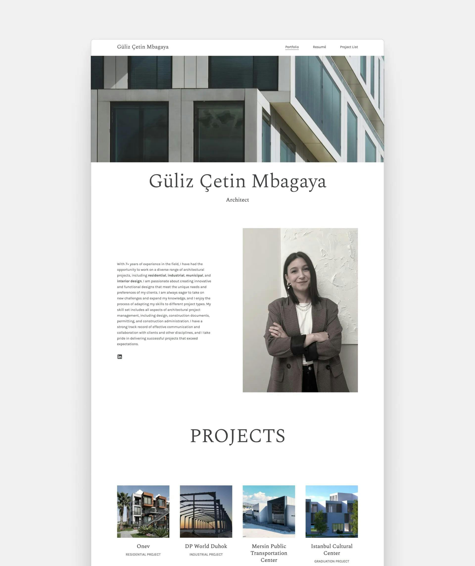
Homepage layout of Güliz Çetin Mbagaya
Güliz Çetin Mbagaya's portfolio home page layout
Güliz crafts a professional first impression when you come across her portfolio. She kept the layout simple, but she made it interesting with the large fonts and intriguing project thumbnails.
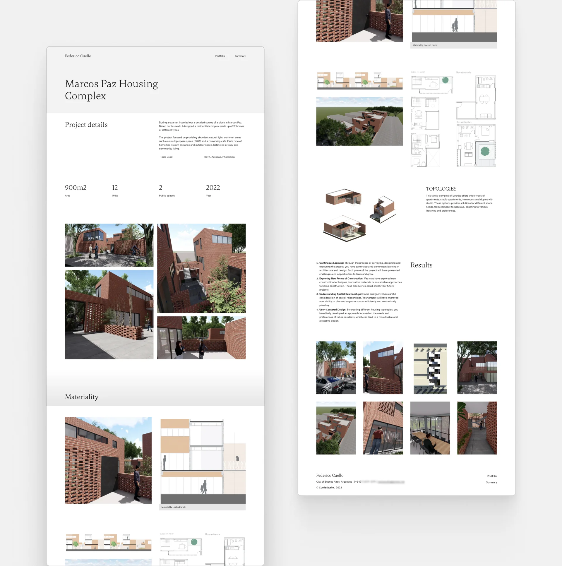
Project page layout example by Frederico Cuello
Frederico Cuello's project page (machine translated from Spanish)
Frederico's project page is informative and captivating at the same time. The structure is well-thought-out, and the information is easily digestible. We're amazed by his work and his presentation simultaneously.
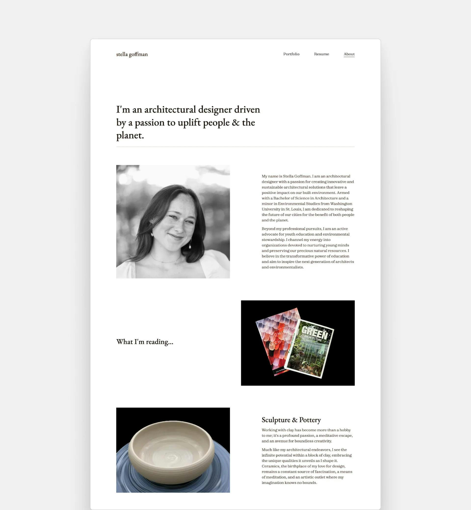
About page by Stella Goffman
Stella Goffman's about page example
Stella's About page is such an outstanding source of inspiration. She kept the page clean and minimal, but she made it exciting with the alternating layout of images plus text. We also love the content she included.
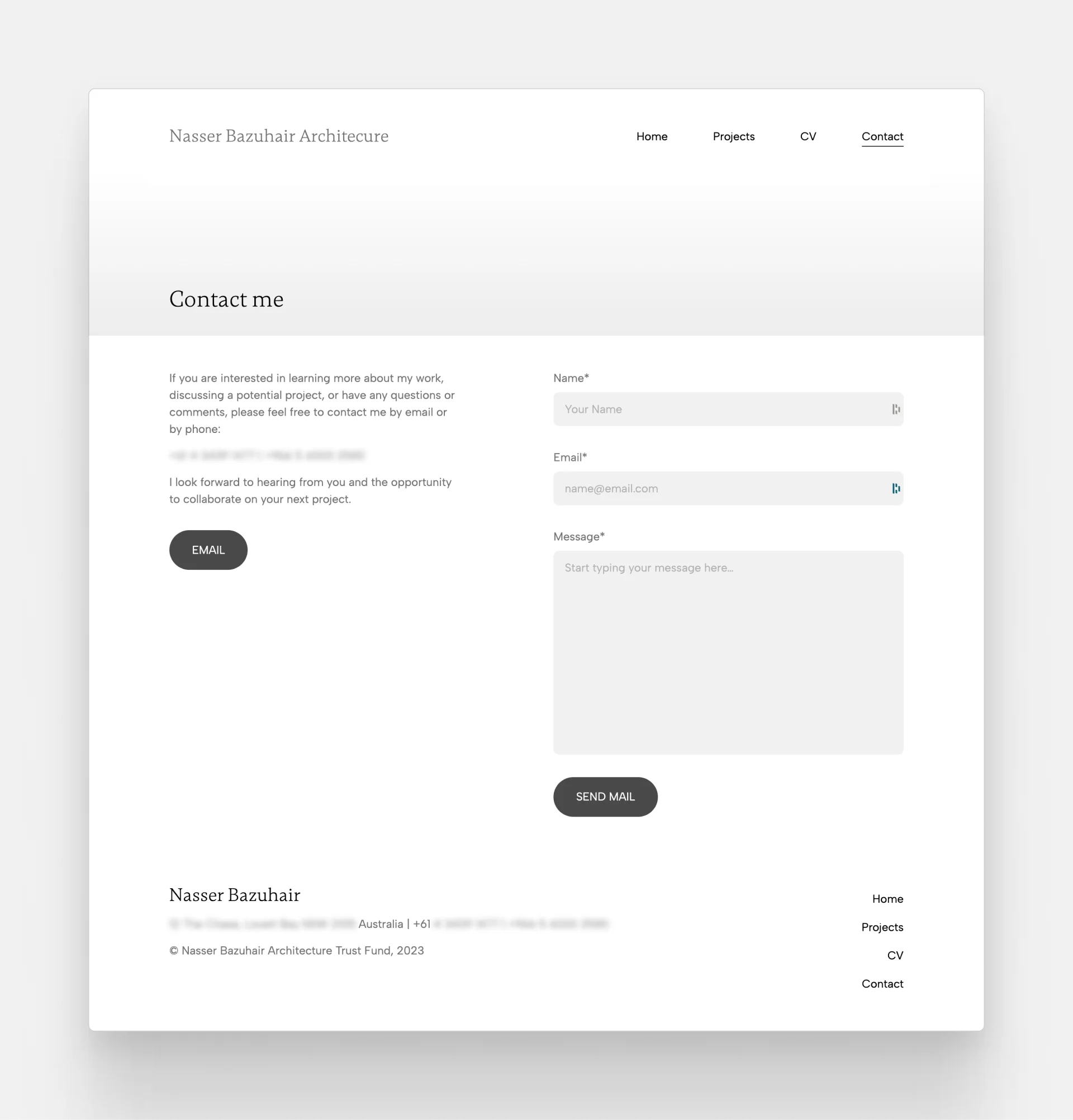
Contact page example by Nasser Bazuhair
Nasser Bazuhair's contact page layout
The purpose of a contact page is straightforward. Show how your audience can get in touch with you. Therefore, a clutter-free and simple layout is necessary. Nasser nailed this on his contact page. He included a short contact form to make sending an email easy for his visitors.
Architecture Portfolio Website or PDF?
We are at an interesting turning point in our industry. Everything is moving towards digital and online solutions, yet some of us—probably due to the nature of our work—still prefer drawing on paper and printing out documents.
While only creating a physical portfolio isn't the most appropriate, convenient, or sustainable solution anymore, a PDF booklet still offers that sense of flipping through the pages—like it was a couple of decades ago. You can also ensure that your portfolio will keep its layout regardless of the device your work is viewed on. Plus, you can always decide to print it out anytime you want.
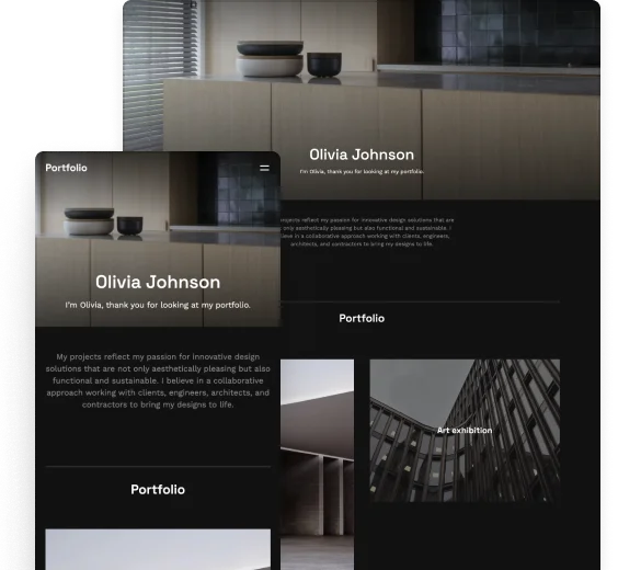
On the other hand, sending a portfolio website may just be that breath of fresh air recruiters are looking for. Thanks to the nature of this format, you can interactively present your work with embedded 3D models or videos. It's convenient to view anytime, anywhere, it's easy to update, and you don't have to worry about file size limitations.
Our recommendation is to have it all. You never know what will be the most suitable version when it comes to your dream job, so it's best to have all the options.
We can clearly hear you thinking that you don't even have the time to create one decent portfolio, let alone more. But we have good news.
Archifolio offers you a hybrid solution. You first create your website quickly and easily with several pre-built sections, templates, font presets and color palettes to choose from. Then, with a click of a button, you can export it as a PDF, which you can either send online or print out easily.
You can establish your online presence and have an offline version of your work in just one sitting. Two portfolios with one stone.
5 Key Advice For an Architecture Portfolio Layout
1. Guide your audience through your portfolio
Generally speaking, people don’t want to “just get lost” on your architecture website. Rather, they enjoy it if they always know where to go next. Think about what you want them to do on your website and guide them through for a great user experience.
If you’re in doubt here’s what we think could be a good journey:
- They start on the home page.
- After finding your name and what you specialize in (e.g. through your architecture resume), they see how many relevant projects you have to show them.
- Then, they go to one of your project pages.
- Ideally, they’d check out some others.
- They liked what they saw, so in the end, they want to get in touch with you. So they navigate to your Contact page.
An easy way to make sure that they generally follow this journey is to utilize visual hierarchy. You want to make sure that the first thing to see is the largest or most highlighted element, the second thing is the second largest, and so on.
2. Don’t be afraid of white space
White space is your best friend when it comes to creating an architecture portfolio. Your best imagery can only shine through your portfolio if it has room to breathe. Don’t be shy to use a whole frame for your most important image. This will allow your audience to really appreciate your work.
3. Say no to clutter
As tempting as it is to explain every little detail in your portfolio, less is more in your portfolio. Don’t include unnecessary graphical elements. Keep it clean and simple.
4. Don’t go overboard with animations
Interactivity is a huge advantage of architecture portfolio websites compared to PDFs, but it’s easy to overdo it. Keep it to a minimum and focus more on presenting your work.
5. Stay consistent
You need to make sure that your audience doesn’t get confused on your site. They quickly get frustrated and leave before you have the chance to make a good impression. So keep the same fonts, colors, and style throughout your whole site. It’s best to set these globally, so you won’t miss anything.
Getting started with your portfolio
Creating a website or a PDF from scratch may seem like a daunting task, but you'll find a ton of great resources to get you started.
First of all, you can find information on what you should include in your architecture portfolio, how you can set up your online portfolio, and many other helpful guides on the Archifolio blog.
You can also look at some more stunning examples made with Archifolio.
Secondly, if you are like us and you can get frustrated with a blank page, Archifolio will prompt you to start with an architecture portfolio template to get you started. You can customize it to fit your style, but it will speed up your process.
Did you find the inspiration you were looking for? Awesome! Then it’s time to get started with creating your architecture portfolio. We're here to make this process easier for you.
