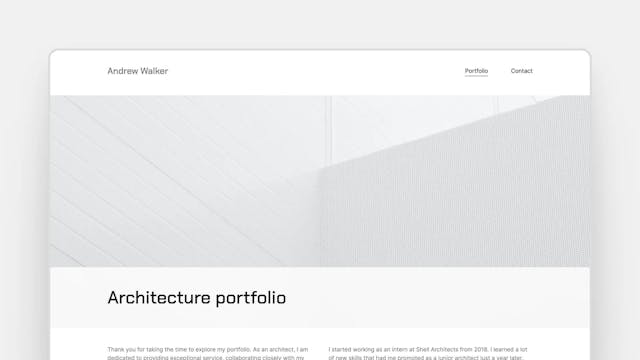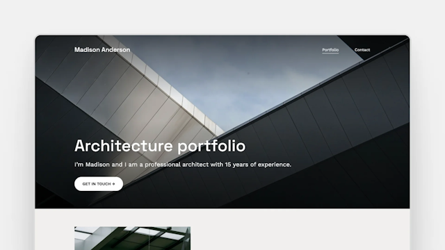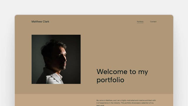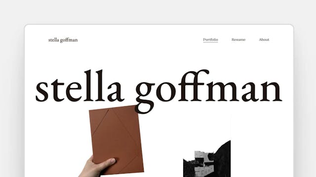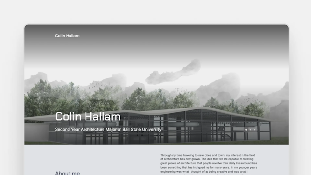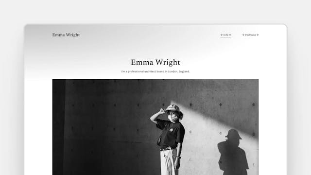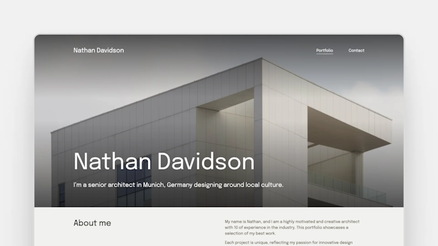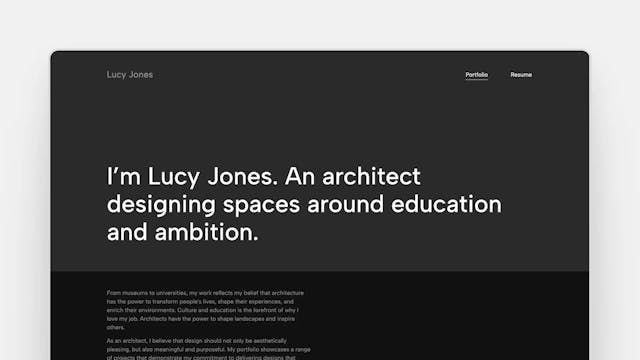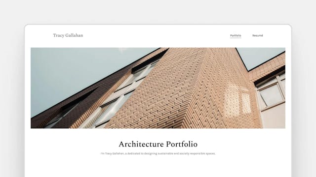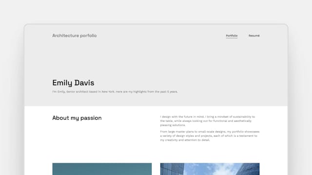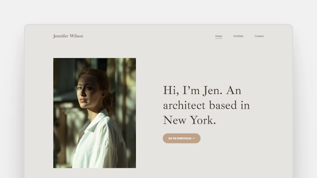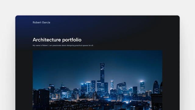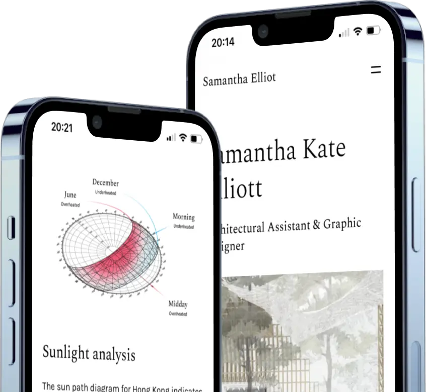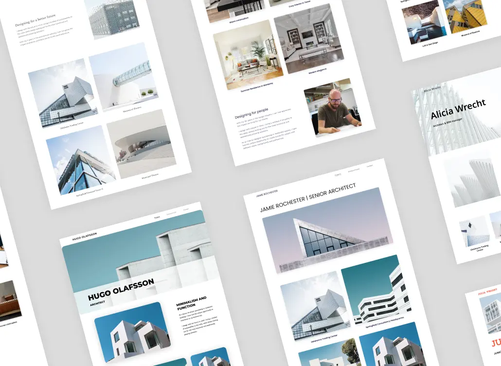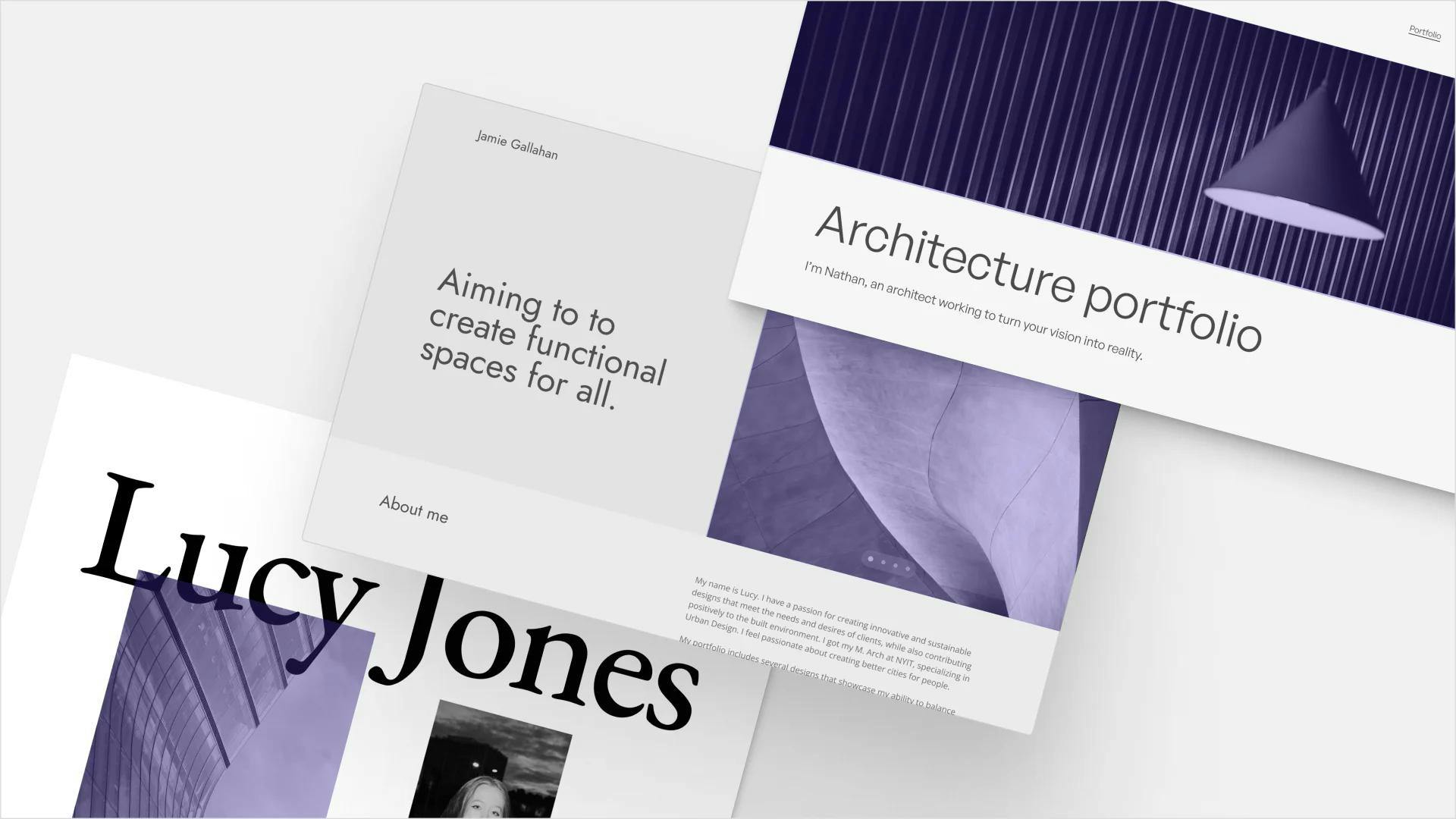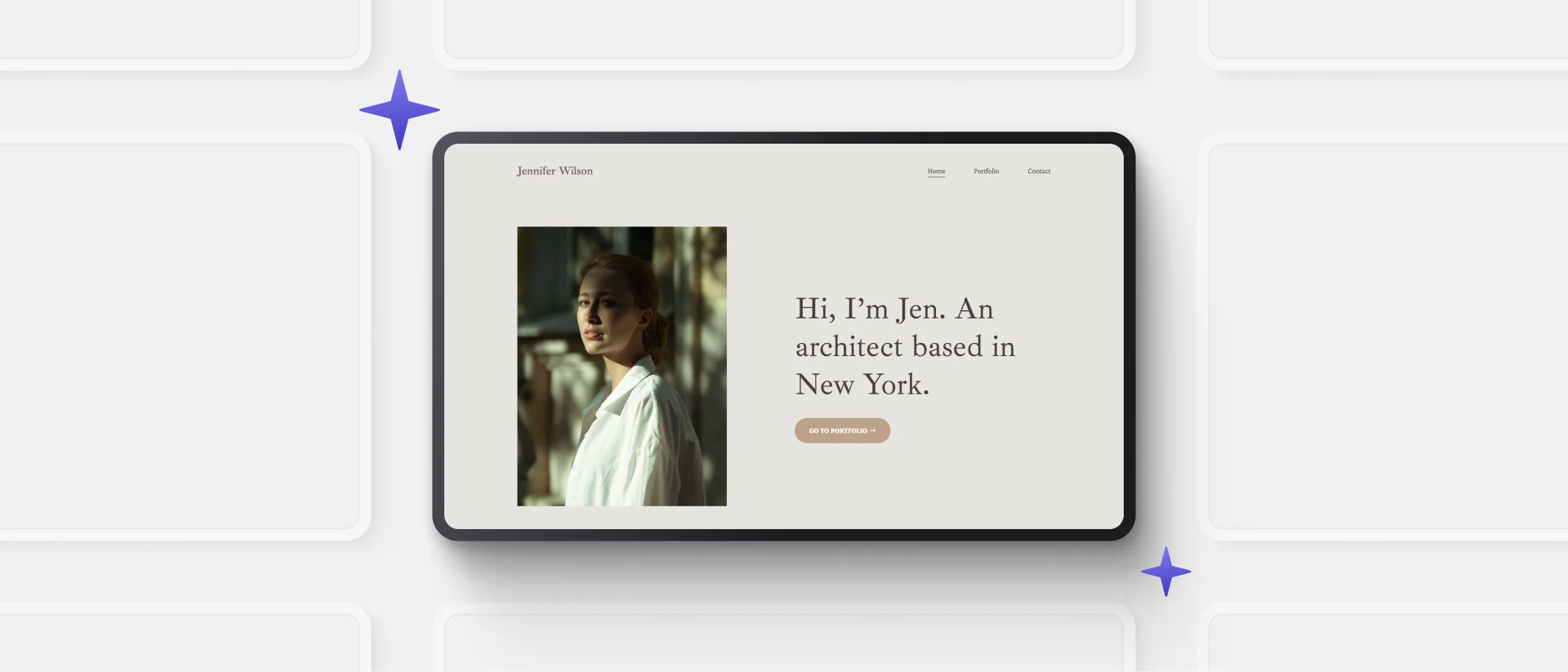
You need an architecture portfolio website to stand out from the crowd.
Architecture studios are drowning in applications, so you need to catch the recruiters’ precious—and unfortunately limited—attention.
Building a website shows that you think outside the box, you’re open to learning new things, and are always ready for a challenge.
So, to help you get started, we’ve handpicked our favorite personal websites to inspire you.
12 Architecture Portfolio Website Examples
Why Start Now?
We saw an interesting contradiction when we talked with architects from all around the world: Everyone was aware that the architectural industry – along with the hiring process – is transitioning to the digital age. However, only a few of them have started building their own websites.
“I know I should be working on my website, but I just don’t have the time right now.” We’ve heard that again and again.
But think about it: The top architecture agencies are flooded with PDF portfolios and a perfect layout and impressive images are no longer enough to catch the recruiters’ attention. Therefore, the format is how you can stand out from the crowd.
Leveraging innovative tools like an AI image generation tool can help you create unique visuals that make your portfolio truly stand out.
In every walk of life, we always see tons of reasons why it’s better to put something off. But we hope that this is the sign that you’ve been looking for. And we’re not just here to motivate you, we also show you how:
How to Create Your Architecture Portfolio Website
1. Choose a Website Builder
There are plenty of great website builders out there. Thus, it’s hard to find the one that meets the specific needs of those in the architecture and construction fields.
Look for a website builder that:
- is easy to learn without having to watch thousands of tutorials,
- loads super quickly,
- allows you to upload high-quality, large images,
- has an intuitive interface with a what-you-see-is-what-you-get editor,
- allows you to buy or connect your domain (e.g. yourname.com),
- lets your audience zoom into your images (especially important with technical drawings),
- gives you guidance on how to create a stunning portfolio with useful tips,
- helps you create a portfolio fast so that you have more time to work on your projects.
Archifolio checks every one of these boxes and more. It was created with architects in mind to give you the tool you actually need. Give it a go and sign up.
2. Organize Your Projects on Your Computer
The best methods we’ve found is to organize your files by:
- Project type (e.g. residential, healthcare, commercial, etc),
- Date (Projects of 2020, 2021), or
- Professional/academic experience.
Going through your images, think about the 1-3 most important lessons that the given project has taught you, or a restriction that was difficult to tackle, and how you overcame it.
Because in the end, you shouldn’t include everything that you have in these folders, just the most influential ones.
This will be what the hiring managers are interested in anyway, not the 100th fancy render. Besides, it might be an excellent opportunity to eliminate the digital clutter on your device.
If you're working across multiple devices, consider transferring data from your old Mac to your new one to centralize and organize your projects.
And the same goes for the number of projects that you’ll include. Curate your projects deliberately and only include those that you’re truly proud of.
You’ll be evaluated by the worst project in your portfolio. So make that a good one!
3. Be Intentional with The Story of Your Design
Here at Archifolio, we have a tried-and-true recipe for great project pages. The order looks something like this:
- Project title
- Project hero image of the end result
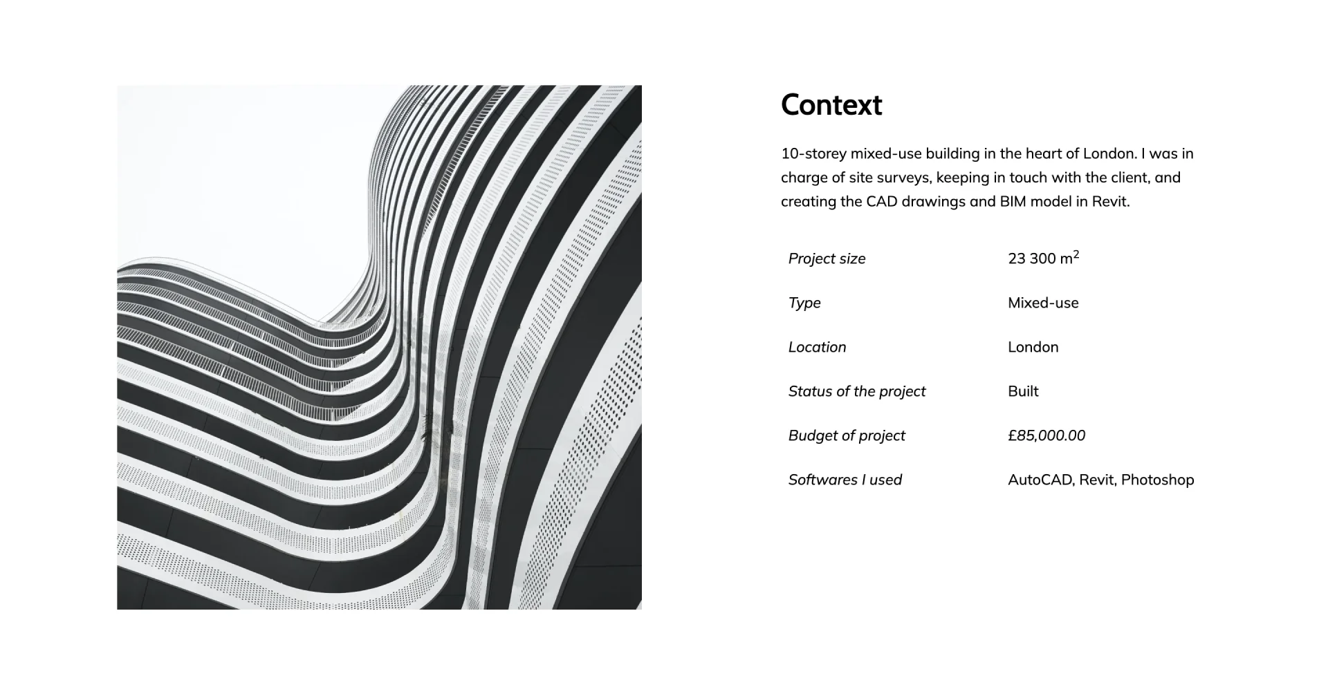
- Contextual information* (e.g. year, budget, size of real estate)
- Site map
- First sketches
- (Design inspiration)
- Elevations
- Sections
- Floorplans
- Details
- Interior elevations
- (Technical drawings)
- Renders
- Photographs of the end result.
Thus, you can build a narrative for your projects to invite your audience on a journey.
Actually, this step is the one that most architects – that haven’t yet discovered Archifolio – struggle with. However, with our tool, you have a built-in guide that you can follow to tell a story with your design.
*contextual Information in Depth:
Start each project with a bullet-pointed list of the most important information. Some ideas about what you can include:
- your contribution (in just a few words),
- academic year (for architecture student portfolio websites),
- type of the project,
- project budget,
- size (in m2 or ft2),
- location,
- date/year, and
- stage of the project.
Keeping it consistent throughout your site will make it easy to understand every project instantly.
4. Tailor Your Portfolio Website to You
Your portfolio website should be about you and your work. It’s great if the look of your site is in harmony with the style of your work. Adjust the colors and choose a font pair that suits your style.
Adding an architecture resume or a short introduction will make your site more personal and also it provide the employers with relevant information.
Don’t fall into the common mistake of spending too much time with this step. Yes, it’s important, but so is researching and applying to jobs.
Lucky for you, with Archifolio, you get a set of expert-designed color and font presets. You can mix them up as you like. As a result, even with minimal effort, your site will look stunning.
Are you ready to start working on your architecture portfolio website? Check out Archifolio and create a portfolio that you are proud of.
