11 Architecture Portfolio Cover Tips to Stand Out + 21 Examples
You know you have to make an outstanding first impression whenever you submit an application. But the question is: How? There’s only one page in your portfolio that everyone will see. And that’s your architecture portfolio cover.
So now let’s look at some inspiring examples and what they teach us, shall we?
#1 Keep it simple, but interesting

Amina Sherief's portfolio cover
Template: Museum
Amina created a minimalistic but memorable portfolio cover. The focal point is a simple interior photo that captures attention and showcases the architect's design style. The clever use of whitespace surrounding the chair gives a sense of elegance and allows us to focus on the intricate details of the image.

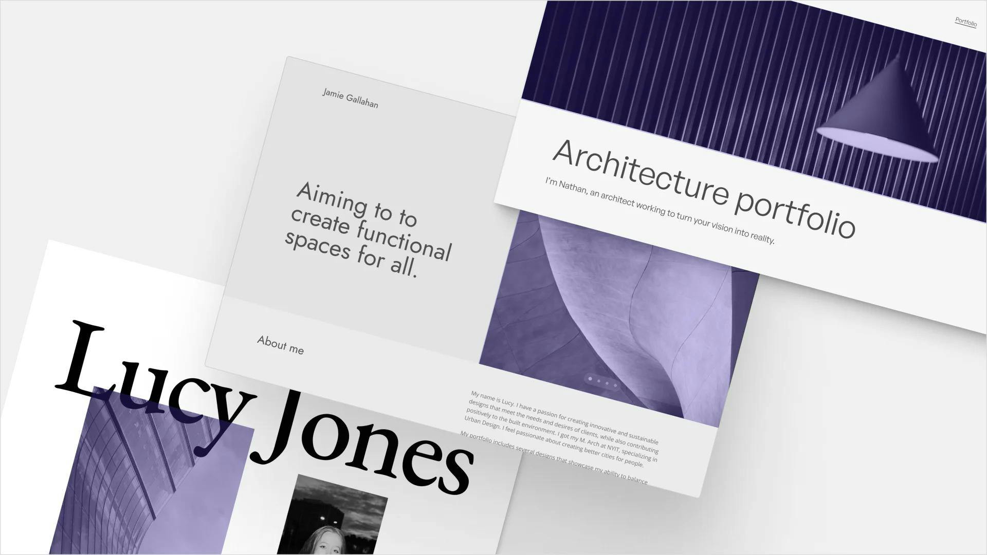
The PDF view of Layan’s architecture portfolio cover
Template: Modular
Speaking of white space, Layan used it expertly when arranging her architecture portfolio cover. She’s added her radiant logo to the left, with her name and personal brand statement (“Sculpting Spaces, Inspiring Minds: A Dynamic of Art and Architecture“) on the right. It’s simple, minimal, and just intriguing enough to catch viewers’ attention.
Don’t be afraid to leave a good amount of white space in your cover.
#2 Be clear – Include the most important information
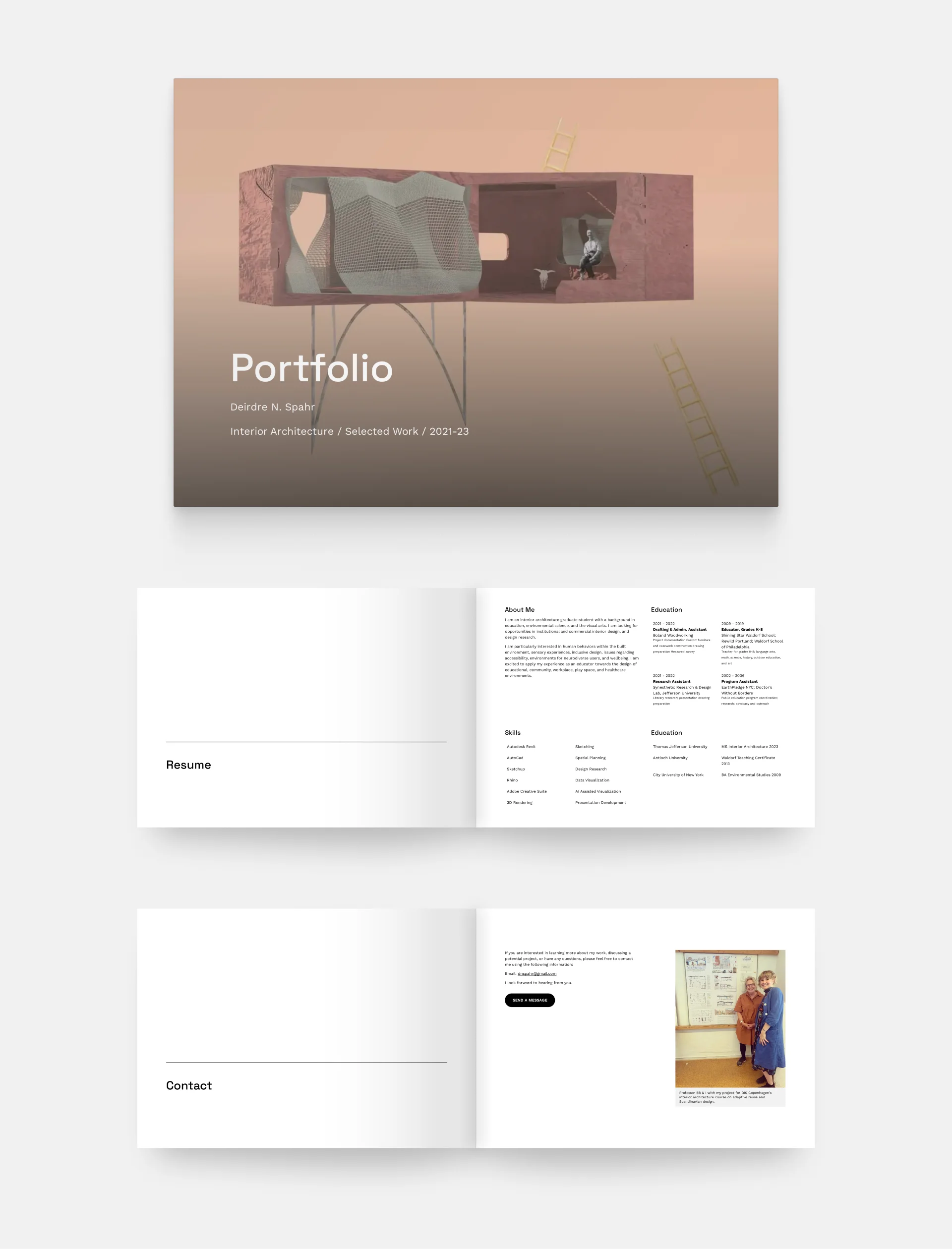
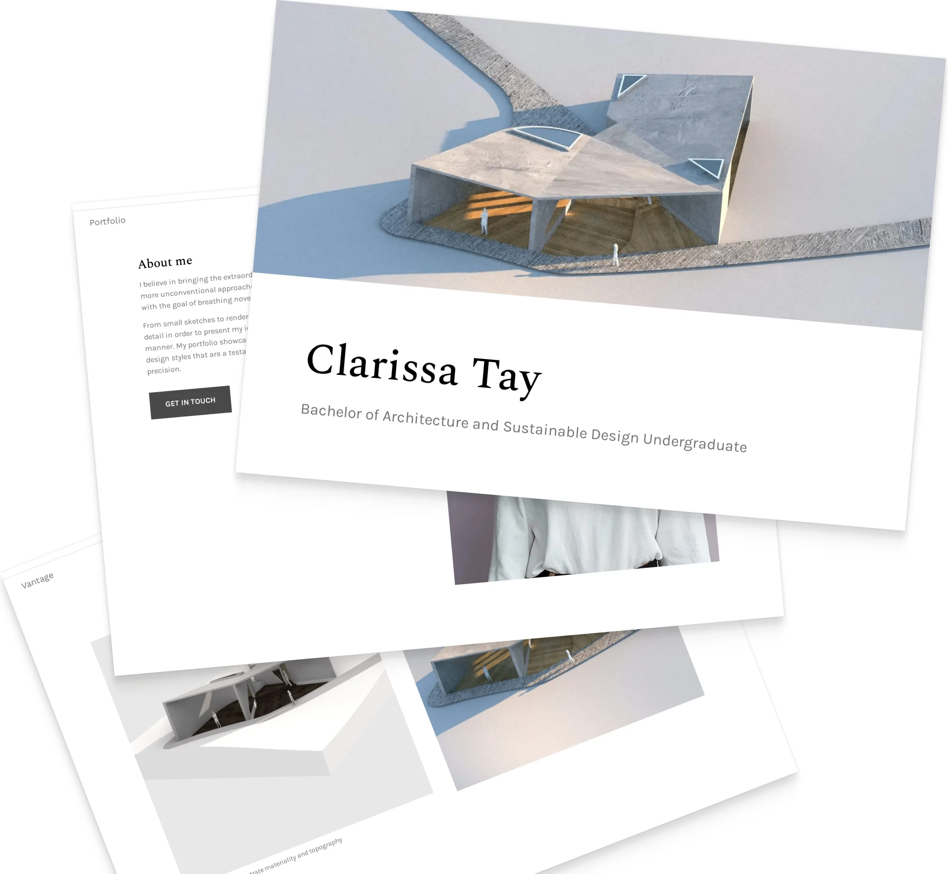
Deirdre Spahr's portfolio
Template: Museum
Deirdre Spahr's architecture portfolio cover blends artistic expression with functional clarity. The main illustration immediately draws the viewer's attention and communicates the designer's artistic vision. The large, modern title font communicates a sense of contemporary design and establishes a clear visual hierarchy. They added the most important information right below, which adds a touch of professionalism and ensures that the cover is not only visually appealing but also conveys essential information.
You don’t want your audience to wonder: Am I at the right place? Instead, include all the relevant information right on your cover.

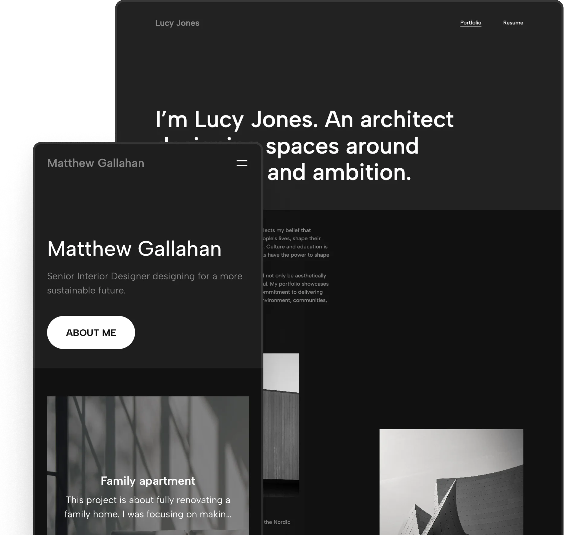
The portfolio cover and the first few pages of Casa Zayan’s architecture portfolio
Template: Loft
This architecture portfolio cover page has a different layout but just as much of the essential information, including the architect’s name and the years from which the projects were selected. This time, the illustrative image is not behind the text however, but on the side instead.
On the website version of the portfolio, which you can check by clicking the picture, the cover or hero section at the top actually has 5 different, dynamically changing photos, which make the portfolio even more engaging.
#3 Show your originality
If you want to stand out among hundreds of applicants, you need to think outside the box. You can, for example, present your projects not just through images, but videos or 360° views. Or, you may create a video resume that makes an amazing first impression.
PDFs do not cater to this functionality, but you can create an architecture portfolio website and place them there.
The cover there is your above-the-fold section (or hero section). You have the same rules to follow as in a PDF portfolio. Make it memorable and hook your audience.

Marco’s architecture portfolio website, with a unique cover/hero section.
Template: Downtown
Just like Marco did with his architecture portfolio website. The title “Meu Portfólio” stands out and grabs your eye, and the misaligned, differently sized pictures underneath provide additional visual interest.
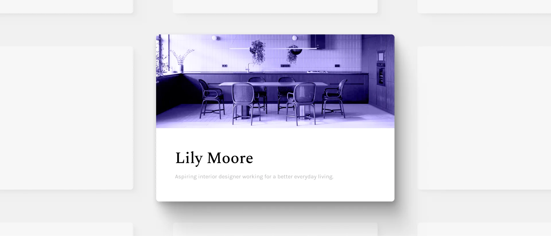
Natalya Pukhova's portfolio website
Template: Museum
Or how Natalya did in her interior design portfolio. She has a clear navigation bar and a well-thought-out layout. She managed to create a modern yet cozy look on her portfolio cover by including a low-contrast, bright hero image.
Stand out from the crowd by showcasing your projects on a portfolio website page.
We hear you thinking to yourself: Creating a website? I don't have time to build a website and make a PDF portfolio. So why bother?
Actually, you can now make both at once. Give Archifolio a try: you can easily create a portfolio website, and then export different versions of it as a PDF, whenever you need it.
All that with stunning templates, narrative blueprints, color palettes, and lots of portfolio layouts that follow the industry best practices.
With the intuitive editor, you can get your portfolio done under an hour, even if you’ve never built a website before.
#4 Give a sneak peek
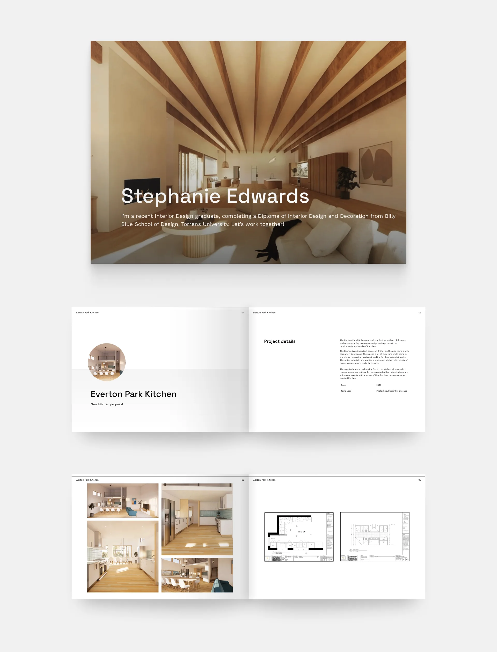
Stephanie Edward's portfolio
Template: Museum
The cover of Stephanie's architecture portfolio gives you a taste of her style and projects alike. It features a rendering of the designer's (presumably) favorite project; a modern, but cozy interior with exposed beams. What we love about this image is the strategic placement of the beams, which not only presents her abilities as a designer but also skillfully guides the viewer's attention to the title of the portfolio.
You can use snippets of the work you’re including in your portfolio to make your audience interested in what’s inside.

Template: Metropolitan
John Paul’s architectural work has a very distinctive style and he gives the perfect sneak peek on his portfolio cover. And while the PDF version only features one (luxurious) image, on the portfolio website (click the image to check it out), you can see three different ones, changing dynamically.
They give you a perfect idea of what to expect before you even start scrolling.
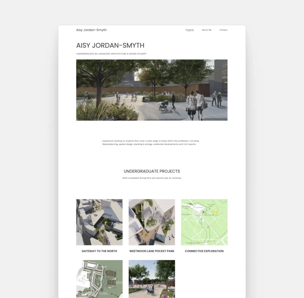
Aisy Jordan-Smyth's website
Template: Palazzo
Aisy Jordan-Smyth’s portfolio starts with a stunning render from one of her projects. It shows how her plan will be used, which is intriguing enough that we want to see more. Other than her projects, she’s kept it minimal, which allows her images to shine.
Don’t be afraid to show a certain perspective of your designs right at the beginning. Just keep everything around it minimal.
#5 Showcase your skills

Cover page example by Jacob Agoglia
Template: Museum
Keeping your PDF portfolio under 10 Mb isn’t an easy task, and often you won’t have room for sketches inside. However, Jacob managed to include them on his cover—and later on the project thumbnails of the website version of his portfolio. Perfect solution!
Your sketching skills can be showcased on your portfolio cover if you don’t have room for it inside.
#6 Keep it consistent

Melissa Domenici's portfolio website
Template: Loft
The above-the-fold section of Melissa's portfolio is a stylish introduction to a sophisticated collection of projects. The hero is brought to life with an interactive slider, presenting highlights from the portfolio below. As you explore the pages within, there's a remarkable harmony—a consistent dance of colors, images, fonts, and layouts.
For a cohesive look, use the same fonts and colors in your portfolio as on your cover.

The architecture portfolio website and PDF covers of Sophia Dagan
Template: Agora
In the case of Sophia’s portfolio and its cover, it’s the monochrome look all throughout that brings the element of consistency. It starts with the sketches at the top and continues throughout the case study thumbnails, and even the photo in her about me section.
The use of color, or the lack of it, can be a powerful tool to create consistency.
#7 Express your creativity
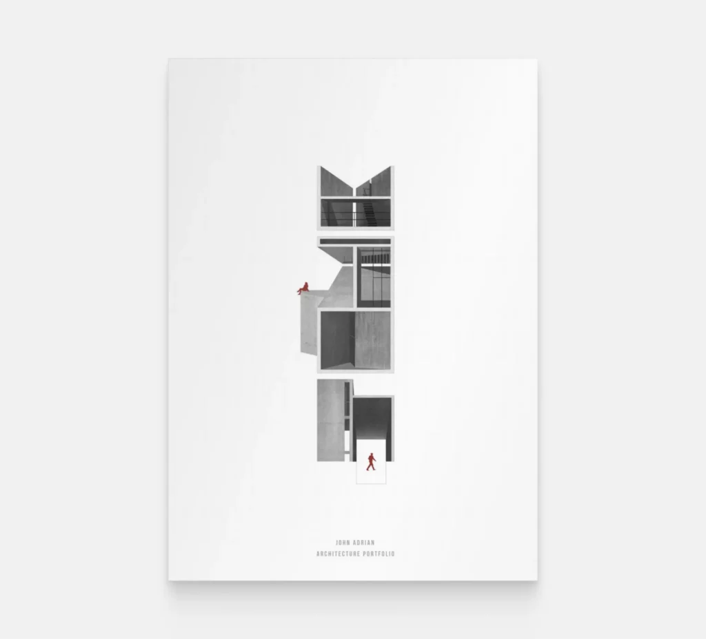
Portfolio cover example by John Adrian
John Adrian created a composition that is easy to understand, yet full of intricate details that keep our attention. He played well with the monochrome visual and the maroon accent color.
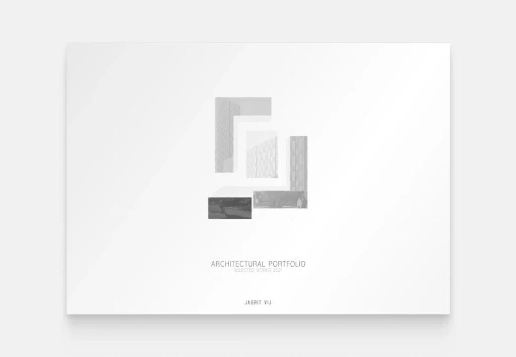
Example from Jagrit Vij’s portfolio
Jagrit Vij’s portfolio was created for landing an internship position. We love the originality of the building graphic. Not sticking to regular visualization rules, he’s managed to create something unique.
Let your creativity run wild. Try to let go of the rules and focus on what you’d like to express with your architecture portfolio.
#8 Make a strong first impression
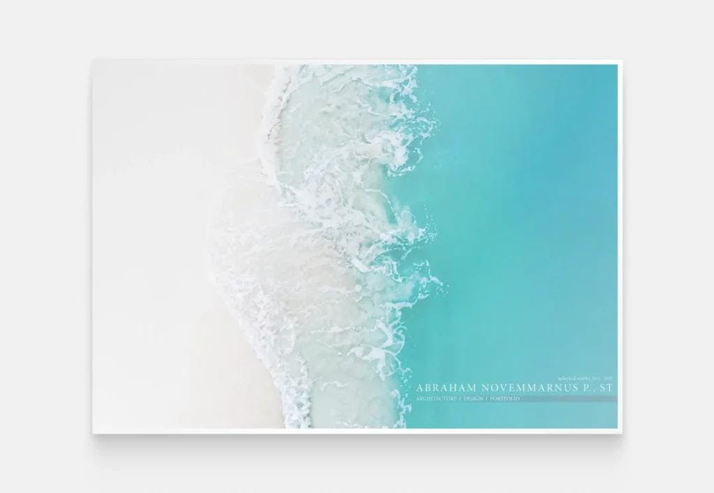
Abraham Novemmarnus' portfolio cover page
The portfolio of Abraham Novemmarnus is not something you see a lot of. If you put it next to 5 other portfolios, your eyes will definitely be drawn to this one. He used the sea as inspiration, creating the illusion of a sandy beach.
Think about how your portfolio will be received and how you could stand out from the crowd.

Amal Saud’s architect portfolio cover and a few highlighted projects
Template: Metropolitan
You can stand out with architectural images as well. Amal’s portfolio cover features a picture from one of the portfolio’s highlighted projects, looking stunning and giving a sneak peek at the same time.
If you have an especially stunning project image, don’t be afraid to use it as your portfolio cover
#9 Don’t be afraid of using colors
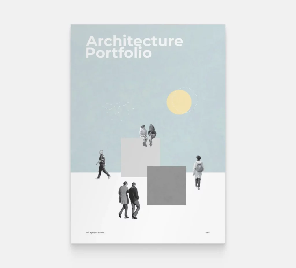
Cover page example by Bui Nguyen Khanh
We love how Bui Nguyen Khanh created an architectural composition without including the building itself. It shows the architectural vein. She used black and white cutouts but chose a dusty blue background.
While most architectural portfolios are black and white, feel free to experiment with colors. It will help you stand out among other portfolios.
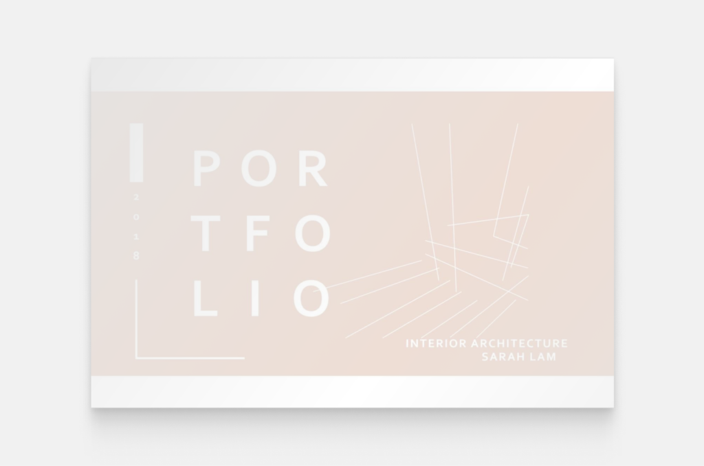
Sarah Lam’s cover page
Sarah Lam’s interior architecture portfolio is elegantly simple, but the touch of its faded pink color gives it liveliness. The subtle line drawings provide a visual reassurance that we’re about to see some stunning projects.
Don’t be afraid of using colors, but also consider how it will look if your portfolio is printed in black and white.
#10 Pay attention to your images
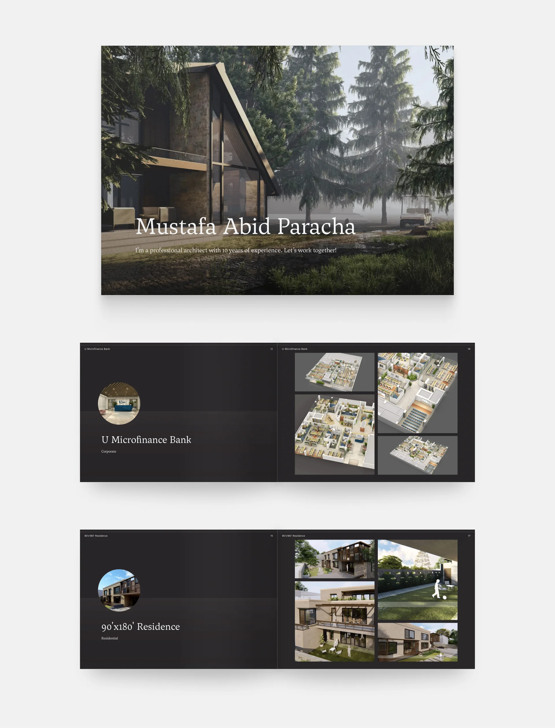
Mustafa Abid Paracha's professional architecture portfolio
This cover not only invites us to discover more of Mustafa's work but also communicates a decade of expertise. It features a captivating, full-page background image of a beautiful render with greenery. The use of a serif font adds a timeless elegance to the cover, complementing the overall aesthetic.
If you’re using photography or renderings, make sure to opt for the best-quality for a good first impression.
#11 Use typography to your advantage

Aksh Palan's portfolio website
Aksh's architecture portfolio cover commands attention with a bold and sleek design. The elegant dark background and bright text create a striking contrast. The hero section includes a dynamic slider that walks us through the project highlights. It's incredibly easy to understand their site thanks to the visual hierarchy achieved by following typography best practices.
Typography can help you guide your audience’s eyes from the most important information to the least important one. Use it to your advantage.

Nadya’s portfolio homepage with standout typography at the top
Template: Downtown
The same concept works in light mode too, of course. In this instance, Nadya chose to write “Portfolio” with big bold letters underneath her website menu. You see her name at the very top anyway, and it’s still going to catch your eyes.
Key takeaways – summary
We’ve shared 11 tips with you throughout the article, so now let’s summarize what the architecture portfolio cover examples above have taught us:
- Keep your cover simple, but interesting.
- Be clear, and include the most important information (e.g. a title, your name, the date, etc.).
- Show your originality.
- Give a sneak peek into your projects.
- Showcase your skills, wherever possible.
- Keep your design consistent throughout your portfolio.
- Express your creativity on your cover page.
- Make a strong first impression.
- Don’t be afraid to express yourself with colors.
- Only use high-quality images.
- Use typography to your advantage.
Ready to create your architecture portfolio cover?
If starting with a completely blank page isn’t your thing, we’ve got you covered.
In Archifolio, you start with a portfolio template that will get your creative juices flowing. The sample content and pre-built case studies give you an idea of what to write and where, you just need to customize it all to fit your design style.
Creating your portfolio takes no time with the intuitive what-you-see-is-what-you-get editor and global design settings. And the best part? You can use the website as your master portfolio, and export different PDF versions of it anytime.
It’s optimized to keep the image quality high, and the file size low.