Mastering Storytelling in Architecture Project Pages – Insights from Nikita Morell
What are some of the biggest mistakes that architects make when writing their project page copy? Why is written content so important in a portfolio? How should you structure your project page?
To answer these questions, we sat down with Nikita Morell, an expert copywriter and marketing strategist who works specifically with and for architects. She's also the leading face of architectural copywriting, the creator of Architects Wordshop and Site Smart, and the writer of emails that make even the most serious architects smile.
Importance of copy in portfolios
Question: Architecture is very visual. Why is copy so crucial and important then?
Nikita: A lot of architects think that their work can speak for itself. Obviously, to some degree, it can. But words paired with visuals give visuals context, and it also helps to direct their attention.
There might be an image of a beautiful facade. As a viewer, you look at it, and you think, “Oh, that's nice.”
But when you've got words, you can really tell the story.
You can say, “Well, hang on, look at this part, and this detail, this is why it’s not your average facade,” and give a lot more depth and detail.
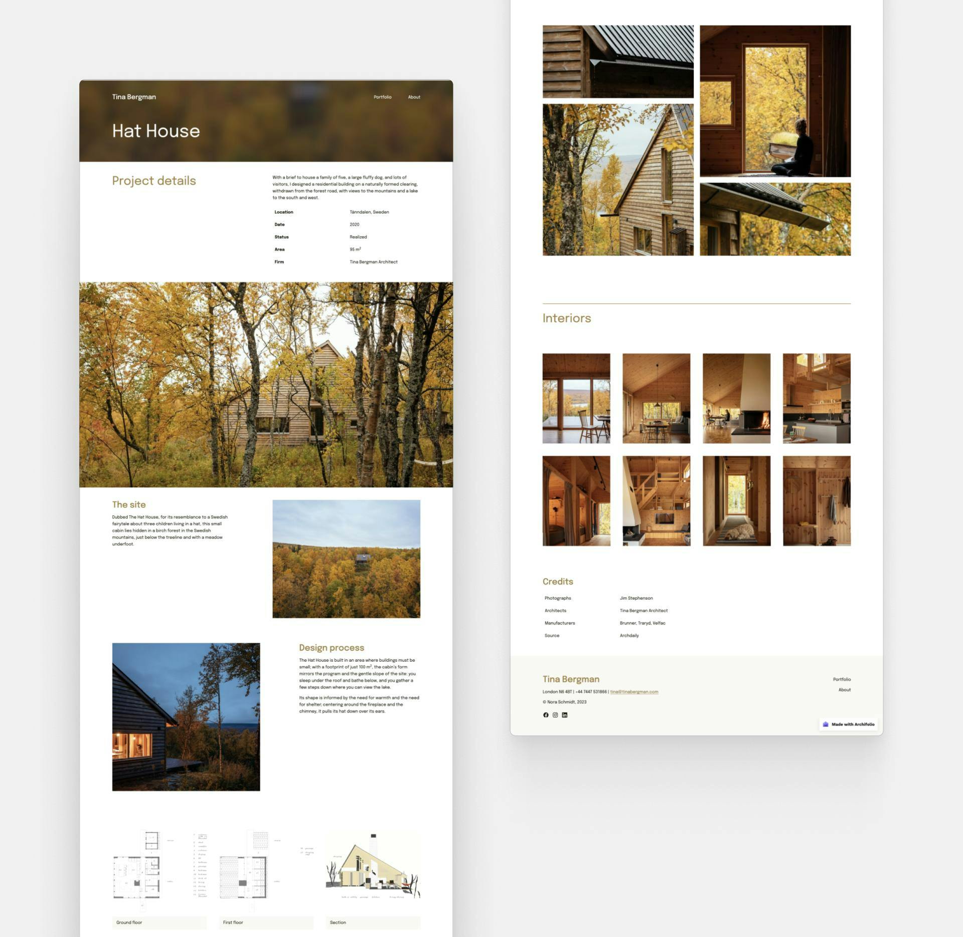
This site was created with Archifolio's Palazzo template
Biggest mistakes in project pages
Q: You've studied over 600 architecture websites. You've seen the good, the bad, and the very bad. What are some of the biggest mistakes you've seen when it comes to project pages?
N: The biggest mistake is not having any words. Just carousels of images without the powerful context that words bring.
Another big mistake is not thinking about the person reading the project description.
What I mean by this is that you want to be writing for your ideal clients. When they see a project, they should think, “Oh, they've done this before, they can do that for me.”
And finally, a big mistake I see is that the copies are overly descriptive. They just say that this is the facade, that is the interior, and they’re not telling the story of the project. Describing on a surface level what the images are isn’t going to elevate your project.
Q: How much copy is too much?
N: It’s hard to give an exact amount that will work for everybody. I've seen a lot of different types. But as a rule of thumb—depending on layout—around 250 to 500 words is a good amount.
However, a good thing I've seen is to put the viewer in control of how much they want to read. Some architecture practices, like David Chipperfield, have a short version, which is just a few short sentences, and then it says “Click here to see more” which opens this whole case study. So, it's like a journey allowing the reader to control how much information they get.
However, it’s also good to note that you don’t need paragraphs. On my website, I've got this thing called the Project Description Blueprint, where I go through different ways to lay it out. One of them is just having subheadings and bullet points.
The bottom line is that you have to be thinking about these ideal clients. How are they reading project descriptions? A commercial property developer deciding based on just the hard data will most likely just skim the text. But a homeowner will be emotionally involved and therefore will appreciate looking behind the scenes.
You’ve got to be in the mindset of how they're consuming the information.
Storytelling in project pages
Q: How should you tell a story on your project page?
N: I've actually come up with a framework, and it's called the Archi Project Story Arc™. Pretty much every story—whether it's a movie you watch on Netflix, or it's a novel that you read—has this universal story arc.
- It starts with setting the scene. In other words, it provides context for the project. What was the site like? What's the surrounding environment like? What were some of the constraints?
- Then you start introducing the characters. In your project, this might be your clients, the contractors, or other people who were part of the project. Here’s the perfect opportunity to introduce the client brief.
- Like most stories, it should build up to a climax. What were the challenges you faced? How did you overcome them? What was the client’s experience? What was your process? The whole point of a project story is to showcase your design thinking and how you overcame certain problems. In a way, it should position you as the hero a bit.
- And then comes the resolution. What are the results? How did your project improve the lives of the clients? For commercial projects, what were the results in terms of the bottom line?
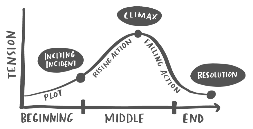
Knaflic, Cole. Storytelling With Data: Let’s Practice! Wiley, © 2019.Illustration by Catherine Madden
One hot tip that I always give my clients is to try and collect data. I know that architects might shy away from numbers, but it can communicate transparency, and position you as an expert. Try talking about percentages, visitor traffic, time spent on a project (if it was impressively low for example), or how much of the budget you saved.
Another thing that stands out for me personally is talking about the whole experience of the space not just describing what you can see. Talk about things that evoke the sense of touch, smells, and sounds. Feel free to get creative with it.
An idea that I’ve had for a long time is to create a Spotify playlist for one of your projects and embed it on your site. So, you have a given set of tunes that are playing to create this immersive experience.
Q: What are some essential elements that cannot be missed from a project page?
N: One crucial part of telling the story is talking about what your client wanted. What was the brief? Feel free to go deep into it. For example, don’t just say that it was a residential project. Say that they were a growing family, and they wanted more space and storage in their house. Your potential client might be in the same shoes, and thus, it will get them involved in the story. And then moving on from there say how you met that brief.
You should also talk about certain design elements, but you don't want to be stuffing too much into these project pages. I would recommend picking three design features, design decisions, or something that really stood out in the project and focusing on those.
Q: Do you have a favorite piece of copy that you’ve seen on a project page?
N: Yes, I've got lots! Off the top of my head, Inbetween Architecture is an excellent example. I love the storytelling aspects and the amazing headlines on the project pages.
For each project, they have a “What if…” statement. This is the perfect way to show that it is a very innovative firm without having to say that “we think differently.” I'm a big fan of showing rather than telling.
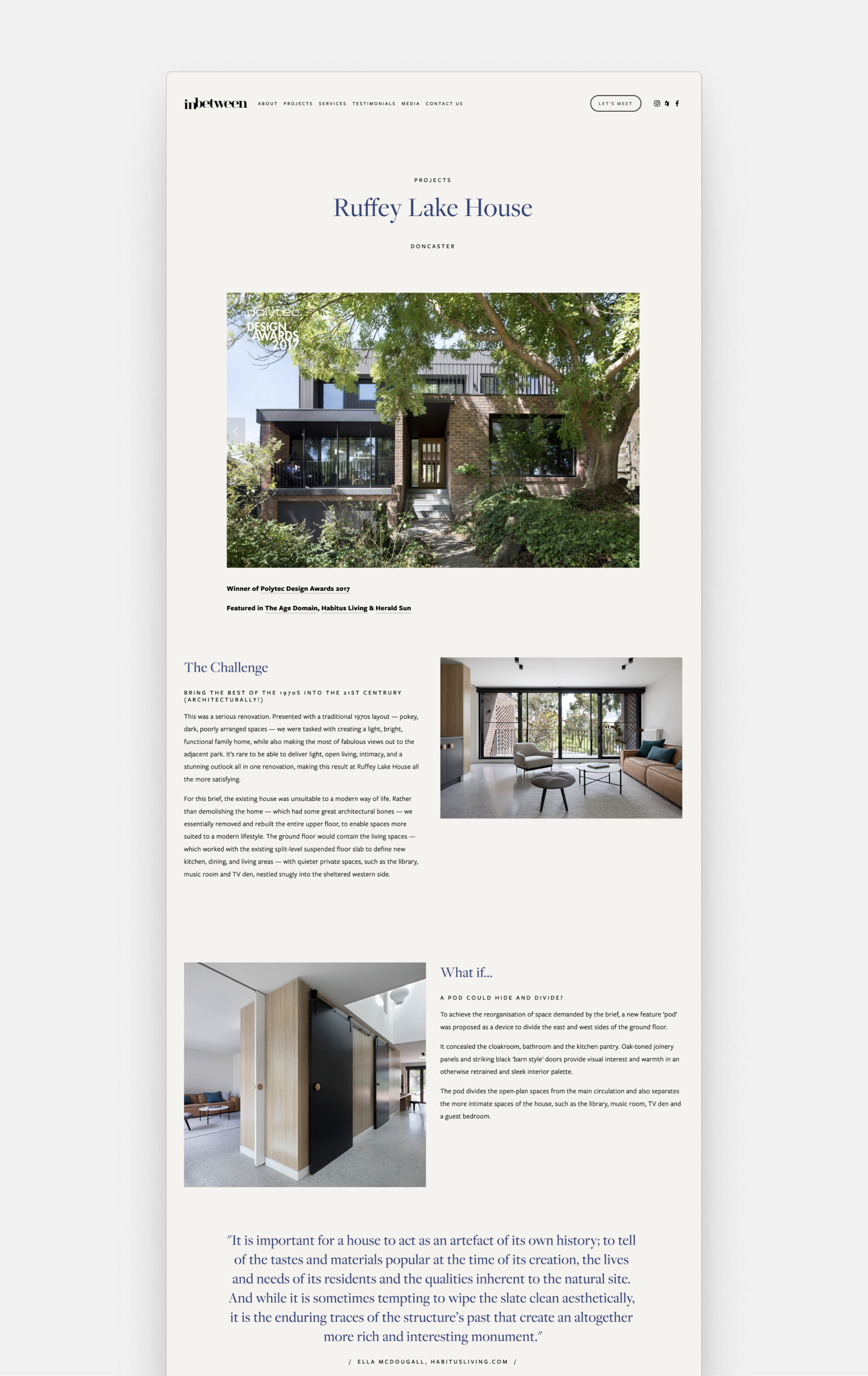
Project page example by Inbetween Architects
But the biggest thing is the way they weaved in client testimonials. They've got little snippets from the homeowner about what they're loving about the house.It shows those results and the resolution of the story without being very forced. I really liked them.
Finding your own voice
Q: Can we still utilize the idea of an “ideal client” when someone’s applying for a job?
N: Absolutely! When you're writing a cover letter for an ideal job, you'd have to be thinking about the person reading it. Potentially they have read a hundred other applications, so the question is: how can you make yours stand out? That's where words come in. And not only words but tone of voice.
For example, for an employer that’s overwhelmed with applications, sending a cover letter that uses short, sharp language will sound different from all those other cover letters they've read. Thus it will definitely help you stand out.
And the same goes for your project description. You need to think about how you’ll be different from all those other applicants. It could be your visuals, the portfolio design, the overall feeling your portfolio evokes, and it could be how you sound different.
And this last bit, your words, are often the one overlooked.
Q: How can architects find their unique voice?
N: I actually studied tone of voice last year, I did a big course with Justin Buckman, a voice expert. And there is a lot of science to it, which I think a lot of people don't realize.
First of all, there’s voice and there’s tone of voice. Voice is the main component, a testament to who you are as a person. It goes unchanged no matter what. It’s the tone of voice that’s adjusted to the situation at hand.
There are a number of elements contributing to your unique voice. Three of these are:
- Your vocabulary. There are lots of different words for the same thing, and it does matter which one you choose to use.
- Your cadence. Do you use short, sharp sentences that give a sense of urgency? Or are they more poetic and long?
- Your tone. The tone is a bit more complex. Do you want to be friendly and warm, or do you want to be remembered for being witty and bold?
Obviously, your tone on your website might be different from a serious proposal document, even though the voice will be the same. There's a lot of nuances with that.
The way I help my clients keep that consistent is I create a voice style guide, which has the do's and the don'ts. It is quite in-depth. It goes into little details, even tiny grammar things—like do we say “do not” or “don’t”? Small things that add up to a big picture.

ChatGPT for architects?
Q: Should architects use AI writing tools? What are some of the pitfalls to look out for?
N: I'm actually currently working on a webinar for architects to use ChatGPT. I think if used in the right way, it’s a very good tool. It can definitely help with things like your homepage tagline or project descriptions. I've been doing a lot of testing, to see what is the right kind of input for maximum effect.
I think the biggest pitfall is that AI writing tools just haven't nailed the voice part.
It’s clear that what comes out isn’t coming from your firm. However, it can be a great starting point.
In short, I'm a big fan of it. And I think architects should definitely use it.
Working with Nikita
Q: How can somebody get your expert help and advice?
N: My personal mission is that I want to help as many architects as possible. I am passionate about helping solo architects or smaller firms, and I know that not all architects have big marketing budgets. That’s why I’ve created Architect Wordshop and Site Smart, my six-week-long course, helping architects get their website messaging done.
In all honesty, Site Smart is probably the next best thing to work with me one-on-one because I'm on the calls every week and it's very hands-on. But when people just don't have the time or capacity to even be a part of the copywriting, I just get it off their plate.
We recommend subscribing to Nikita’s emails, which are not only helpful but genuinely funny and entertaining as well.
Q: What do you have planned for the future, what should we be looking out for?
N: Two things:
- Site Smart is opening up for enrollment in September 2023. We'll be kicking off in October. Over a hundred architects who want to get their website done for 2024 are on the waitlist, but it’s worth joining. Also if you just want me to take care of your website’s copy, you can get in touch with me and we’ll work from there.
- And then the other thing that I've been working on—which is quite exciting,—is called Testimonials in One Hour. It's a masterclass on showing architects how to write solid testimonials.
Testimonials help you tell the stories of your projects. So a lot of it goes back to what we've been talking about today.
