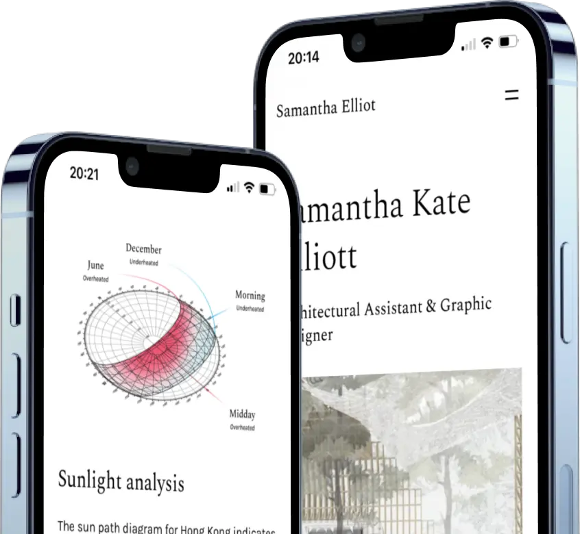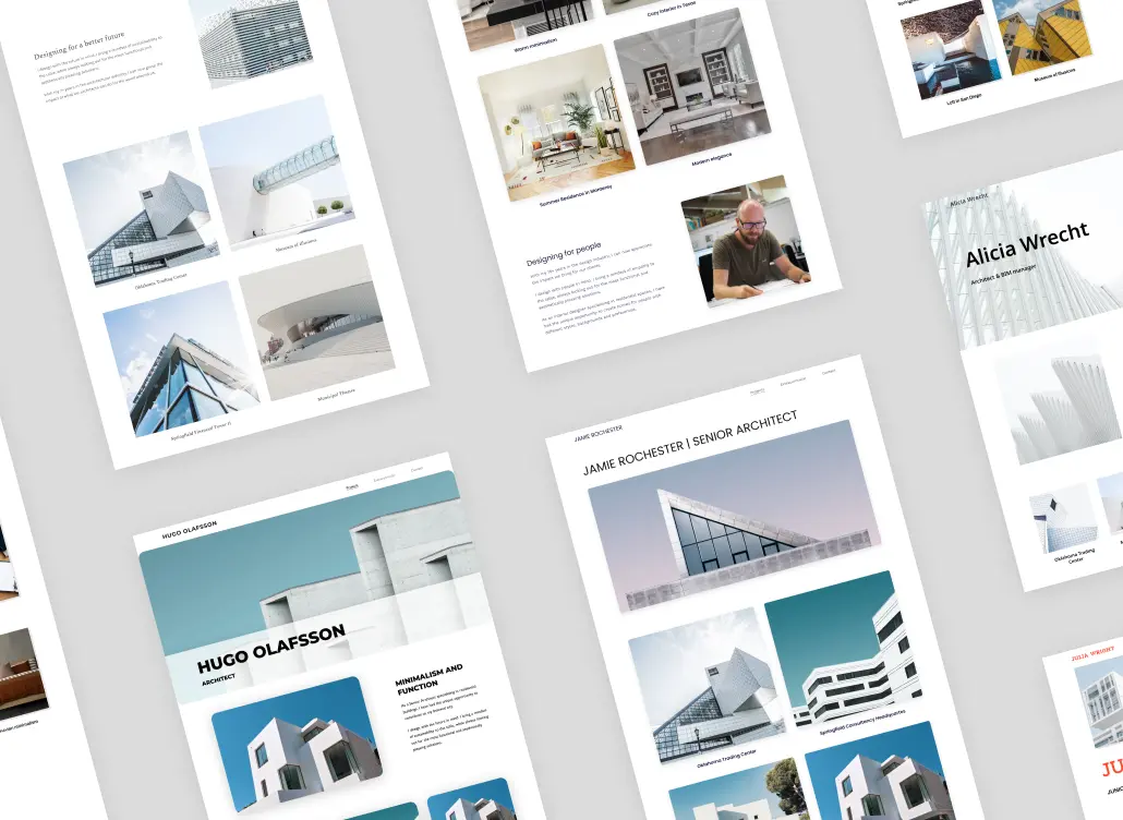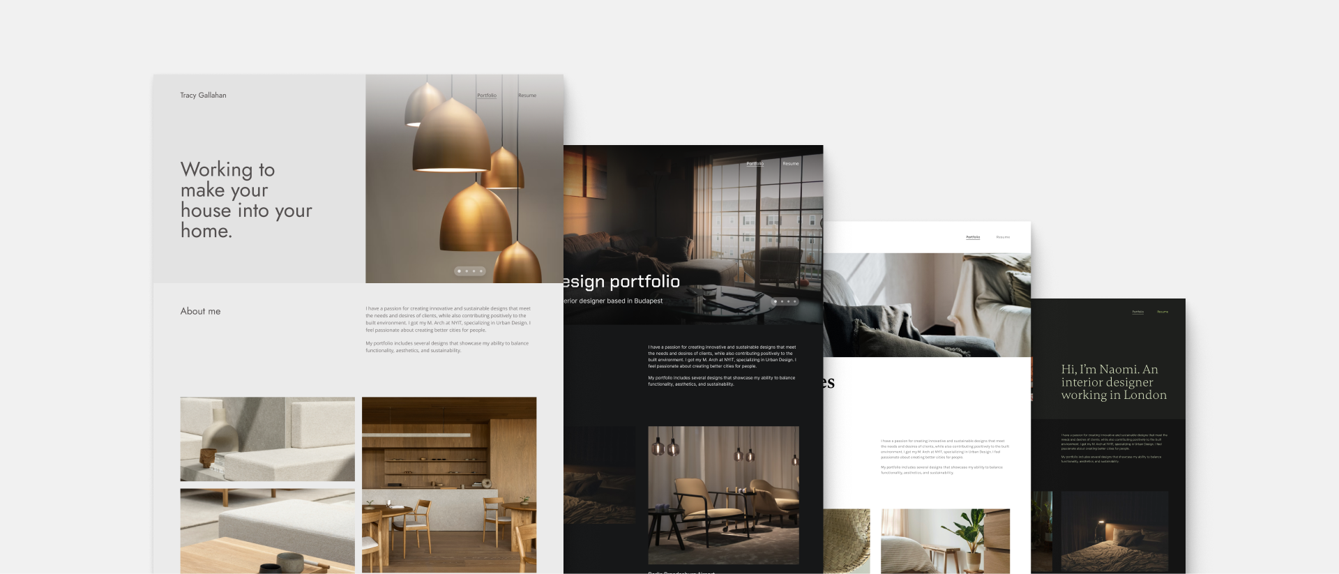
There's an endless number of interior design website templates out there. So why do we think that you just found the one that will work for you?
Because we made these templates with you in mind. We built Archifolio specifically for creative professionals, who could do with some extra time on their hands. What you get here is not only a pixel-perfect website theme, it's also a tried-and-true formula for an effective portfolio website.
So, without further ado, here are the 12 fully responsive interior design website templates that you'll be excited to share.
Interior Design Website Templates in a Glance
To get started with these templates, just click on the one you like the most, and create your account in Archifolio. No need to download them or to add them to any application.
Once you're in the editor, you can customize these templates to further fit your style.
Structure & layout
These website themes are made up of sections. As you edit your site in real time, you'll see how these sections will appear on your live site.
You can add and remove sections as you like. You'll find general, blank sections that you can fill out, but we also created presets. These have dummy texts that serve as text templates, which you can then use to write about the topic in your own words.
When you sign up, we ask you about your profession, and it's not in vain. When you select "interior designer", we'll set a relevant structure and fill your site automatically with relevant content.
Colors & fonts
You'll find plenty of ready-made font presets and color palettes, but you can also add your custom colors.
Thanks to the global editing in Archifolio, you'll keep a consistent style throughout your portfolio. This means that you can play around with the templates, colors, and fonts and see which one fits your content the best, your images and copy won't be affected.
Responsivity & format
What's more, you don't have to worry about mobile or tablet view, it's all taken care of, and your site will look stunning no matter where you view it. Plus, you can also export your site as a PDF, which allows you to use your portfolio offline or even print it out.
Are these templates free?
Yes, you can access these templates completely for free. You can try out every feature in Archifolio in the Free plan.
No credit card information is requested when you sign up, and you will not be charged until you decide to upgrade to Premium.
With Archifolio, you don't just get the templates, but a portfolio-building tool that helps you edit, share and export your portfolio to PDF. There are a couple of Premium features that allow our Premium community to further customize and make the most out of these templates.
But the good news is that even as a free user you can try out everything in the editor (even the Premium features), you just won't be able to save them until you upgrade.
What do you get with Premium?
- Your domain: We host your website for free on Archifolio with a default URL. However, if you'd like to have your own domain (e.g. yourname.com or yournamestudio.com), you can get that in a hassle and jargon-free way as a Premium member.
- Fonts & Colors: Every template comes with a default font and color preset, which you can use for free. However, you can change it to reflect your design aesthetics and branding with the Premium plan.
- Project publishing: You can have as many public project pages with Premium as you want. Plus, you'll get unlimited storage for your unlimited ideas.
- PDF export: Do you need your portfolio to be both online and offline? With Archifolio Premium, you can export your whole site as a PDF.
Templates in detail
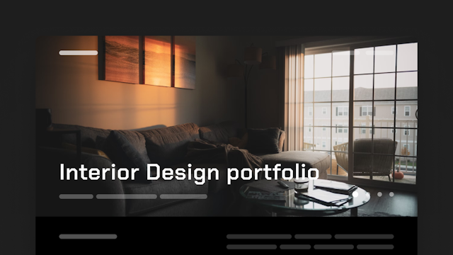
Metropolitan
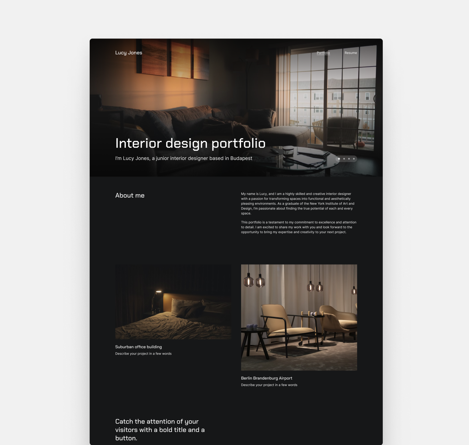
If you choose Metropolitan, you won't create a website - you'll create a statement. It has a dark background that sets the stage, and then the text in white pops elegantly. And the font isn't your run-of-the-mill typeface either. It's edgy, unique, and unexpected.
This website template starts with a slider that lets you showcase your top-notch images in all their glory. Thus, you can place your favorite projects front and center.
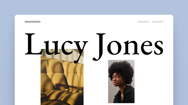
Downtown
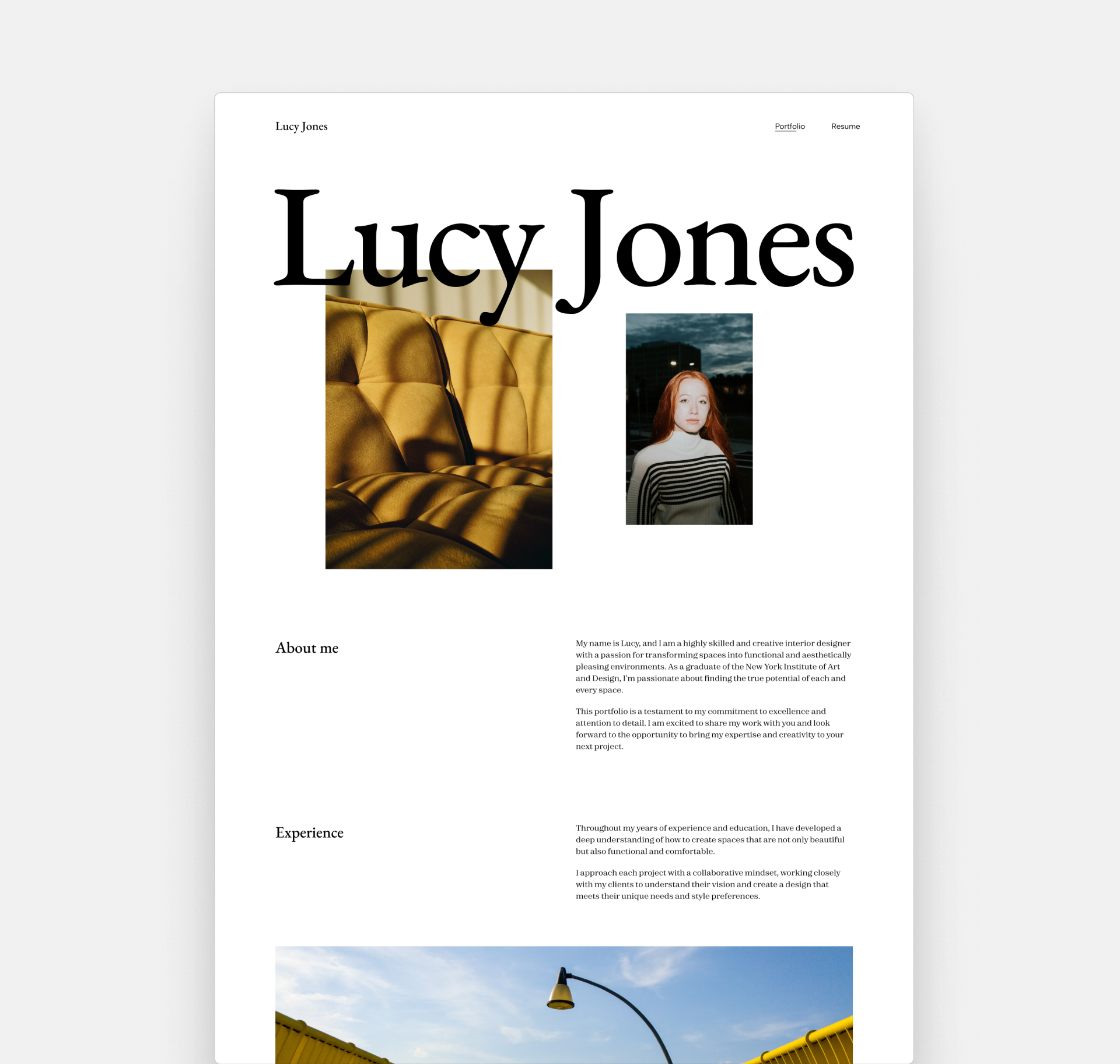
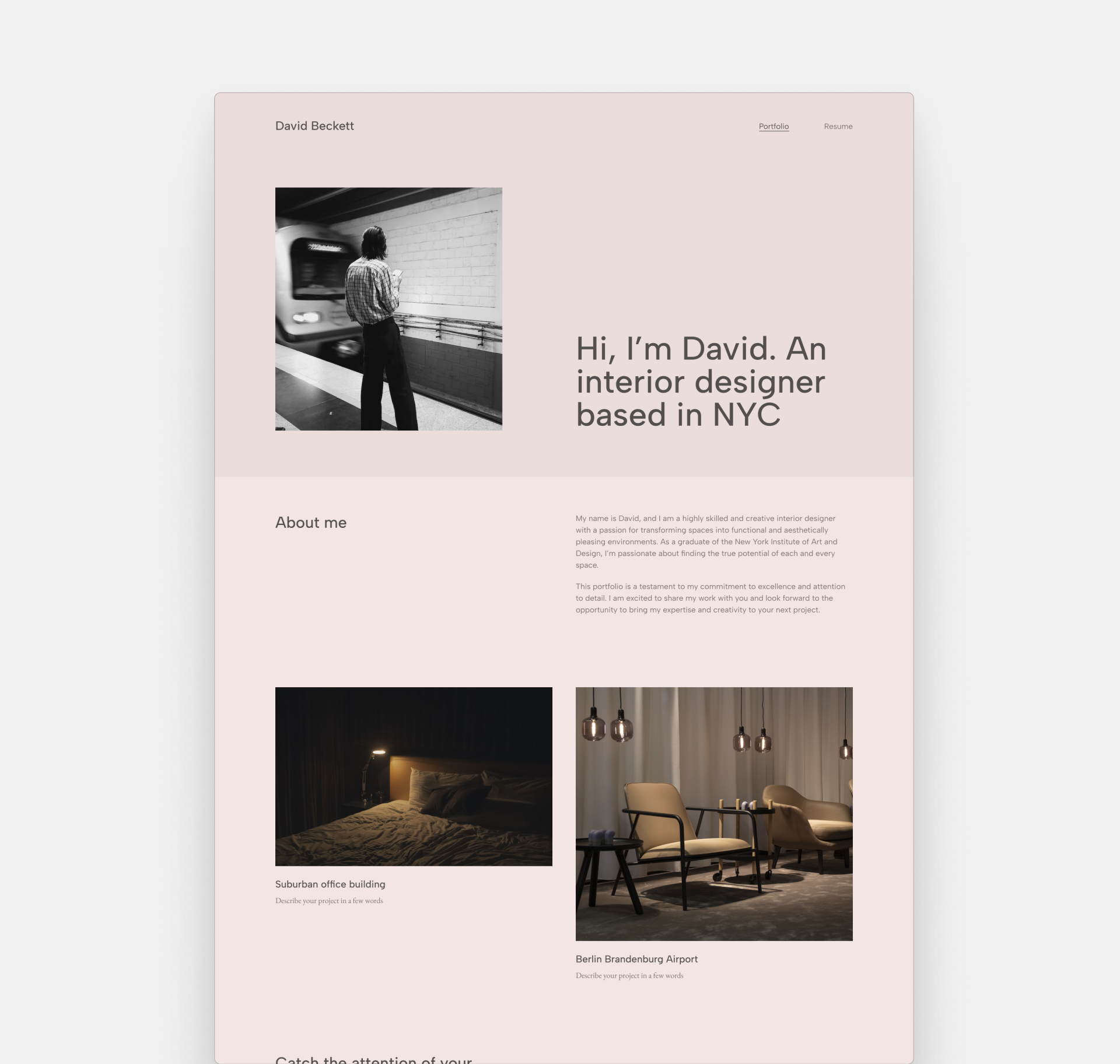
Transform your portfolio into an experience of its own. As soon as someone lands on our page created with Downtown, there's this massive title in the middle. Right below that, there are two hero images side by side, for a portrait of you and your best project image.
Your name, your face, your signature project – all in one inviting hero.
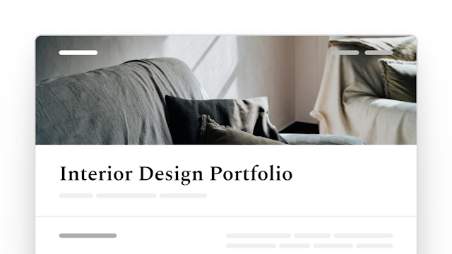
Agora
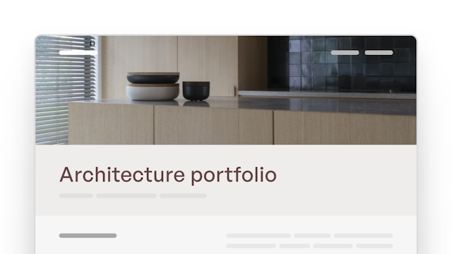
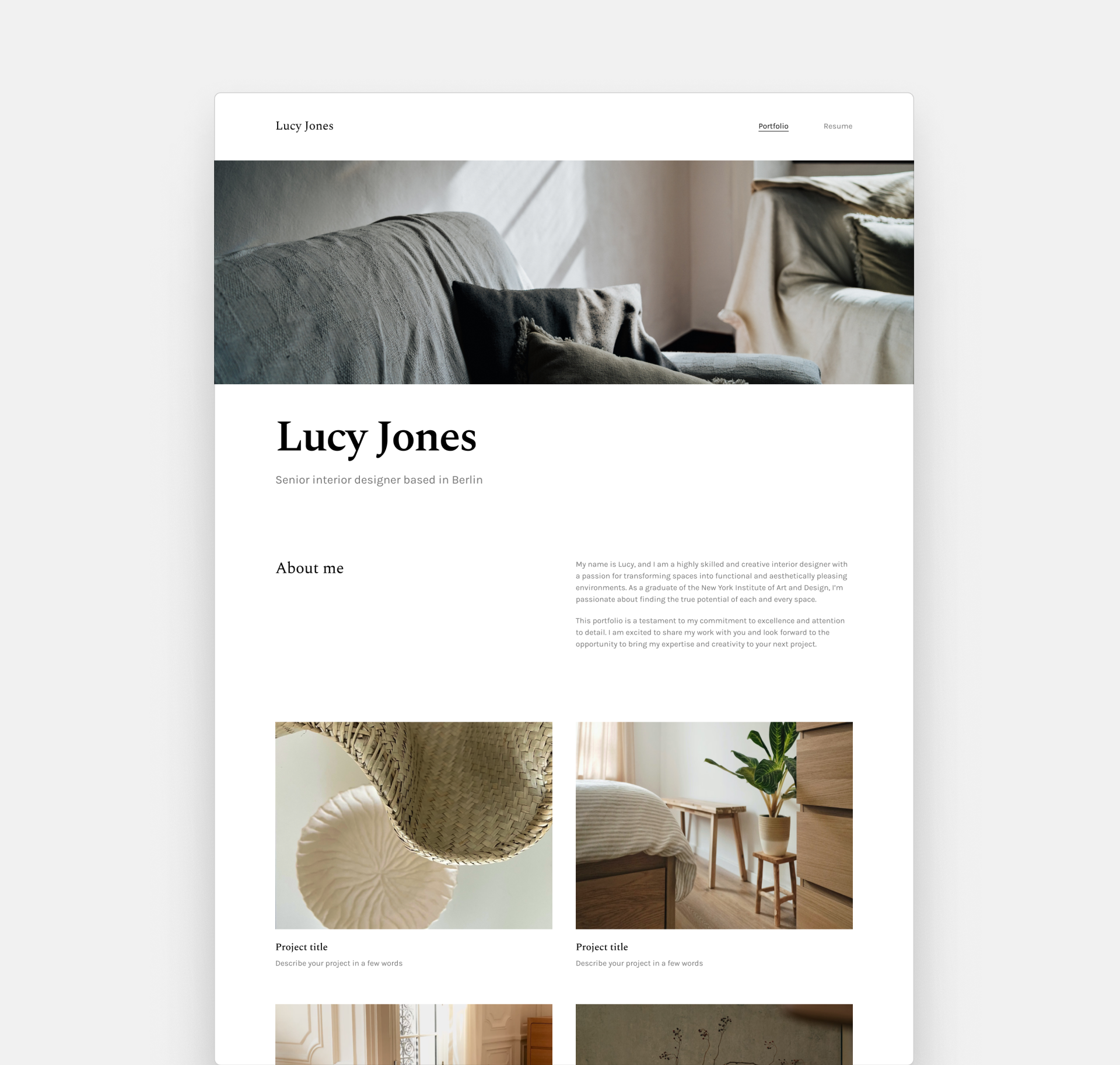
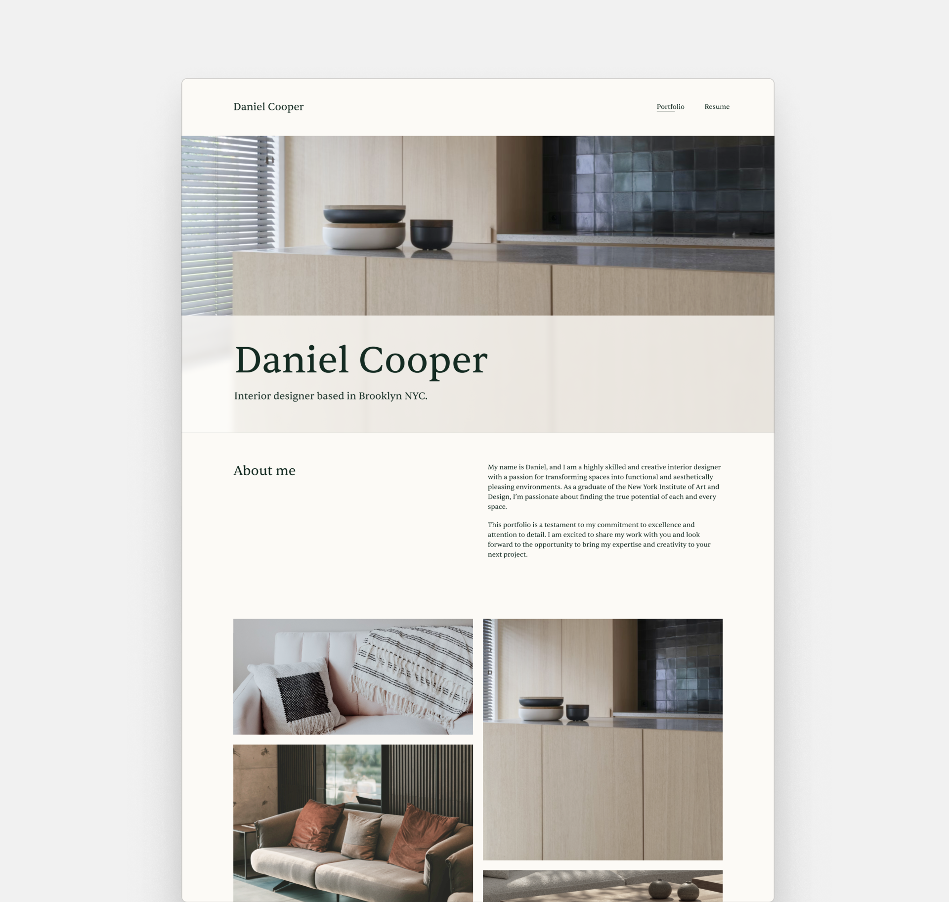
Agora has everything you need in a website template. Full-width hero image, straightforward but inviting intro, and effortless navigation.
Those massive thumbnails practically beg to be clicked on. And when you do, you're in the heart of the project page. It's like your portfolio is inviting people to step into the stories of your designs.
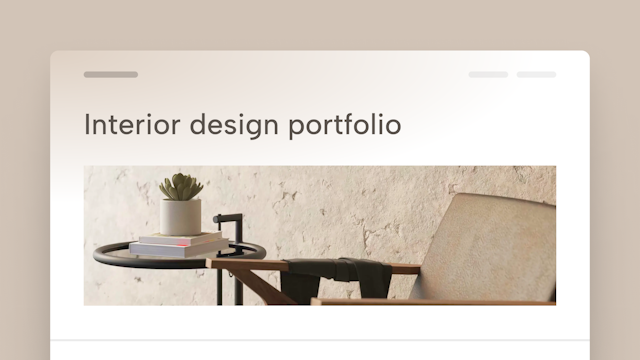
Palazzo
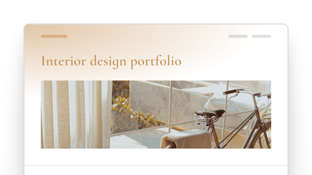
Effortless elegance is an understatement when we talk about Palazzo. The hero is airy, with tons of white space, yet the composition of the title and the cover image is tight and put-together. The main design element is a play on light –just as in your interior design projects.
The uncluttered layout and the modern font make this template what it is: a modest, but stunning declaration of your design philosophy.
Loft
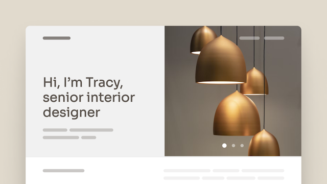
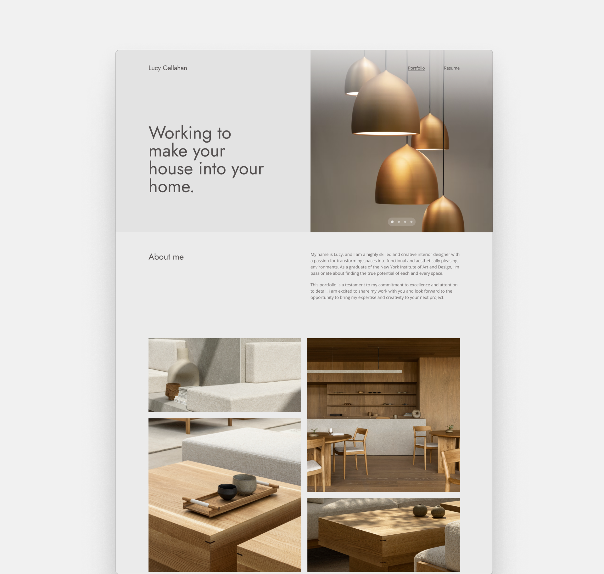
The above-the-fold section in Loft captivates your visitors from the moment they arrive. The sophisticated typeface adds an air of exclusivity, while the slider on the right creates a dynamic experience.
The default colors and fonts in this template are the perfect canvas for your elegant designs. But you can always mix it up when you're editing your site.
Museum
Museum perfectly embodies the power of visual storytelling. Starting with a captivating hero image, it invites visitors into your design world immediately. Paired with a well-composed introductory paragraph, you'll sweep your visitors off their feet.
The vast and detailed project thumbnails call your visitors to learn more about your work and leave a memorable impression about your professional work.
Modular
If you're all about that clean and minimal aesthetic, you'll love the Modular template. It's that perfect blend of neutral and contemporary.
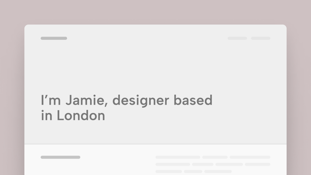
The above-the-fold design is sleek, modern, and the cool part? It doesn't even need an image to look stunning. But then, make sure that you write your copy in an inviting and engaging manner —just like the opening sentence of a great book.
Deco
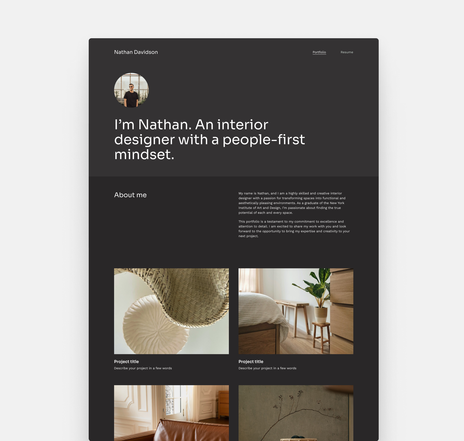
Deco is where minimalism meets impact. The hero might seem basic at first, but paired with the short introductory sentence –incorporating your approach and design philosophy– it will let your portfolio shine in its uncluttered glory.
It comes in a dark background, allowing your project thumbnails to take the lead and make your visitors want to see more.
Haus
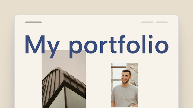
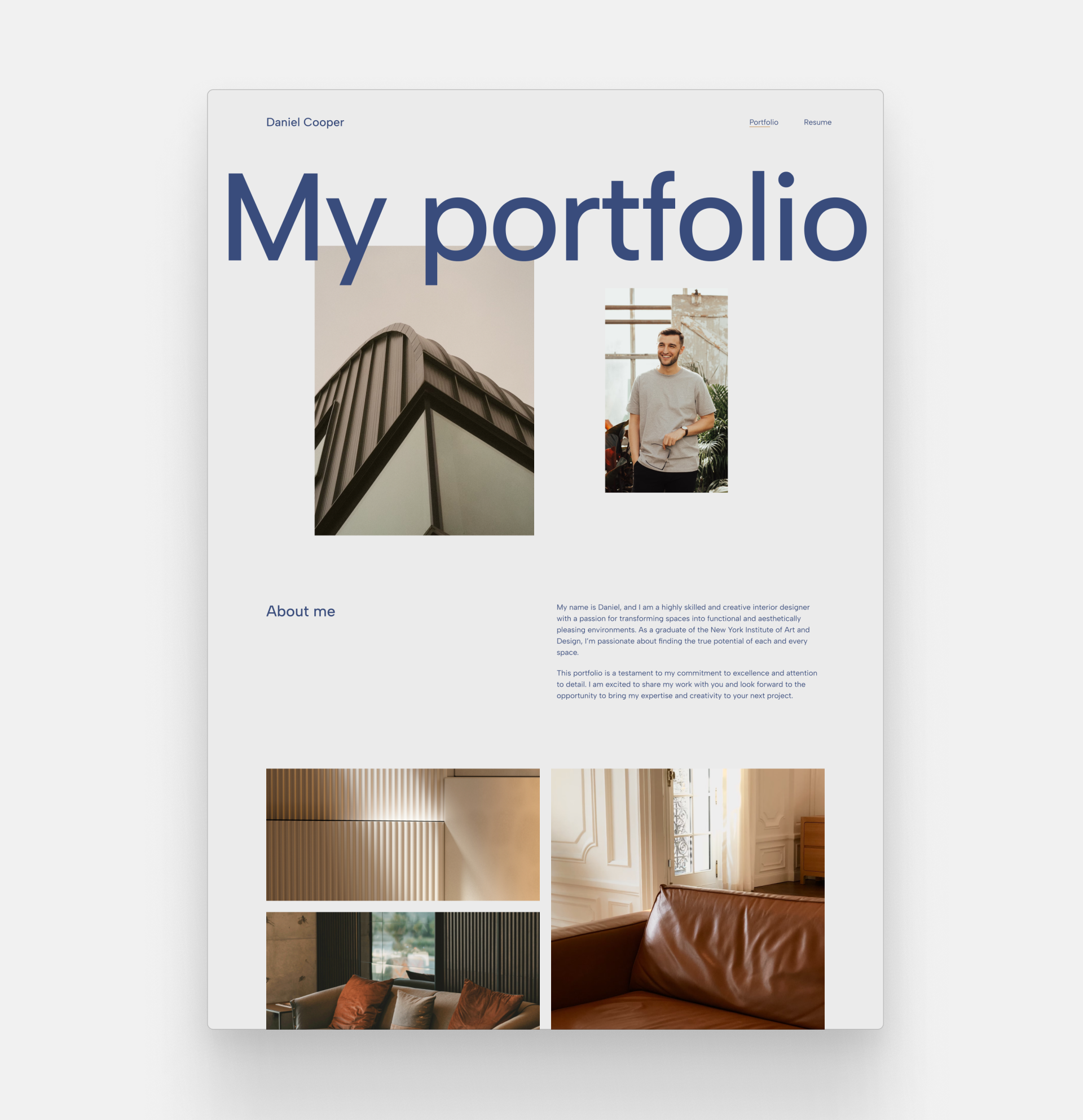
Haus radiates stability and trustworthiness. The centerpiece is the grand title, positioned in the middle, getting the attention and interest of anyone who visits this page.
With the blue color —the hue of professionalism, reliability, and depth— this template is so professional. In fact, it's so professional that it could even start to get boring—until you see the offset layout of the first two images, which brings playfulness, and personality.
Classica
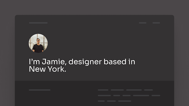
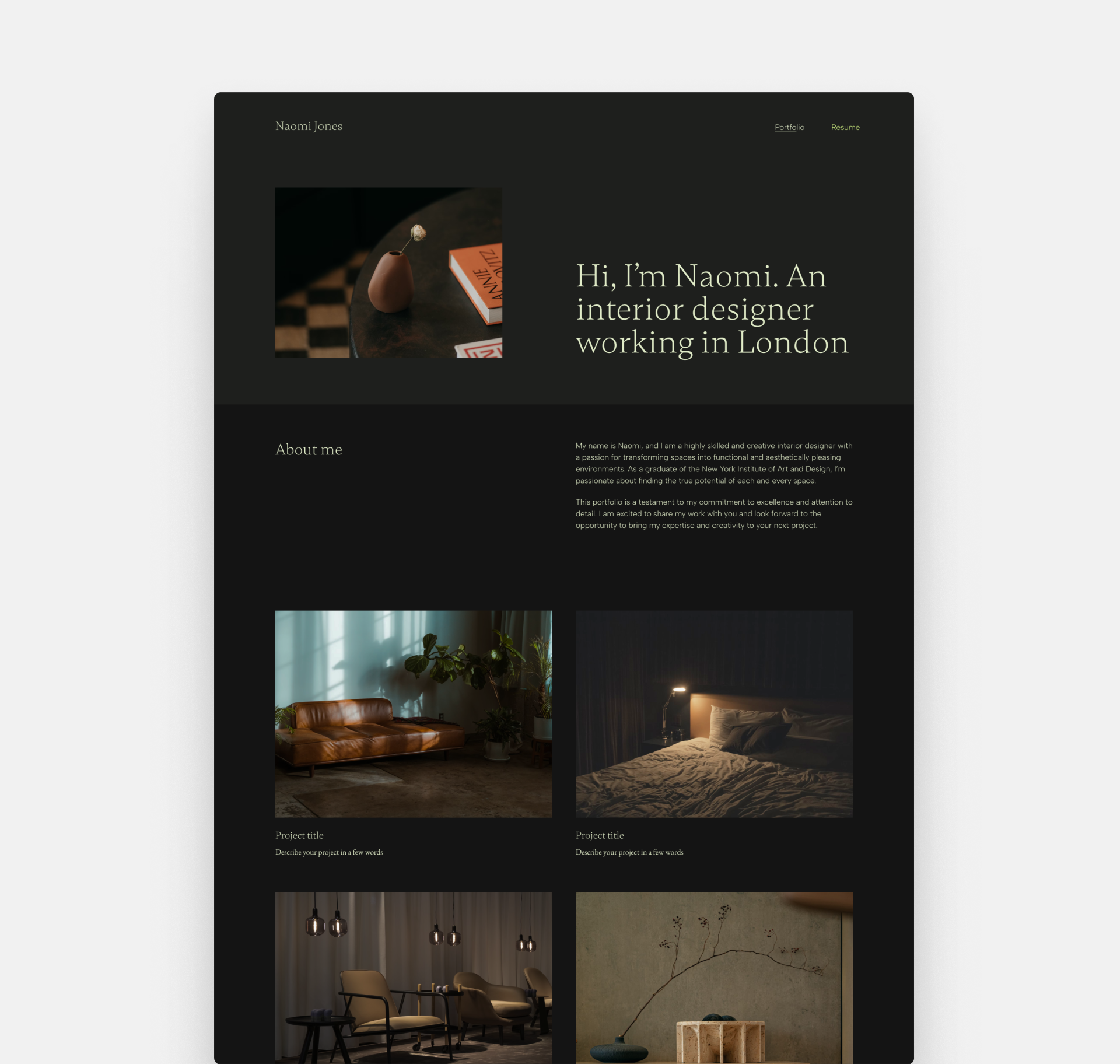
The Classica template, with its moody, modern vibe, may just be the showstopper that you've been looking for. It has a dark background and a font that's thin with a vibrant yellow color – like a neon sign in a dim alley.
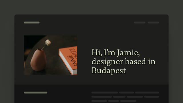
The hero makes room for a small image next to your title, perfect for a small detail that intrigues the reader to discover your portfolio. They'll be ready to find the hidden gems that illuminate your website.
Chapter
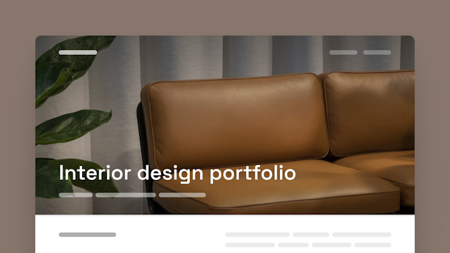
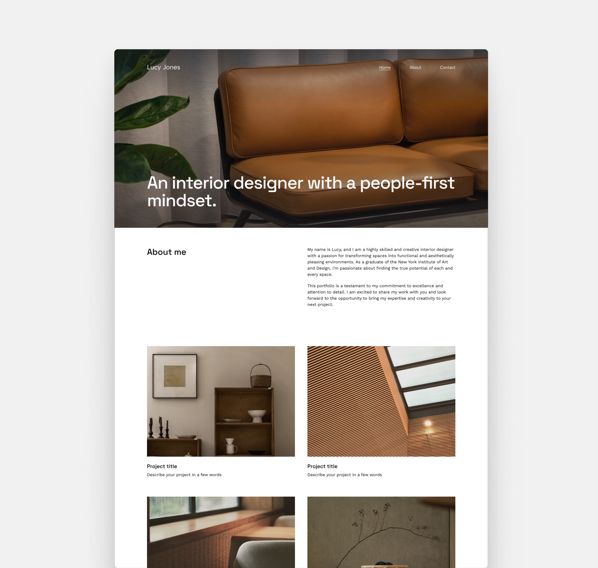
If you're looking for a lasting first impression, you will love Chapter. Here the title of your portfolio is seamlessly embedded within the hero image. Choose an image that shines the best light on your work as a designer.
The hero is like those perfectly framed photos you take to capture the essence of a space. And don't worry about legibility; there's an overlay that ensures your title shines while keeping it readable.
Beaux
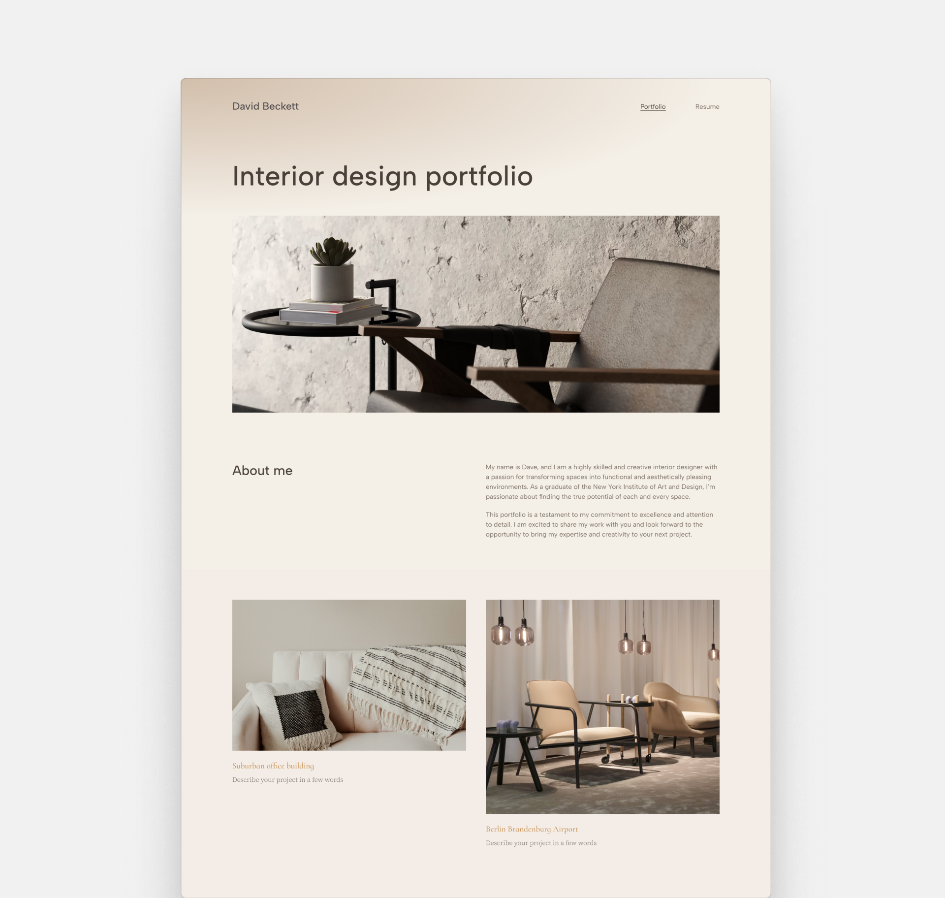
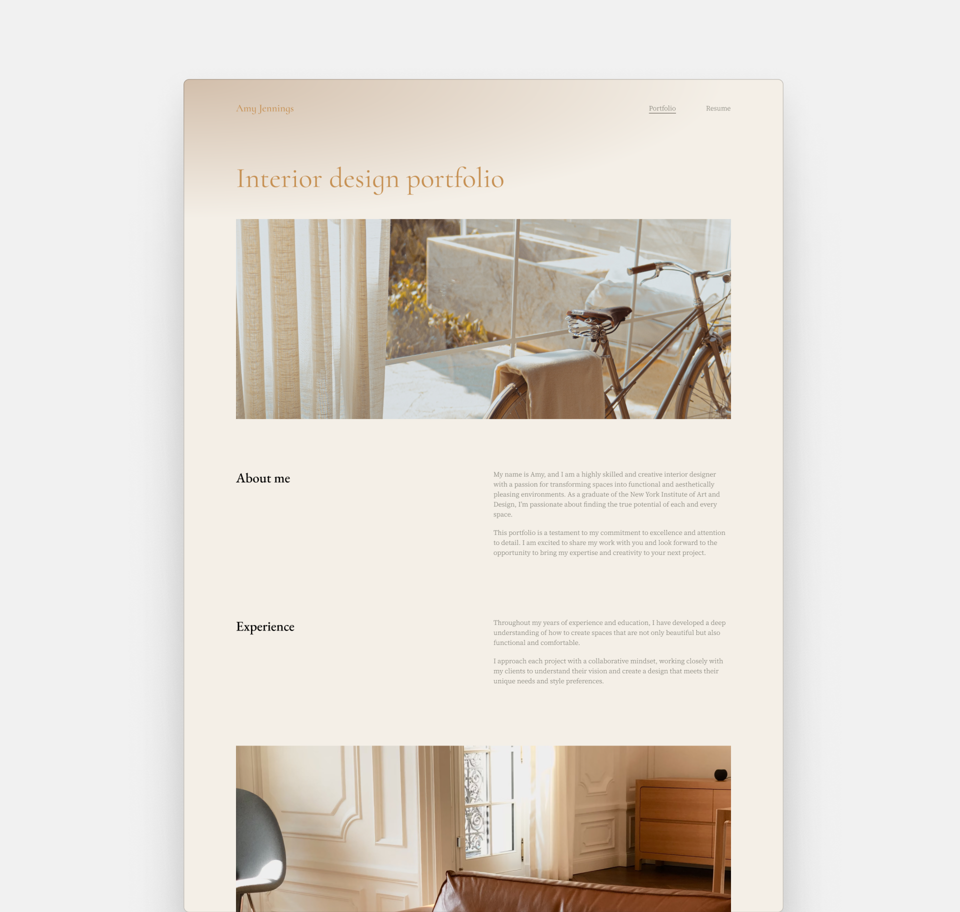
Archifolio's Beaux template is like a breath of fresh air, perfect for interior designers who want their portfolio to have that touch of class and elegance.
It's bright and welcoming, just like the spaces you design. The beige color palette pairs perfectly with the classic serif vibe, which results in a timeless style.
Interior design portfolio examples
In the creative process, looking at examples, and seeing what worked for others is an important step.
So, here we are with 6 examples to check out.
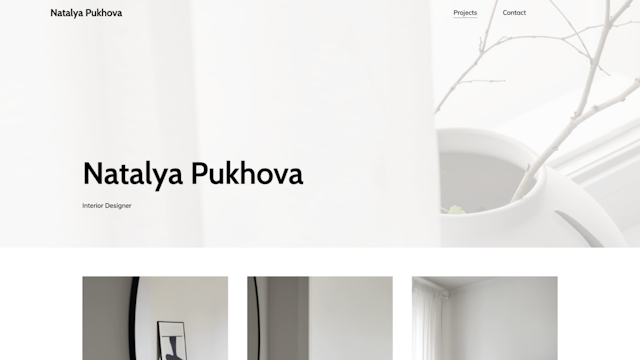
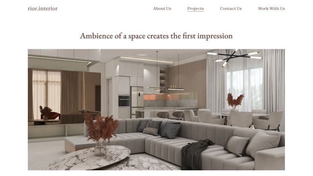
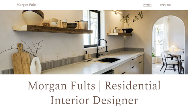
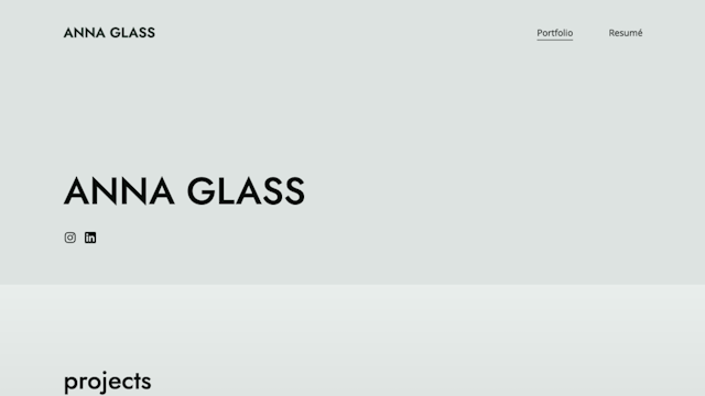
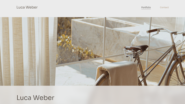
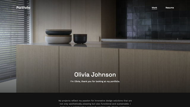
Want to see more? Visit our dedicated interior design portfolio examples page.
Now all you have to do is choose your favorite template, upload your work, and customize it to your liking. Are you ready for this next step in your career?
