Interior Design Portfolio Trends - What To Follow & What To Forget
TL;DR: Interior design portfolio trends of 2023
As designers, being open to new styles, ideas, and approaches is part of the job description. But merely keeping up with the trends is no longer enough: we need to communicate it with the world.
Show, don’t tell.
Going around and telling people how trendy you are will do little good. Instead, let your interior design portfolio convey the message for you.
Potential clients and employers want to know that you will bring a fresh look to the table. If you hand in a portfolio that looks like it was created in 2005, you won’t be considered trendy, no matter what your projects are like. Therefore, being up-to-date with the latest interior design portfolio trends is vital.
In this article we’ve collected the best trends, so you can stay ahead of the curve.
Best Interior Design Portfolio Trends of 2023
Balance instead of symmetry
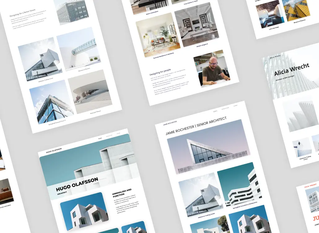
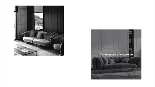
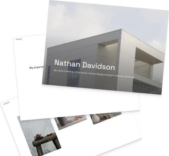
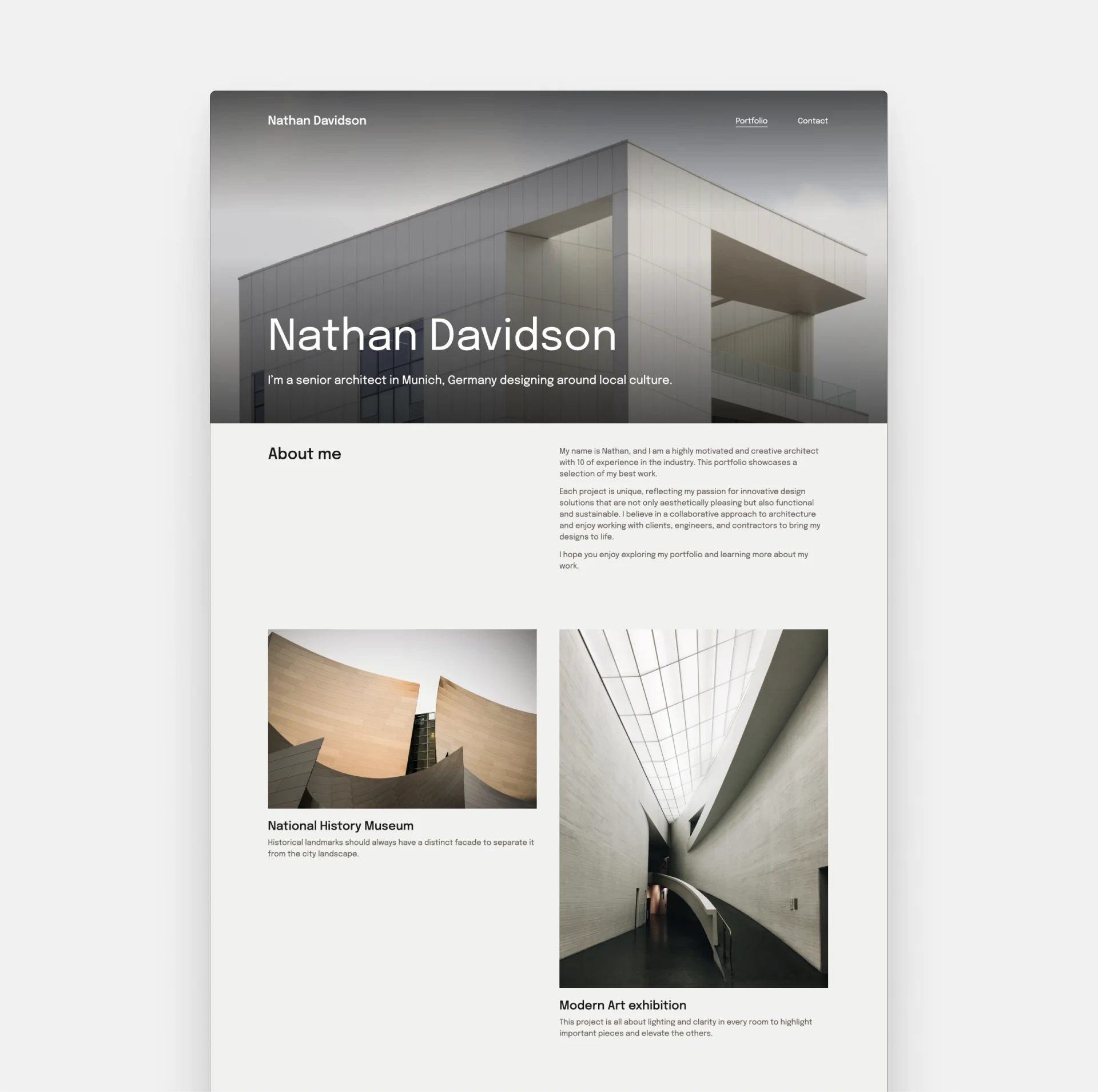
Symmetry is not the only way to achieve visual balance. In fact, avant-garde designers create compositions that feel stable, while being completely asymmetrical.
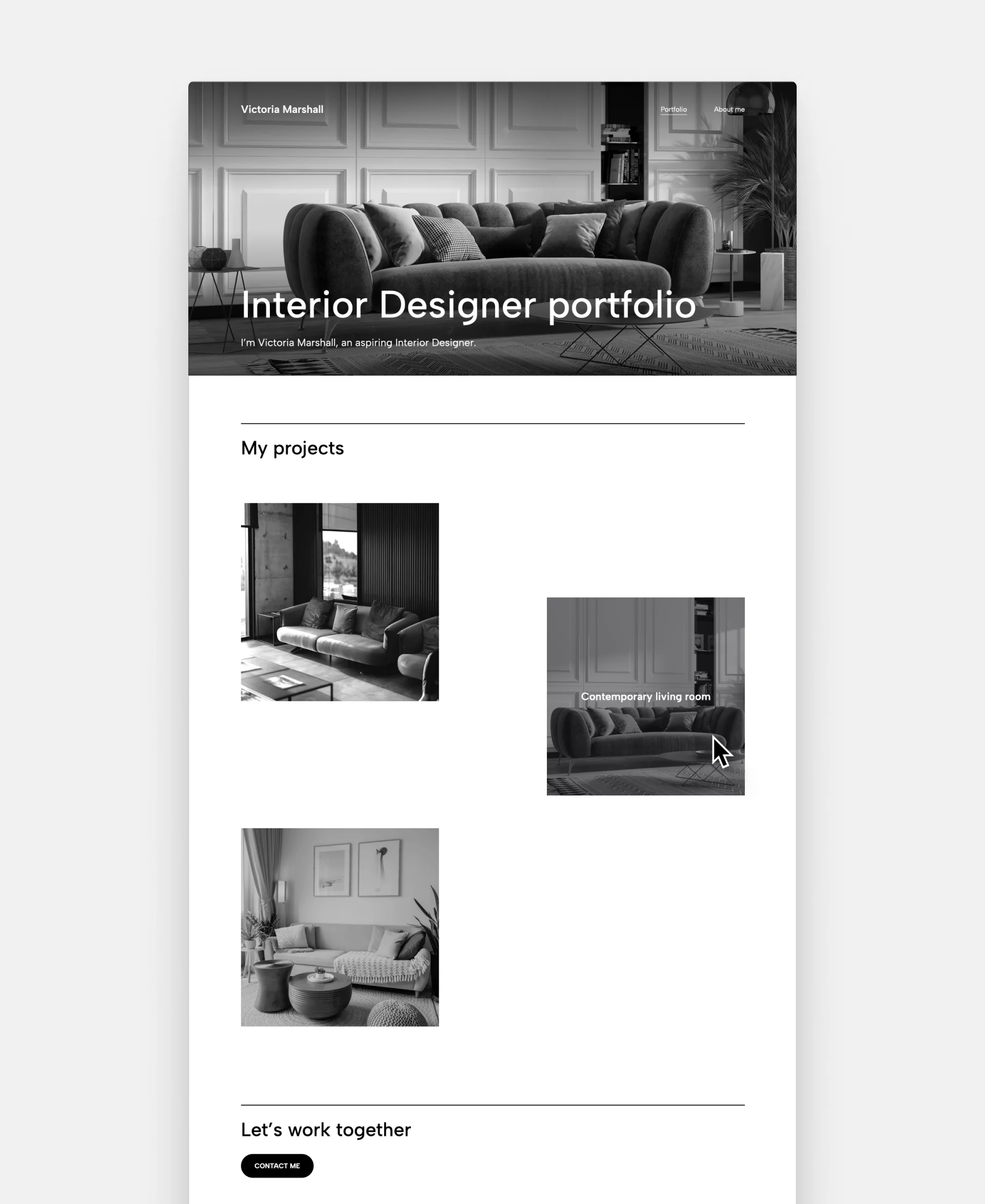
Interior design portfolio example with an asymmetrical balance
While it looks spectacular, you need to be careful not to go overboard. Use a neutral color palette and leave plenty of whitespace. Too many bold design choices will result in chaos and a cluttered feel.
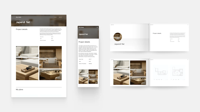
The omnichannel approach to portfolios
Similarly to interior design as a profession, the influence of the latest technologies can be seen in portfolios as well.
But what’s the omnichannel approach? It means providing the same experience seamlessly no matter where or how your visitors find you. They should have the same feeling whether they are on your website, on your Instagram page, or if they see your portfolio printed out in front of them. It helps them remember you better, and being memorable is half the battle.
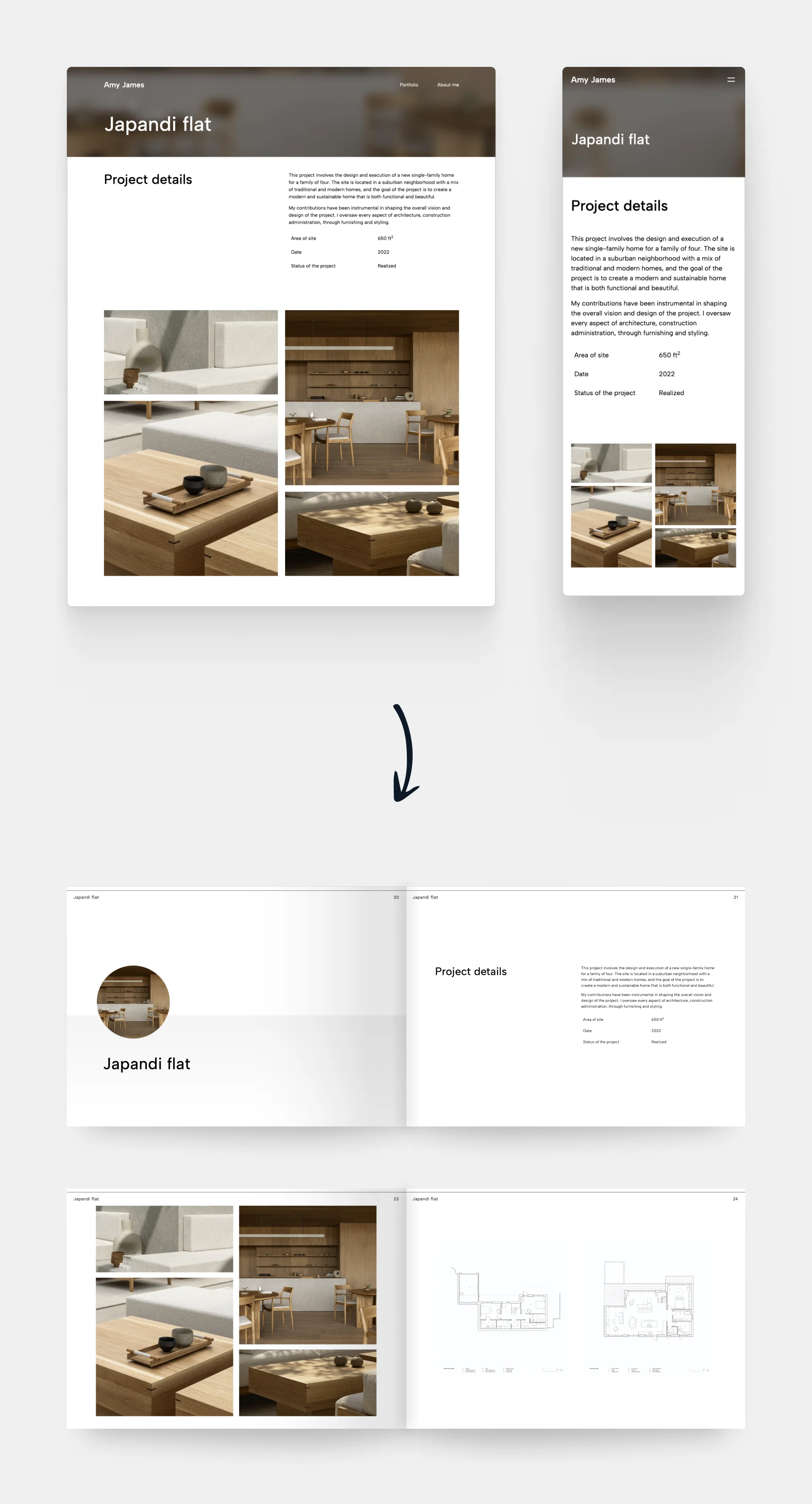
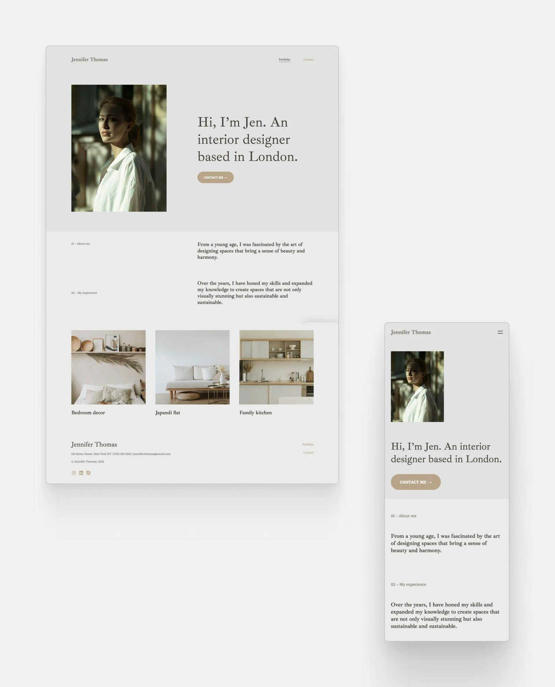
This is how Archifolio turns a responsive website design into a printable PDF.
How can you create an omnichannel portfolio? The short answer: be present online and offline, and have a consistent design that’s authentic to you.
The long answer: Think about the message you want to communicate with your work. Create a portfolio website that is optimized for all devices, and be professionally active on social media. Have a business card and printed portfolio that you take with you to interviews or client meetings.
While it seems like it’s a lot of work at first, you don’t actually need to create numerous different portfolios for all these different uses. Just build one with Archifolio, which you can…
- use as a website (that’s optimized for all devices),
- export as a PDF for printing or sending it as an email attachment,
- use it as an online presentation.
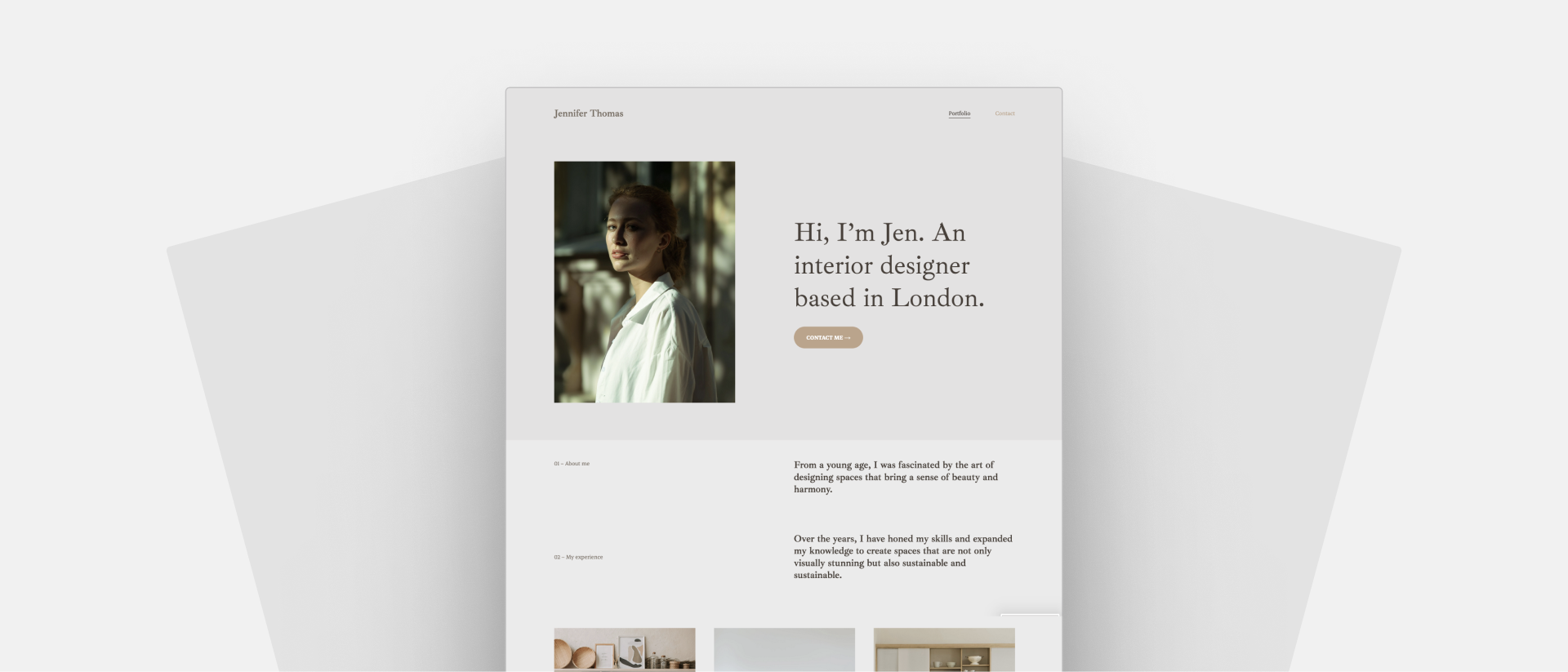
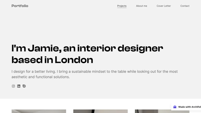
Simple, polished design
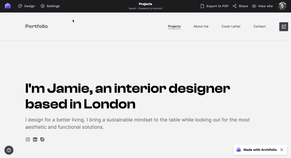
Some things never change. A minimalist, clean portfolio design is an evergreen trend for a reason.
A clutter-free layout helps your project images stand out. This is especially beneficial when you’re showcasing a reflected ceiling plan or an electrical blueprint. You can’t afford to have too much noise on the page, as the images themselves are already detailed.
This interior design portfolio design is clean and simple, but the small details make it compelling.
A black-and-white portfolio design is still a popular choice. But don’t be afraid to experiment with a more vibrant accent color, provided that you keep other tones to a minimum.
Bold typography
While minimalism has been a determining style in portfolio layouts and colors, we’re seeing a shift to bold, distinct font choices.
Choosing a maximum of two typefaces is still best practice, and how they work with each other continues to be an important consideration.
While typefaces are a wonderful way to distinguish ourselves from other designers, we should never sacrifice readability for style.
To spare you some time, we’ve handpicked numerous font pairs for you in Archifolio that score high on the readability scale and look stunning.
We also made experimenting with fonts easy. Changing fonts no longer means manually going over each text box. Global font settings make it easy to see exactly how your text will look like with the given typeface.
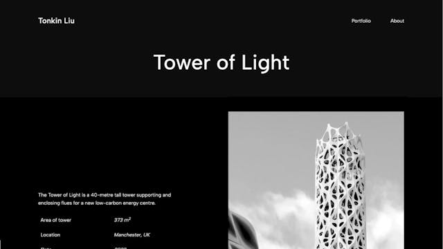
Dark mode
This recent web design trend –unsurprisingly– reached interior design portfolios as well. The idea behind it is that we flip the feeling of a white paper with black writing to a dark background with light text on it.
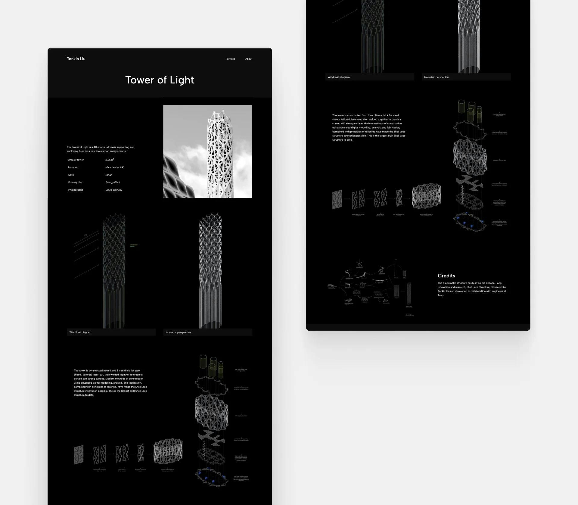
The dark background gives an elegant feel to this architectural project.
On smartphones and other devices, the use of dark mode is supposed to reduce eye strain and use less energy. Though these benefits are debated, one thing is for sure: “dark mode” portfolios look remarkable. Dark mode brings a sleek, elegant, and moody atmosphere, allowing your images to shine.
So maybe… it’s time to join the dark side?
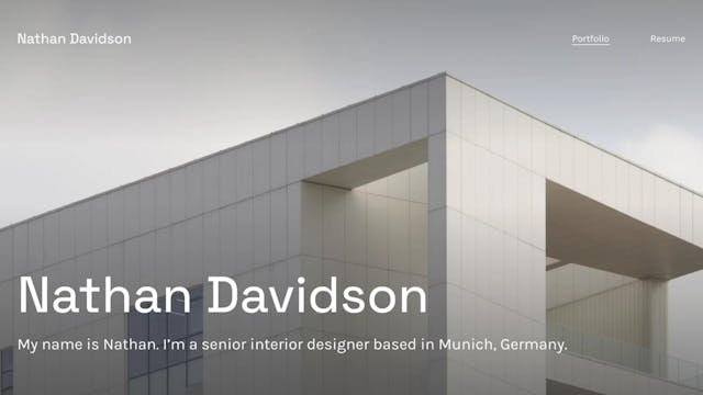
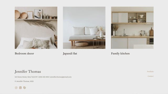
Catalog-like images
Even though the emphasis had always been on the project images –they are the protagonists after all–, even more space is allocated for them nowadays.
Full-width images allow your visitors to appreciate the details better, and bring that wow-factor you're looking for.
Full-screen images are here to stay. Giving visitors the chance to appreciate them to the fullest is an interior design portfolio trend we support. However, these work best with professional photography or realistic renders.
Which trends to ditch?
Sacrificing usability for design
Breaking the rules is sometimes not only allowed but essential. However, it seems that once a designer has an established brand, they feel entitled to have a lousy website.
The trend of creating an unreadable, inaccessible, incomprehensible website just for the sake of breaking the rules isn’t something that should be followed.
This website has insufficient contrast. For most of us, it’s just a giant reminder to clean our laptop screens.
Social media as your portfolio
While it’s an integral part of the omnichannel approach, sending just an Instagram page as your portfolio is considered unprofessional. Some firms will simply disregard your application.
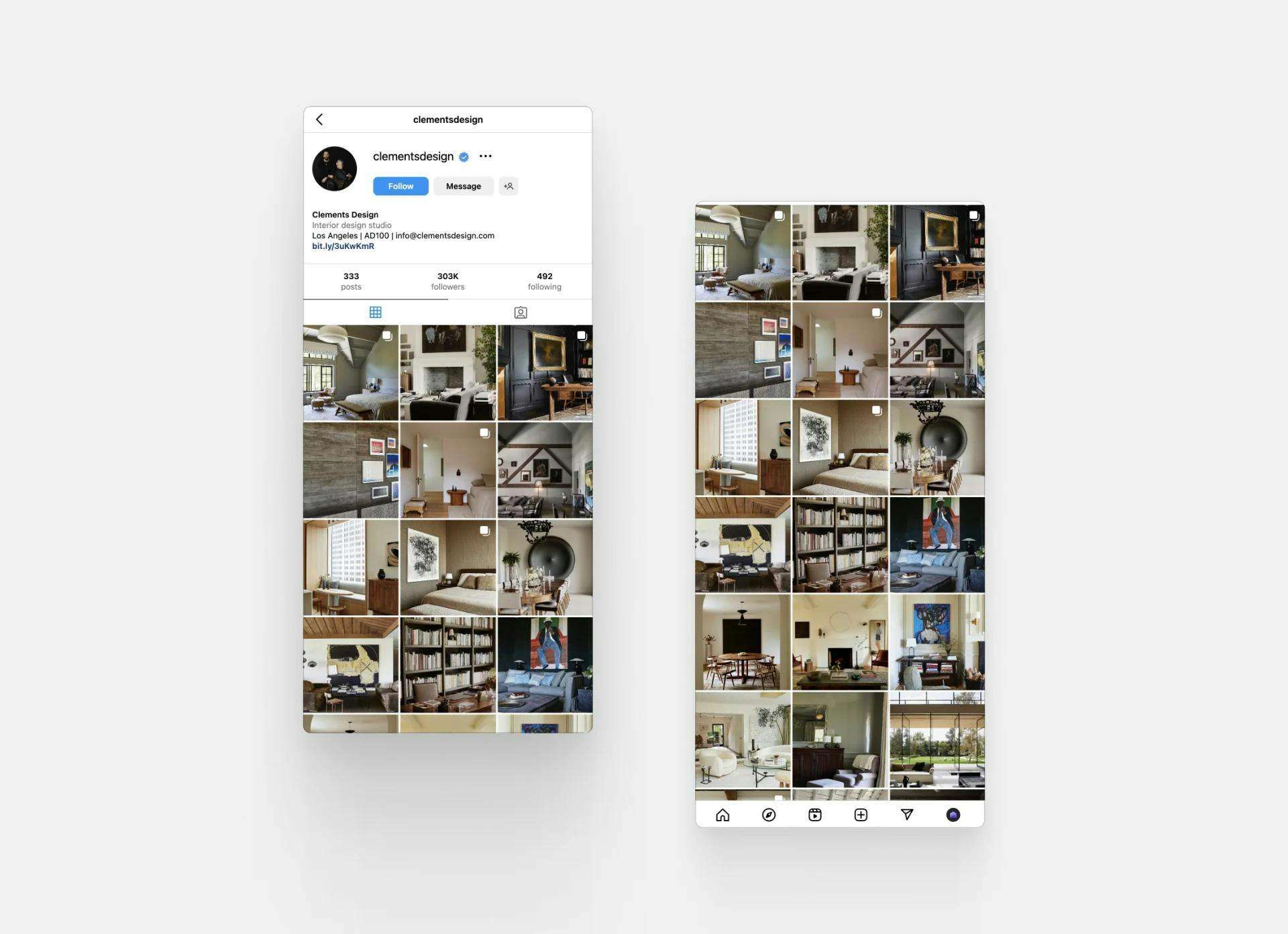
Clements Design has their Instagram page as a primary portfolio. They, however, also have a website with a contact page.
A social media account is not a good primary portfolio for numerous reasons. Image quality is reduced, the information is scattered all around the place, and categorization is non-existent. It’s time-consuming for a recruiter to see if you are the person they’re looking for, and your portfolio shouldn’t cause any frustration.
It is however a great secondary channel for showing your work, approach, and personality.
Final thoughts
There it goes, this was our collection of the better and worse interior design portfolio trends of 2023. Which ones are you excited about? Anything you’re not a fan of?
While staying up-to-date and being part of the pulse of the industry, it’s important to stay true to yourself. Know the trends, but only get behind those that you truly feel aligned with.
All of the good examples above were built with Archifolio. Are you ready to build your own all-in-one portfolio? Get started today!